Understanding Scatter Plot Graphs
In this article, a scatter graph plot has been demonstrated using spreadsheets in the WPS office. A scatter plot uses dots to represent values for two different numeric variables.
 Navin Baskar·11 Jul 2022·1 min read
Understanding Scatter Plot Graphs
In this article, a scatter graph plot has been demonstrated using spreadsheets in the WPS office. A scatter plot uses dots to represent values for two different numeric variables. The position of each dot on the horizontal and vertical axis indicates values for an individual data point. Scatter plots are used to observe relationships between variables.
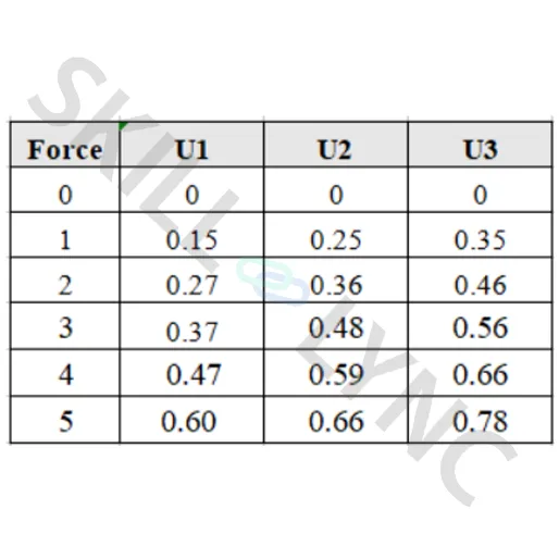
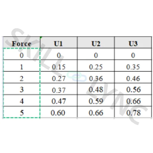
Take this table as an example. Here a force vs displacement graph has to be plotted to observe the relationship between the three variables. The ‘U’ denotes the displacement value for three different cases.
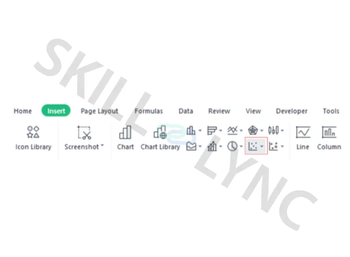
A scatter graph can be plotted from Insert > Insert scatter (x-y) chart.
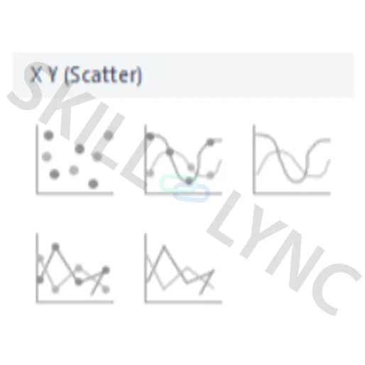
Here the scatter graph with smooth lines and markers can be selected.
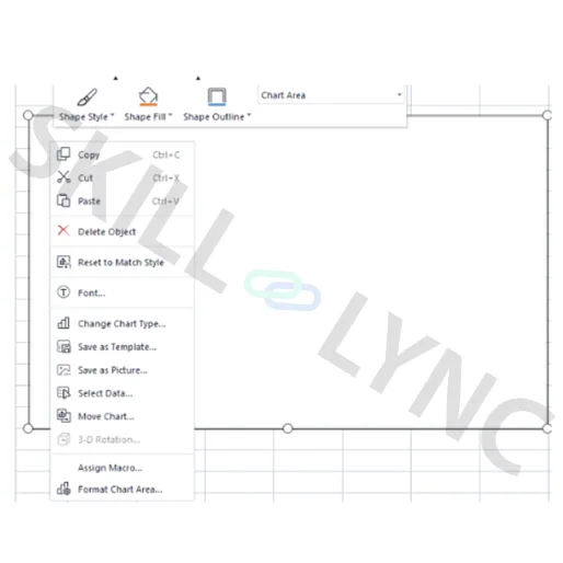
After selecting the scatter graph a blank tab will appear and do a right-click on it to get a dialog box opened. Here click the ‘select data’ option where we will be able to input the required data.
Now a new tab will appear and click the ‘add’ option under legend entries(series).
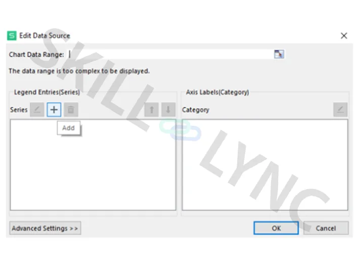
Give a series name and put the cursor on the series X values and drag the values under U1 from the table as shown below.
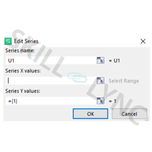
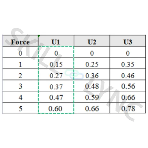
The series y values can be also updated in the same manner.
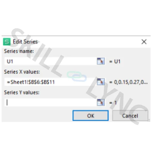
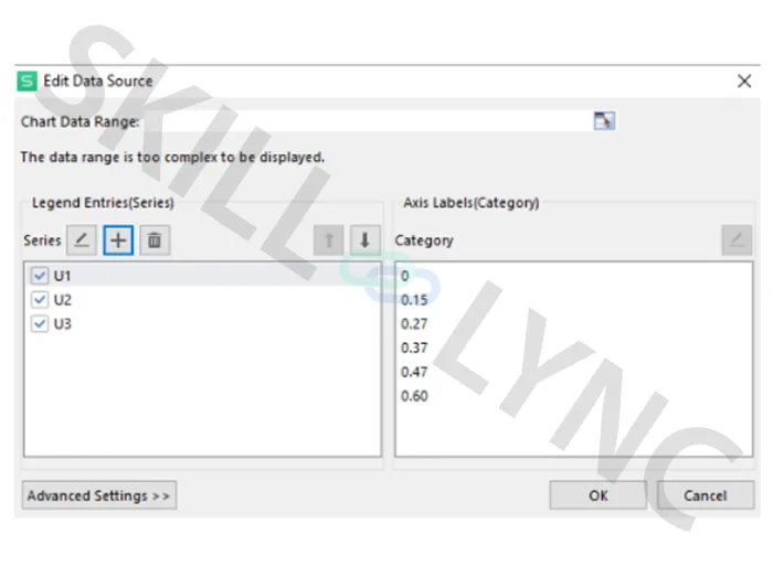
The same procedure can be followed to update the values for the other two displacements. The below image shows the filled edit data source page.
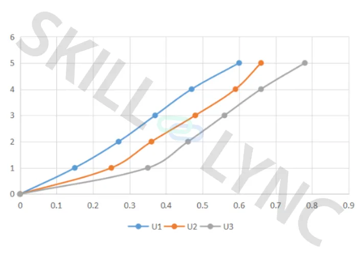
Finally, the graph will look like this as shown below.
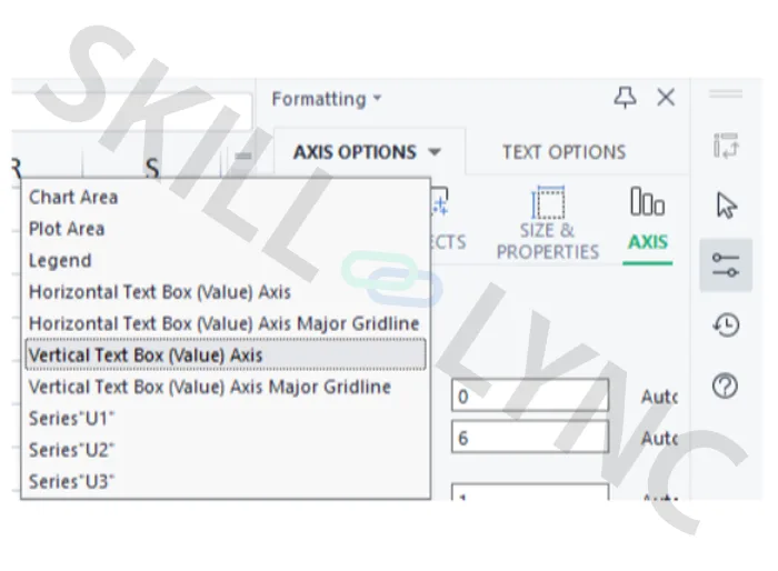
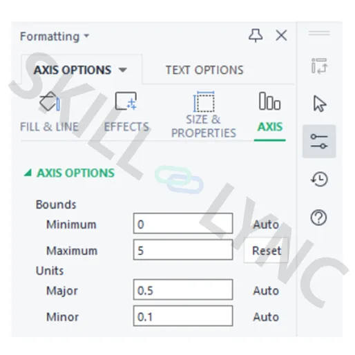
If needed the coordinate axis can be adjusted using the ‘Axis option’ and all the bounds and units can be changed accordingly.
Finally from the quick layout all the axis titles, chart titles, legends, etc are edited.
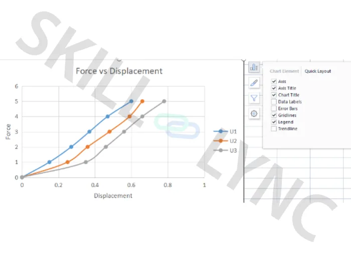
At this point, we have finished a simple scatter chart.