Unsupervised Learning
Aim:
- How is similarity calculated if data is categorical in nature.
- Implement K-means for “Car dataset” and come up with the business insights.
How is similarity calculated if data is categorical in nature.
The simplest way to find similarity between two categorical attributes is to assign a similarity of 1 if the values are identical and a similarity of 0 if the values are not identical.
Other method involves converting the categorical data into label encoding using a for loop which runs for the length of the array which containt the list of column names of the categorical data.
Code:
Dataset: https://drive.google.com/file/d/1WSP0t0_6tNwkbEjcPFKS1p1iMS5rCeHu/view?usp=sharing
Explaination:
- Importing python libraries is the first step.
- The dataset is imported as a pandas DataFrame, make sure the datafile and the python file exist in the same folder.
- The object type columns of data is first converted to label encoded data for us to be able to include these features in our analysis.
- The resulting dataset is scaled down using standardscaler to avoid bias in results.
- Correlation matrix is visualised in form of a heatmap to obtain the most contributing factors that influence the price of the data.
- Kmeans algorithm is implemented to form clusters.
- The clusters are grouped and each feature is plotted against the price values.
- PCA is performed on the most prominent features of the dataset and then the PCA columns are plotted against the price values.
- The plots obtained from the 2 methods are observed to draw conclusions.
import numpy as np
import pandas as pd
import matplotlib.pyplot as plt
from sklearn.preprocessing import StandardScaler
from sklearn.cluster import KMeans
import seaborn as sn

#data = pd.read_csv('E:\ai ml\aiml challenge\challenges\week11\CarPrice_Assignment.csv')
data = pd.read_csv("CarPrice_Assignment.csv")
pd.set_option('display.max_rows', None)
pd.set_option('display.max_columns', None)
print(data.head())
print(data.isna().sum())

pd.set_option('display.max_rows', None)
pd.set_option('display.max_columns', None)
print(data.info)
print(data.describe())
print(data['price'])

pr=data['price']

obj_df = data.select_dtypes(include=['object']).copy()
# method two to convert categorical data into label encoded data
name=['CarName','fueltype','aspiration','doornumber','carbody','drivewheel','enginelocation','enginetype','cylindernumber','fuelsystem']
print(type(name))

for i in range(0, len(name)):
    print(i)
    obj_df[name[i]] = obj_df[name[i]].astype('category')
    obj_df[name[i]] = obj_df[name[i]].cat.codes
    #obj_df.drop([name[i]], axis='columns', inplace=True)
    i=i+1

print(type(obj_df))
print(obj_df)
print(obj_df.head())
pd.set_option('display.max_columns', None)
pd.set_option('display.max_rows', None)

obj_data = pd.DataFrame(data.drop(['car_ID','CarName','fueltype','aspiration','doornumber','carbody','drivewheel','enginelocation','enginetype','cylindernumber','fuelsystem'], axis=1))
print(obj_data)

frames = [obj_df, obj_data]
result = pd.concat(frames, axis=1)
pd.set_option('display.max_rows', None)
print(result.shape)
print(result.head())


stsc=StandardScaler()
result_std=stsc.fit_transform(result)
scaled_result = pd.DataFrame(result_std, index=result.index, columns=result.columns)
pd.set_option('display.max_rows', None)
print(scaled_result)


corrmat = scaled_result.corr()
f, ax = plt.subplots(figsize=(10,10))
sn.heatmap(corrmat, ax=ax, cmap="YlGnBu", linewidths = 0.1)
plt.show()
print(type(result))

corr_matrix=scaled_result.corr()
top_corr_features=corr_matrix.index
plt.figure(figsize=(12,10))
sn.heatmap(scaled_result[top_corr_features].corr(), annot=True, cmap=plt.cm.CMRmap_r)
plt.show()

new_dat=scaled_result[['drivewheel','fuelsystem','wheelbase','carlength','carwidth','curbweight','enginesize','boreratio','horsepower']]
print(new_dat.head())


k_range=range(1,15)
sse=[]
for k in k_range:
    km=KMeans(n_clusters=k)
    km.fit(new_dat)
    sse.append(km.inertia_)
print(sse)
plt.plot(k_range, sse, '-*')
plt.xlabel('K value')
plt.ylabel('SSE')
plt.grid(True)
plt.title('Elbow plot (To determine best K value)')
plt.show()


# creating new values of y(after scaling down)
km=KMeans(n_clusters=2)
print(km)
y_new=km.fit_predict(new_dat)
new_dat["Cluster_scaled"]=y_new
print(new_dat) #note the change in clustering of the data after standardisation

"""
new dataframes for plotting the points generated after scaling down data
"""

combined = [new_dat, scaled_result["price"]]
coln = pd.concat(combined, axis=1)

pd.set_option('display.max_columns', None)
print(coln)
print(coln.head())

print(km.cluster_centers_)
print(km.algorithm)
pd.set_option('display.max_columns', None)
print(coln)
print(coln.head())


df0=coln[coln.Cluster_scaled==0]
df1=coln[coln.Cluster_scaled==1]
#df2=coln[coln.Cluster_scaled==2]

colname=coln.columns
print(colname)
pd.set_option('display.max_columns', None)
print(df0)
print(df0.shape)
#plt.scatter(df2[colname[i]], df2["price"],color="green")

for i in range(0,len(colname)-2):

    plt.scatter(df0[colname[i]], df0["price"],color="red",label='Cluster 1')
    plt.scatter(df1[colname[i]], df1["price"],color="blue",label='Cluster 2')
    """
    plt.scatter(df1.age_minmax,df1["income_minmax"],color="blue")
    plt.scatter(df2.age_minmax,df2["income_minmax"],color="green")"""
    plt.ylabel(colname[i])
    plt.xlabel('Price')
    plt.title(colname[i])
    plt.scatter(km.cluster_centers_[:,0],km.cluster_centers_[:,1],color="purple",marker="*",label='Cluster centroids')
    plt.legend()
    plt.show()


pd.set_option('display.max_columns', None)
print(coln)

from sklearn.decomposition import PCA
pca=PCA(n_components=2)
# alternate method
# if you choose to write the amount of information needed you must make sure to write the number of principal components 'columns=['pc1','pc2','pc3']'
principalcomponents_std=pca.fit_transform(scaled_result)
principalDF_std=pd.DataFrame(data=principalcomponents_std, columns=['pc1','pc2'])
print(principalDF_std)
print((pca.explained_variance_ratio_))

from sklearn.cluster import KMeans
k_range=range(1,30)
sse=[]
for k in k_range:
    km=KMeans(n_clusters=k)
    km.fit(principalDF_std[["pc1","pc2"]])
    sse.append(km.inertia_)
print(sse)
print(km.inertia_)
plt.plot(k_range, sse, '-o')
plt.xlabel('K value')
plt.ylabel('SSE')
plt.grid(True)
plt.title('Elbow plot (To determine best K value)')
plt.show()

km=KMeans(n_clusters=2)
print(km)
y_new_pca=km.fit_predict(principalDF_std)
principalDF_std["Cluster_scaled_pca"]=y_new_pca

pca_combined = [principalDF_std, scaled_result["price"]]
pca_price = pd.concat(pca_combined, axis=1)


print(km.cluster_centers_)
print(km.algorithm)
pd.set_option('display.max_columns', None)
print(principalDF_std)
print(principalDF_std.head())


df0=pca_price[pca_price.Cluster_scaled_pca==0]
df1=pca_price[pca_price.Cluster_scaled_pca==1]
#df2=pca_price[pca_price.Cluster_scaled_pca==2]
"""df3=pca_price[pca_price.Cluster_scaled_pca==3]
df4=pca_price[pca_price.Cluster_scaled_pca==4]"""

pca_col=pca_price.columns
"""plt.scatter(df3[pca_col[i]], df3["price"],color="black")
plt.scatter(df4[pca_col[i]], df4["price"],color="yellow")
"""

for i in range(0,len(pca_col)-2):

    plt.scatter(df0[pca_col[i]], df0["price"],color="red",label='Cluster 1')
    plt.scatter(df1[pca_col[i]], df1["price"],color="blue",label='Cluster 2')
    #plt.scatter(df2[pca_col[i]], df2["price"],color="green",label='Cluster 3')
    plt.ylabel('PCA data points')
    plt.xlabel('Price')
    plt.scatter(km.cluster_centers_[:,0],km.cluster_centers_[:,1],color="purple",marker="*",label='Centroid')
    plt.title('PCA plot')
    plt.legend()
    plt.show()

print(pca_price.head())
Plots and results:
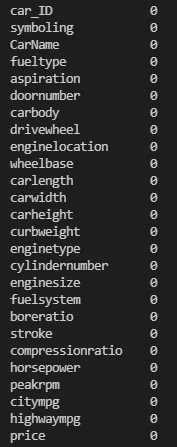
The above print in the terminal proves that there are no NA values in the dataset.
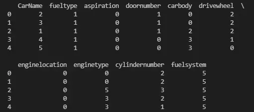
The columns of data which were of datatype 'object' have been converted into label encoded datacolumns.
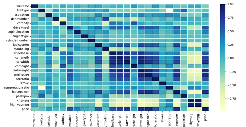
The correlation matrix does'nt allow us to properly distinduish the correlation between data points a heat map containing amount of correlation will be generated.
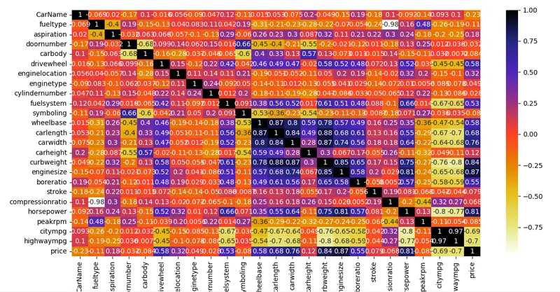
From the above heat map only the values above 0.5 have been selected from the 'price' column.
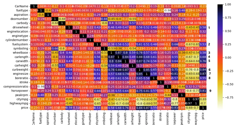
9 most prominent features are chosen because they are the most contributing features for the variation in price.
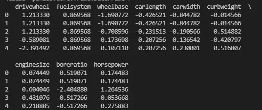
The '.head()' command for the above features are isolated after running 'StandardScaler'.
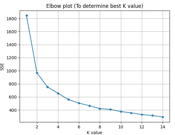
The above shown graph is for K values of 0 to 14.
Ideally K value of 5 would be the most optimum choice to go with but since the plots and clusters appear to be very clumsy when using k=5, k=2 has been choosen for plotting.
Clusters:
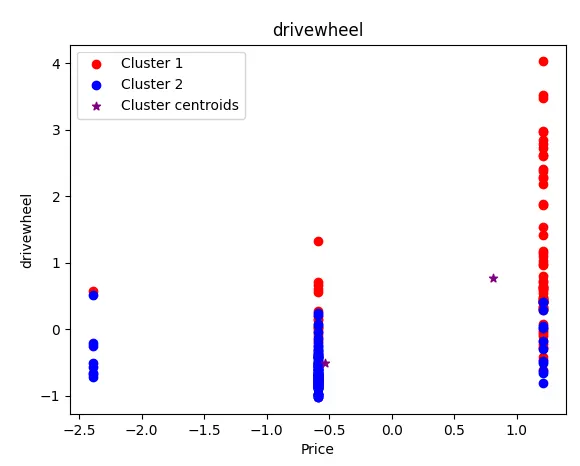
The above plot shows the classification clusters of the column 'drivewheel' against 'price'.
The points are plotted in a vertical fashion because of the fact that there are only 3 distinct types of 'drivewheel' in the dataset.
Note that there are very few red points on the left but as the price increases the red points increase.
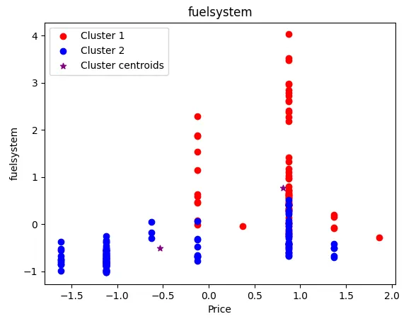
The above plot shows the classification clusters of the column 'fuelsystem' against 'price' from the dataset.
The points are plotted in a vertical fashion because of the fact that there are only a few distinct types of 'drivewheel' in the dataset.A similar tred to what was observed from the 'drivewheel' plot can be observed here.
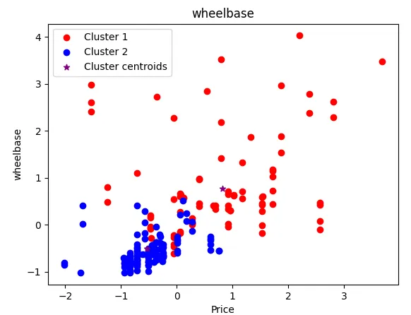
The above plot shows the classification clusters of the column 'wheelbase' against 'price' from the dataset.
The clusters are not that well defined although they clearly show us a visible seperation from one another.
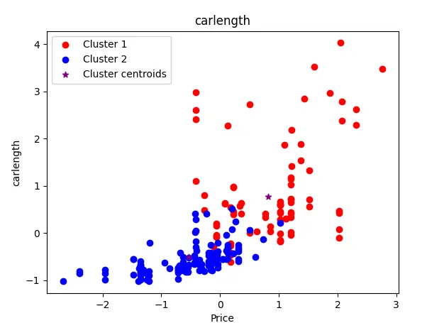
The above plot shows the classification clusters of the column 'carlength' against 'price' from the dataset.
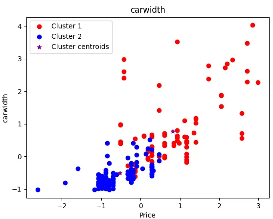
The above plot shows the classification clusters of the column 'carwidth' against 'price' from the dataset.
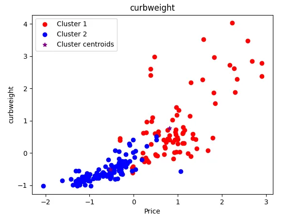
The above plot shows the classification clusters of the column 'carweight' against 'price' from the dataset.
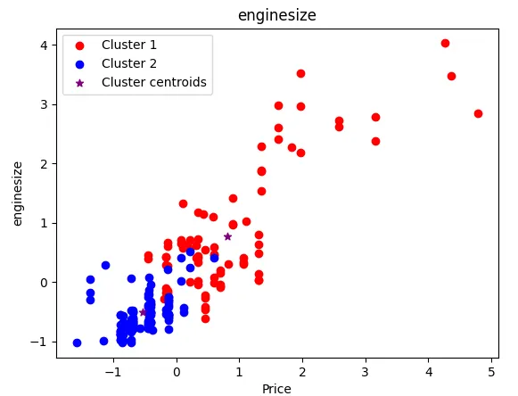
The above plot shows the classification clusters of the column 'enginesize' against 'price' from the dataset.
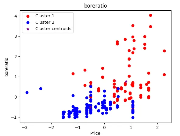
The above plot shows the classification clusters of the column 'boreratio' against 'price' from the dataset.
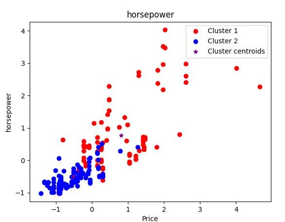
The above plot shows the classification clusters of the column 'horsepower' against 'price' from the dataset.
PCA plots:
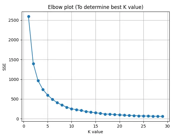
The above K means plot has been obtained from passing 'PC1' & 'PC2' columns of data.
To compare PCA clustering with that of the clustering obtained from the datapoints K=2 has been chosen.
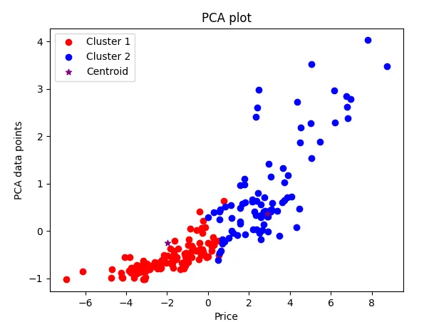
Plot of 'pc1' feature with 'price' can be seen from the enclosed plot.
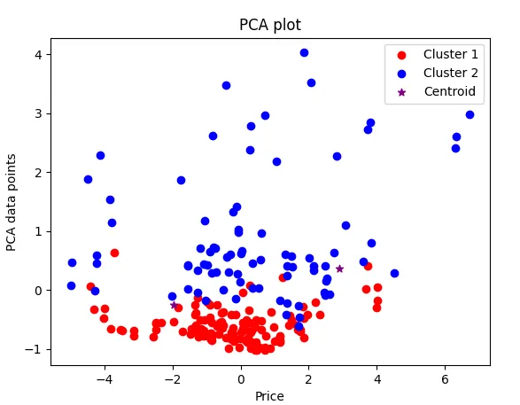
Plot of 'pc2' feature with 'price' can be seen from the enclosed plot.
It can be observed that the cluster 1 feature shown in 'blue' is above the cluster in 'red' unlike the clusters from the original dataset.
References:
Syntax for column concatenation:
https://pandas.pydata.org/pandas-docs/stable/user_guide/merging.html
To retain column names after standardscaler operation: