Supervised Learning - Classification Week 7 Challenge
1. Pros and cons of SVM
Pros:
- It works really well with a clear margin of separation
- It is effective in high dimensional spaces.
- It is effective in cases where the number of dimensions is greater than the number of samples.
- It uses a subset of training points in the decision function (called support vectors), so it is also memory efficient.
Cons:
- It doesn’t perform well when we have large data set because the required training time is higher
- It also doesn’t perform very well, when the data set has more noise i.e. target classes are overlapping
- SVM doesn’t directly provide probability estimates, these are calculated using an expensive five-fold cross-validation. It is included in the related SVC method of Python scikit-learn library.
SVM:
A Support Vector Machine (SVM) is a supervised machine learning algorithm that can be employed for both classification and regression purposes. SVMs are more commonly used in classification problems.
Support vectors are the data points nearest to the hyperplane, the points of a data set that, if removed, would alter the position of the dividing hyperplane. Because of this, they can be considered the critical elements of a data set.
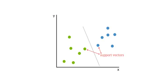
For a classification task with only two features (like the image above), you can think of a hyperplane as a line that linearly separates and classifies a set of data.
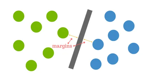
Intuitively, the further from the hyperplane our data points lie, the more confident we are that they have been correctly classified. We therefore want our data points to be as far away from the hyperplane as possible, while still being on the correct side of it.
So when new testing data is added, whatever side of the hyperplane it lands will decide the class that we assign to it.
Support vectors are the data points nearest to the hyperplane, the points of a data set that, if removed, would alter the position of the dividing hyperplane. Because of this, they can be considered the critical elements of a data set.
The distance between the hyperplane and the nearest data point from either set is known as the margin. The goal is to choose a hyperplane with the greatest possible margin between the hyperplane and any point within the training set, giving a greater chance of new data being classified correctly.
Data is rarely ever as clean as our simple example above. A dataset will often look more like the jumbled balls below which represent a linearly non separable dataset.

In order to classify a dataset like the one above it’s necessary to move away from a 2d view of the data to a 3d view. Explaining this is easiest with another simplified example. Imagine that our two sets of colored balls above are sitting on a sheet and this sheet is lifted suddenly, launching the balls into the air. While the balls are up in the air, you use the sheet to separate them. This ‘lifting’ of the balls represents the mapping of data into a higher dimension. This is known as kernelling.
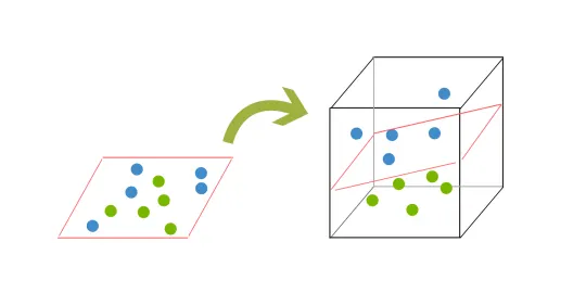
Because we are now in three dimensions, our hyperplane can no longer be a line. It must now be a plane as shown in the example above. The idea is that the data will continue to be mapped into higher and higher dimensions until a hyperplane can be formed to segregate it.
SVM is used for text classification tasks such as category assignment, detecting spam and sentiment analysis. It is also commonly used for image recognition challenges, performing particularly well in aspect-based recognition and color-based classification. SVM also plays a vital role in many areas of handwritten digit recognition, such as postal automation services.
When the data can not to split by using a hyperplane:
It solves this problem by introducing additional feature. Here, we will add a new feature z=x^2+y^2. Now, let’s plot the data points on axis x and z
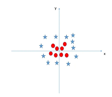
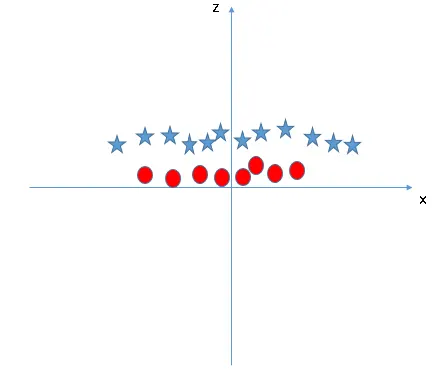
In above plot, points to consider are:
- All values for z would be positive always because z is the squared sum of both x and y
- In the original plot, red circles appear close to the origin of x and y axes, leading to lower value of z and star relatively away from the origin result to higher value of z.
The SVM kernel is a function that takes low dimensional input space and transforms it to a higher dimensional space i.e. it converts not separable problem to separable problem. It is mostly useful in non-linear separation problem. Simply put, it does some extremely complex data transformations, then finds out the process to separate the data based on the labels or outputs you’ve defined.
When we look at the hyper-plane in original input space it looks like a circle: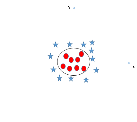
Correlation Matrix:
A correlation matrix is simply a table which displays the correlation coefficients for different variables. The matrix depicts the correlation between all the possible pairs of values in a table. It is a powerful tool to summarize a large dataset and to identify and visualize patterns in the given data.
A correlation matrix consists of rows and columns that show the variables. Each cell in a table contains the correlation coefficient.
In addition, the correlation matrix is frequently utilized in conjunction with other types of statistical analysis. For instance, it may be helpful in the analysis of multiple linear regression models. Remember that the models contain several independent variables. In multiple linear regression, the correlation matrix determines the correlation coefficients between the independent variables in a model.
2. Apply SVM to the “Surface defects in stainless steel plates” dataset and evaluate it
Code:
import numpy as np
import pandas as pd
import matplotlib.pyplot as plt
import seaborn as sn

df = pd.read_csv(r'E:\ai ml\aiml challenge\challenges\week7\faults.csv')
df.hist()
plt.show()

print('The size of the dataset is : ',df.shape)
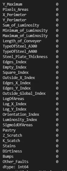
print('isnull = ', df.isnull().sum())

factors=df.iloc[:, 0:27]
# pd.set_option('display.max_columns', None)
pd.set_option('display.max_rows', None)
print(factors)

defects=df.iloc[:, 27:34]
print(defects)

pd.set_option('display.max_columns', None)
pd.set_option('display.max_rows', None)
print(factors.head())
pd.set_option('display.max_columns', None)
pd.set_option('display.max_rows', None)
print(defects.head())

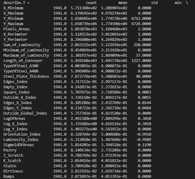
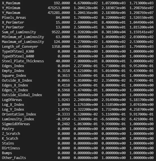
df.describe().T
print('describe.T = ', df.describe().T)

pd.set_option('display.max_columns', None)
pd.set_option('display.max_rows', None)
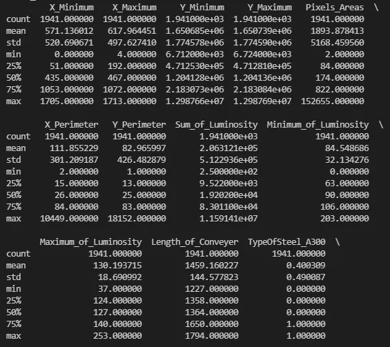
print(factors.describe())
pd.set_option('display.max_columns', None)
pd.set_option('display.max_rows', None)
print(defects.describe())

print('length of factors = ', len(factors))
print('width of factors = ', factors.shape[1])

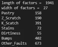
print(defects[['Pastry', 'Z_Scratch', 'K_Scatch', 'Stains', 'Dirtiness', 'Bumps', 'Other_Faults']].sum())

target_index = defects[['Pastry', 'Z_Scratch', 'K_Scatch', 'Stains', 'Dirtiness', 'Bumps', 'Other_Faults']].sum().index
print(target_index)
target_values = defects[['Pastry', 'Z_Scratch', 'K_Scatch', 'Stains', 'Dirtiness', 'Bumps', 'Other_Faults']].sum().values
print(target_values)
#distribution of the target variable
plt.bar(x=target_index, height= target_values)
plt.xticks(rotation=45)
plt.show()


defects['Class']=0
defects['DefType']=''
#data Consolidation - Consolidating the target dummy variables into single variable
defects.loc[defects.Pastry==1,'Class'] = 1
defects.loc[defects.Z_Scratch==1,'Class'] = 2
defects.loc[defects.K_Scatch==1,'Class'] = 3
defects.loc[defects.Stains==1,'Class'] = 4
defects.loc[defects.Dirtiness==1,'Class'] = 5
defects.loc[defects.Bumps==1,'Class'] = 6
defects.loc[defects.Other_Faults==1,'Class'] = 7

#data Consolidation - Consolidating the target dummy variables into single variable
defects.loc[defects.Pastry==1,'DefType'] = 'Pastry'
defects.loc[defects.Z_Scratch==1,'DefType'] = 'Z_Scratch'
defects.loc[defects.K_Scatch==1,'DefType'] = 'K_Scatch'
defects.loc[defects.Stains==1,'DefType'] = 'Stains'
defects.loc[defects.Dirtiness==1,'DefType'] = 'Dirtiness'
defects.loc[defects.Bumps==1,'DefType'] = 'Bumps'
defects.loc[defects.Other_Faults==1,'DefType'] = 'Other_Faults'


defects.drop(['Pastry','Z_Scratch','K_Scatch','Stains','Dirtiness','Bumps','Other_Faults','DefType'], axis=1, inplace=True)
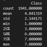
print(defects.describe())
print(defects.head())


pd.set_option('display.max_columns', None)
pd.set_option('display.max_rows', None)
print(defects.shape)


corrmat = df.corr()
f, ax = plt.subplots(figsize=(10,10))
sn.heatmap(corrmat, ax=ax, cmap="YlGnBu", linewidths = 0.1)
plt.show()
print(df.shape)

pd.set_option('display.max_columns', None)
pd.set_option('display.max_rows', None)
print('df1 = ', df)


from sklearn.model_selection import train_test_split
X_train, X_test, Y_train, Y_test = train_test_split(factors, defects, test_size=0.3, random_state=0)

print(X_train.shape)
print(X_test.shape)
print(Y_train.shape)
print(Y_test.shape)

print(X_train.describe().T)
print(X_test.describe().T)
print(Y_train.value_counts())
print(Y_test.value_counts())


print(defects.describe())
pd.set_option('display.max_rows', None)

print(defects.head())

print(Y_train)

print(X_train.shape)
print(X_test.shape)
print(Y_train.shape)
print(Y_test.shape)

from sklearn import svm
model = svm.SVC(C=1, gamma = "auto", kernel = "linear")

Y_train=np.array(Y_train)
X_train=np.array(X_train)
print (type(X_train))
print(type(Y_train))

from sklearn.preprocessing import StandardScaler
sc=StandardScaler()

X_train1=sc.fit_transform(X_train)
X_test1=sc.fit_transform(X_test)

model.fit(X_train1,Y_train)
print(model.score(X_test1, Y_test))
Y_predict = model.predict(X_test1)

from sklearn import metrics
cm = metrics.confusion_matrix(Y_test, Y_predict)
print(cm)
print(cm.shape)
print(type(cm))
print(cm[0, 0])

import seaborn as sn
plt.figure(figsize=(10, 7))
sn.heatmap(cm, annot=True)
plt.xlabel("Predicted")
plt.ylabel("Actual")
plt.show()
Size of the dataset:

Factors:
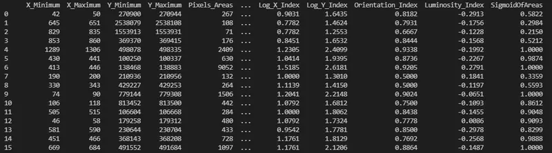
Defects:
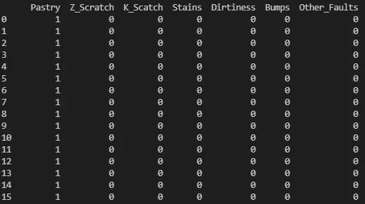
Sum of null values in the dataset:
describe.T
head()
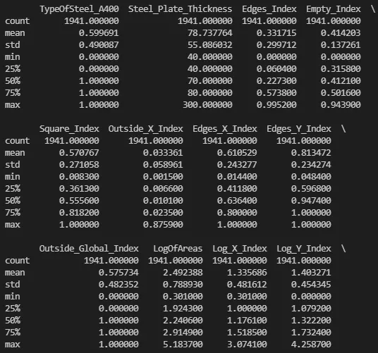
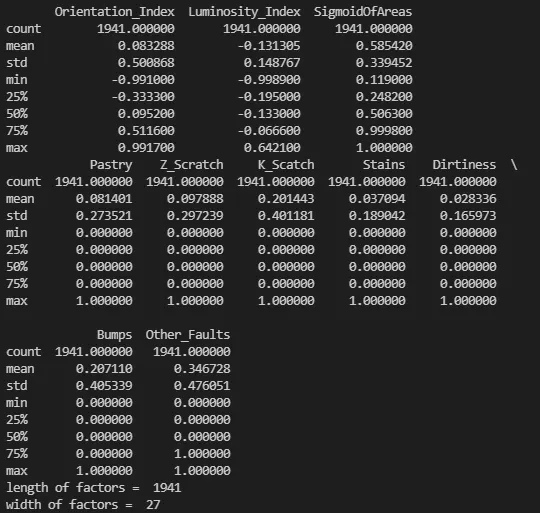
After combining variables and deleting dummy variables: defects.describe()
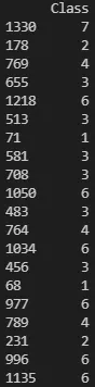
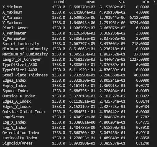
Accuracy of the code:
0.7341337907375644
Plots:
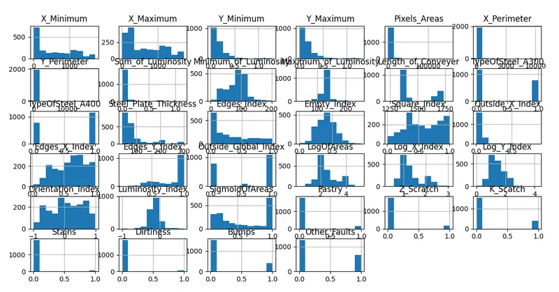
Since the defects are not standardised the values look very different from the other plots.
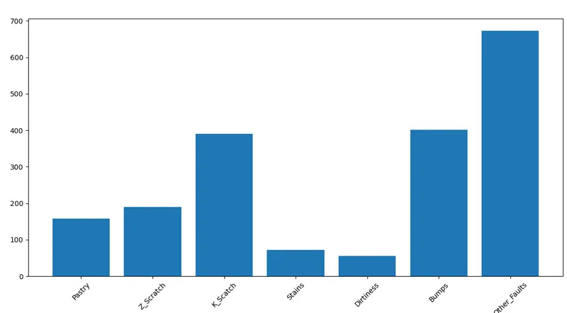
This graph clearly shows the number of entries of each defect.
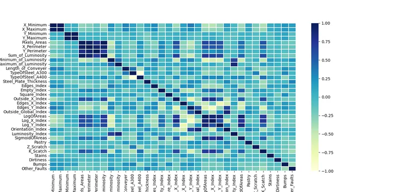
This is the correlation matrix for the entire dataset.
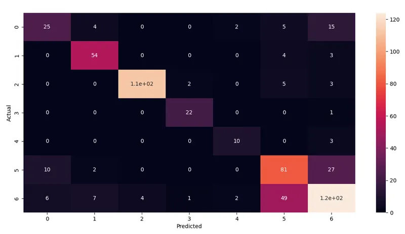
The above confusion matrix shows the entries that have been predicted to have a particular defect to a level of accuracy.
References:
https://rstudio-pubs-static.s3.amazonaws.com/378820_f2d0a64cbe044e31b95aba4fb9eac037.html
https://www.mdpi.com/2075-4701/11/3/388/pdf
Quality Control and Classification of Steel Plates Faults Using Data Mining:doi:10.18576/amisl/060202
http://www.naturalspublishing.com/files/published/h41x902g8m91zk.pdf