Project 1
AIM: The task of this project is to compute the fuel economy numbers for the given vehicle (kmpl) on the urban cycle (UDDS) and highway cycle (HWFET). It deals with the development of a forward energy-based fuel consumption model of a conventional vehicle.
OBJECTIVE:
- To analyse and understand the vehicle operating points in terms of engine speed, torque, transmission speeds, pedal positions, gear, distance travelled.
- Tabulate the fuel economy numbers (kmpl) for UDDS and HWFET cycle. This forms the baseline numbers for comparing with the future hybrid version.
- Plot the time trace for engine, transmission input, transmission output and wheel speed on one plot.
- Plot engine torque, engine power, fuel rate and fuel consumption using subplots.
- Plot accelerator and brake pedal, gear command, vehicle desired and actual speed, vehicle distance using subplots.
- Plot the engine operating points on the engine fuel map.
- Write down appropriate brief comments on each of these plots, describing the vehicle behaviour throughout the drive cycle.
- Generate the plots for both drive cycles
Project:
The following file is to use with the and Simulink results for post-processing of the data.
In this project there are three steps to get the required plots using Matlab and Simulink:
- Initialization file in Matlab
- Simulink model for vehicle model
- Post-processing file n Matlab
The attached Matlab and Simulink model are executed to study the objectives.
These plots are plotted considering there is grade = 0 during the drive cycles.
- Tabulate the fuel economy numbers for UDDS and HWFET cycle.
- Refer to attached spreadsheet which has fuel economy numbers for the above cycles.
Plotting vehicle characteristics time trace:
UDDS cycle:
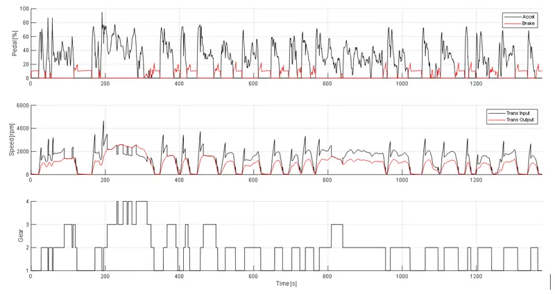
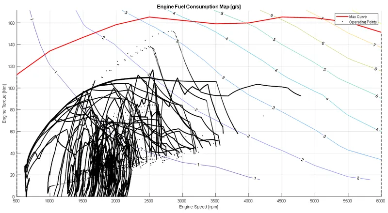
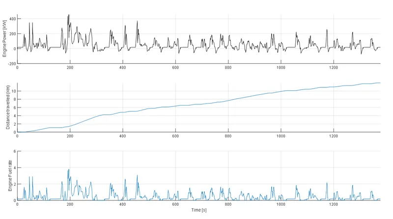
- UDDS cycle represents city/urban driving conditions, where the Vehicle average speed is around 9 mph.
- The braking is very frequent in case of this cycle along with the acceleration.
- The engine torque and gears decide the input transmission speed. Depending on positive or negative torque the transmission output is decided. We can see from the plot the output transmission speed is less most of the time during the drive cycle. This is mainly attributed to the braking of the vehicle.
- From the Time vs Gear plot shows that most of the time the vehicle is in 2nd
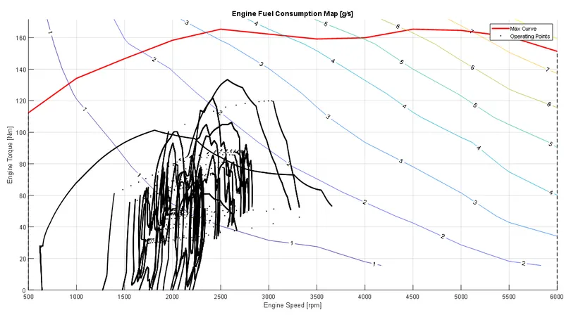
- From the engine operating points on engine fuel map we can see that during the drive cycle the engine speed was between 550 to 3500 approximately. The Red line in the plot represents “Max torque curve” that the engine is designed to operate.
- The operating points represent the engine torque vs speed during the drive cycle. These are represented in black points.
- The contour lines in the plot represents the engine fuel consumption. For the operating points which are below the contour line 1 means the fuel consumption is in these areas is less than 1 g/s. Most of the remaining operating points are falling in between 1g/s to 2 g/s
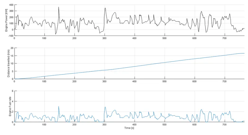
- Plots for engine power, distance travelled and fuel rate are also plotted against time to understand their trend.
HWFET Cycle:
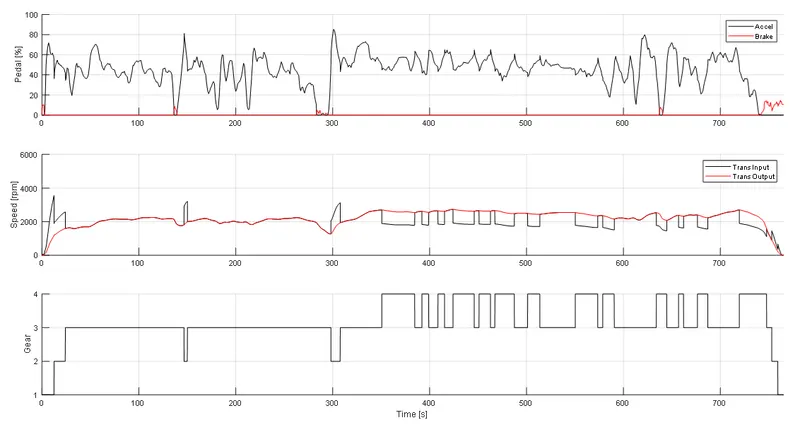
- HWFET cycle represents a mixture of rural and interstate highway driving, where the Vehicle average speed is around 21 mph.
- The braking is less frequent in case of this cycle.
- The engine torque and gears decide the input transmission speed. Depending on positive or negative torque the transmission output is decided. We can see from the plot the output transmission speed is almost equal to input transmission speed most of the time during the drive cycle. This is mainly attributed to less braking of the vehicle. In some of the areas the output transmission speed is more than input, this is mainly attributed to the gear of the vehicle. The output speed is more in the 4th gear and the braking is almost zero.
- From the Time vs Gear plot shows that most of the time the vehicle is in 3rd and 4th
- From the engine operating points on engine fuel map, we can see that during the drive cycle the engine speed was between 1500 to 3500 approximately. The Red line in the plot represents “Max torque curve” that the engine is designed to operate.
- The operating points represent the engine torque vs speed during the drive cycle. These are represented in black points.
- The contour lines in the plot represents the engine fuel consumption. For the operating points which are below the contour line 1 means the fuel consumption is in these areas is less than 1 g/s. Most of the remaining operating points are falling in between 1g/s to 2 g/s.
- Plots for engine power, distance travelled and fuel rate are also plotted against time to understand their trend.
Conclusion:
Thus, the fuel economy numbers for the given vehicle on the urban cycle (UDDS) and highway cycle (HWFET). The vehicle operating points in terms of engine speed, torque, transmission speeds, pedal positions, gear, distance travelled are also analysed.