Project 1
Aim:
- To perform data cleaning on Automobile 1985 dataset.
- To perform descriptive analytics.
Descriptive analysis:
Data cleaning:
Data cleaning is the process of fixing or removing incorrect, corrupted, incorrectly formatted, duplicate, or incomplete data within a dataset. When combining multiple data sources, there are many opportunities for data to be duplicated or mislabeled. If data is incorrect, outcomes and algorithms are unreliable, even though they may look correct. There is no one absolute way to prescribe the exact steps in the data cleaning process because the processes will vary from dataset to dataset. But it is crucial to establish a template for your data cleaning process so you know you are doing it the right way every time.
Code:
Dataset:
https://www.kaggle.com/fazilbtopal/auto85
Explaination:
- Essential python libraries have been called for further use.
- The dataset is imported as a pandas DataFrame, make sure the datafile and the python file exist in the same folder.
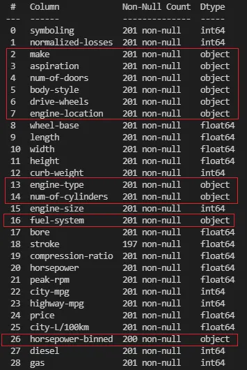
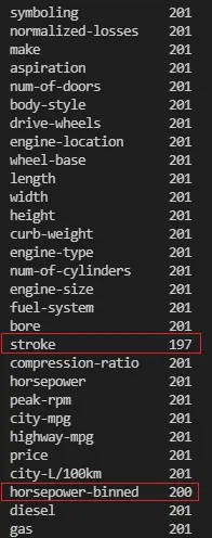
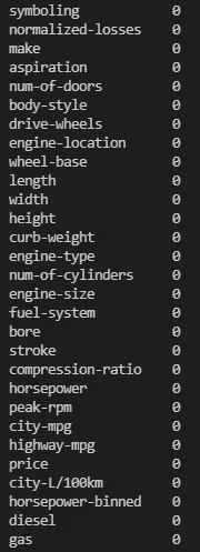
- Implement info, count, isnull and fillna to manipulte the dataset and to convert the dataset into a workable format.
- Convert the redundent column of 'gas' and 'diesel' into a single dataframe column.
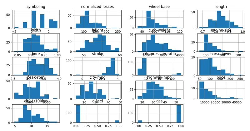
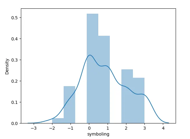
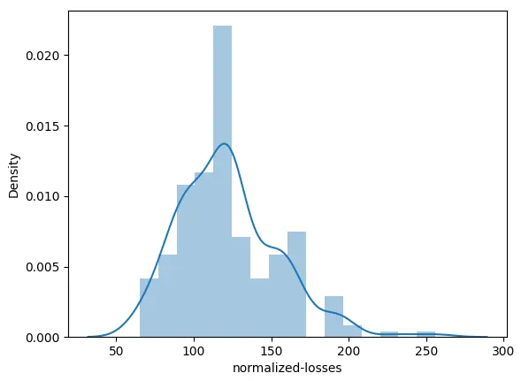
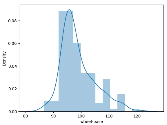
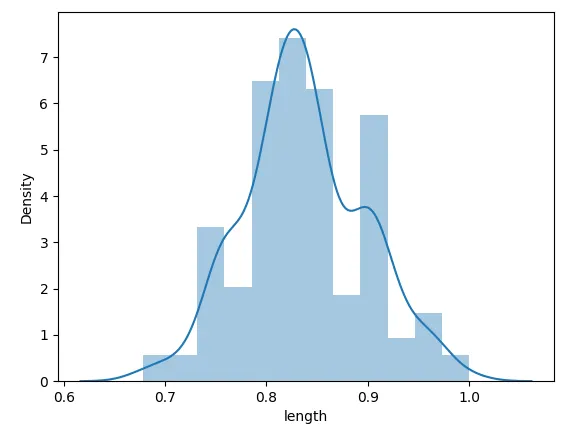
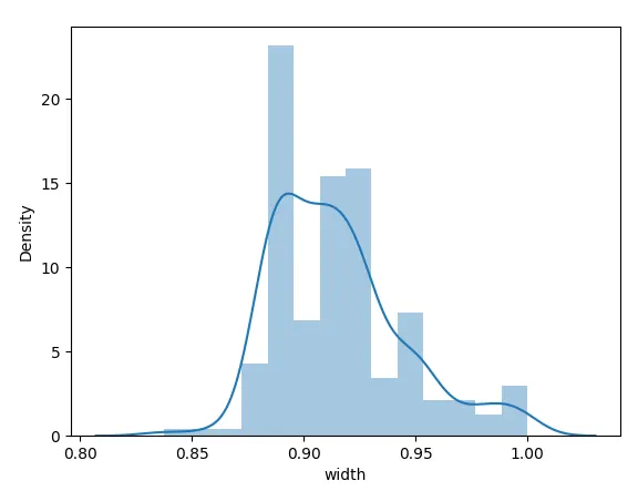
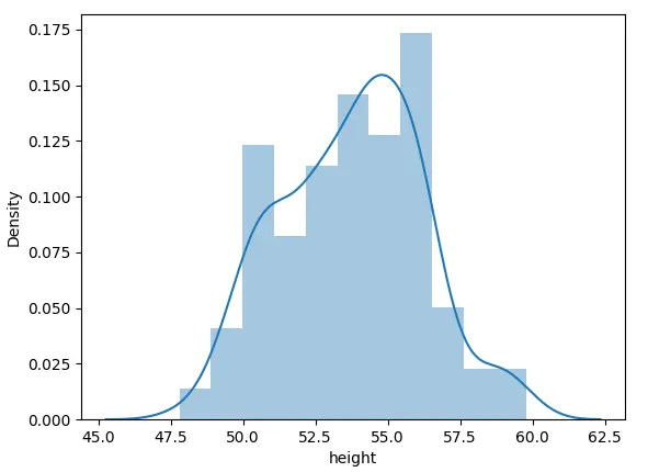
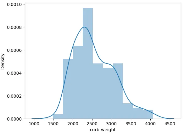
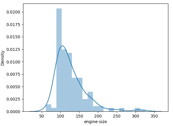
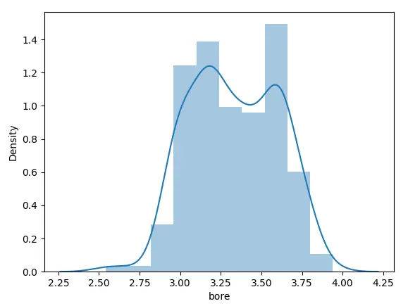
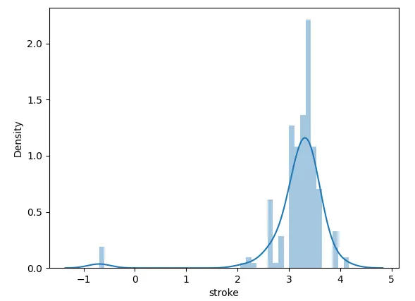
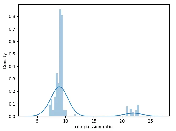
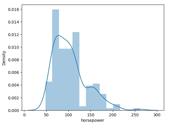
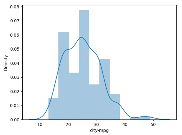
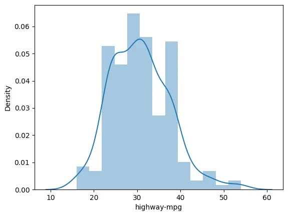
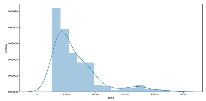
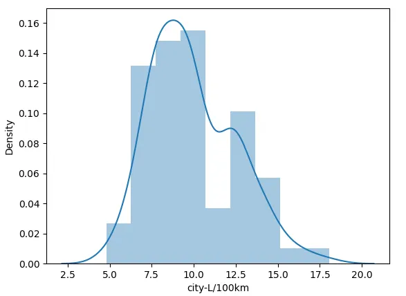
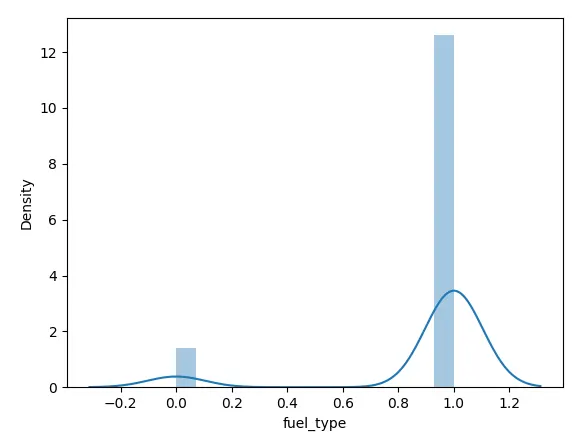
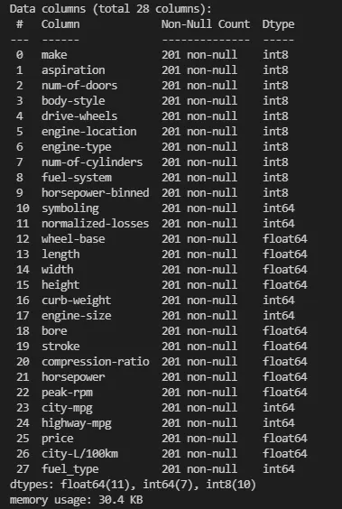
- View essential information of dataset using distplot and convert the categorical data into label encoded data. This has been achieved using a for loop which passes column names to convert them to label encoded data.
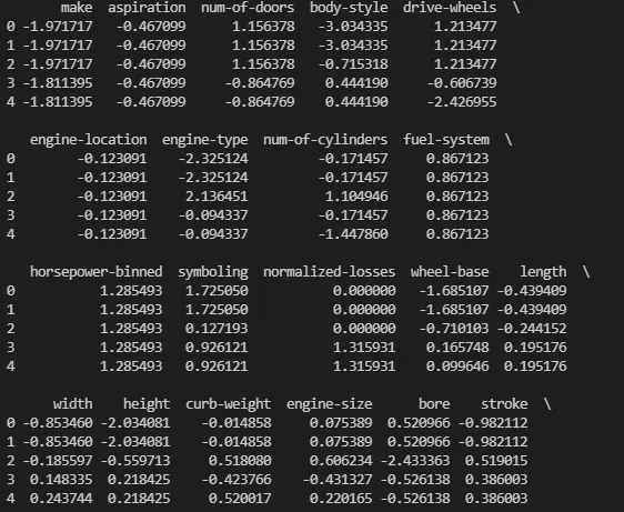
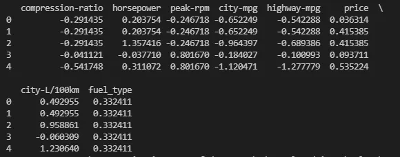
- The dataset is scaled to a particular value to avoid bias in the results.
- Correlation matrix is generated to view the most contributing factor which influences the price of the car.
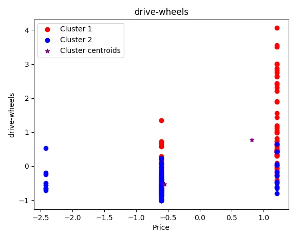
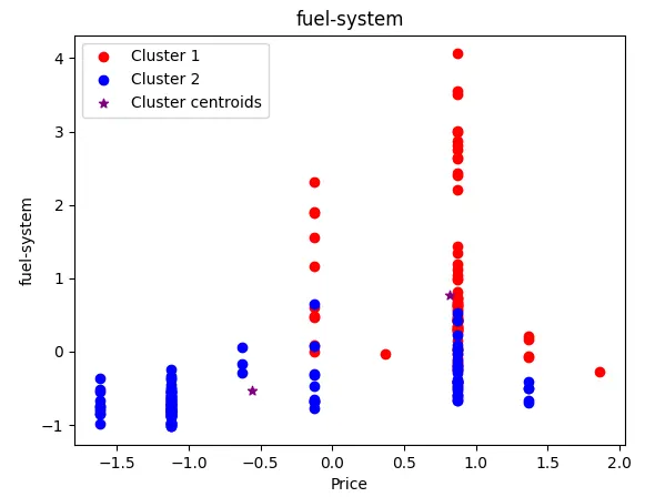
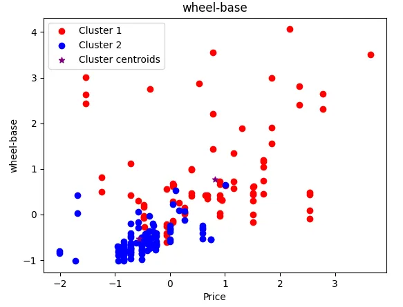
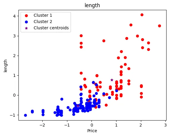
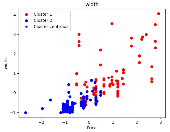
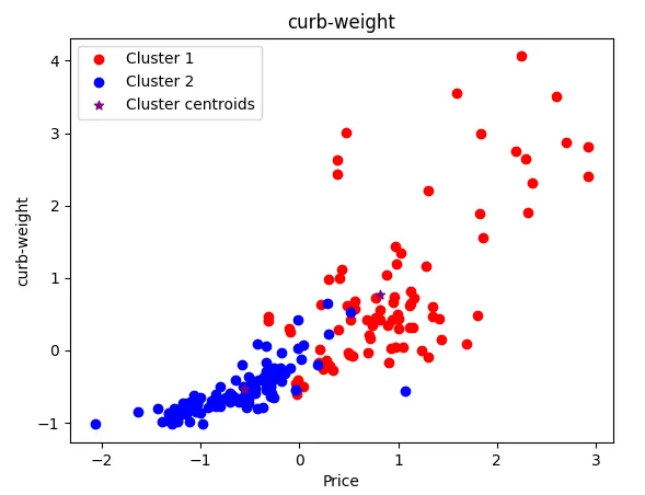
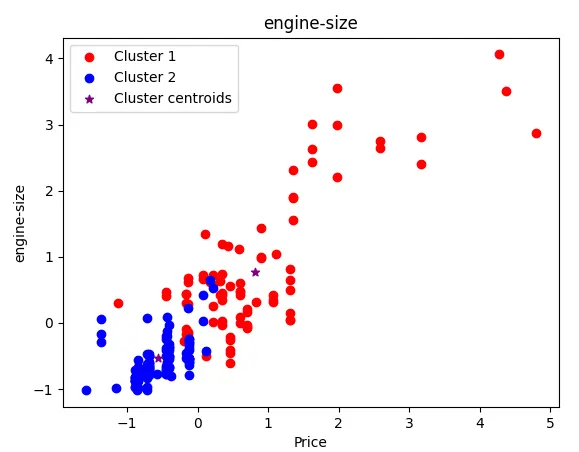
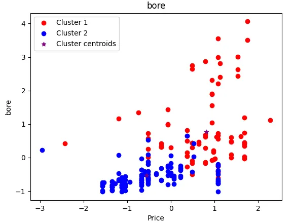
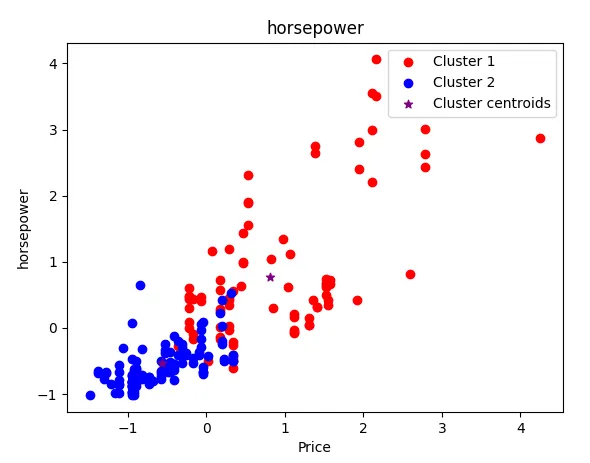
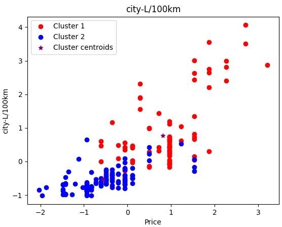
- Kmeans clustering is done to view the dataset as clusters in a scatter plot.
import numpy as np
import pandas as pd
import matplotlib.pyplot as plt
from sklearn.preprocessing import StandardScaler
from sklearn.cluster import KMeans
import seaborn as sn

data = pd.read_csv("Auto_clean.csv")
print(data.info())
print(data.count())
print(data.isnull().sum())
data['stroke'].fillna(value=np.random.randn(), inplace=True)
data['horsepower-binned'].fillna('Medium', inplace=True)
print(data.isnull().sum())
data.hist()
plt.show()

data['fuel_type']=0
#data['DefType']=''
#data Consolidation - Consolidating the target dummy variables into single variable
data.loc[data.diesel==1,'fuel_type'] = 0
data.loc[data.gas==1,'fuel_type'] = 1


data.drop(['diesel','gas'], axis=1, inplace=True)
print(data.describe())
print(data.head())
print(data['fuel_type'])

visual = data.select_dtypes(include=['int8','int64','float64']).copy()
print(visual)
for i in visual:
    sn.distplot(visual[i])
    plt.show()

obj_df = data.select_dtypes(include=['object']).copy()
pd.set_option('display.max_rows', None)
pd.set_option('display.max_columns', None)
print(obj_df)
# method two to convert categorical data into label encoded data
name=obj_df.columns
print(type(name))

for i in range(0, len(name)):
    print(i)
    obj_df[name[i]] = obj_df[name[i]].astype('category')
    obj_df[name[i]] = obj_df[name[i]].cat.codes
    #obj_df.drop([name[i]], axis='columns', inplace=True)
    i=i+1

print(type(obj_df))
print(obj_df)
pd.set_option('display.max_columns', None)
pd.set_option('display.max_rows', None)

df = data.select_dtypes(exclude=['object'])
print(df.info())
print(df.head())

frames = [obj_df, df]
result = pd.concat(frames, axis=1)
print(result.info())

stsc=StandardScaler()
result_std=stsc.fit_transform(result)
scaled_result = pd.DataFrame(result_std, index=result.index, columns=result.columns)
pd.set_option('display.max_columns', None)
print(scaled_result.head())
print(scaled_result.describe())

corr_matrix=scaled_result.corr()
top_corr_features=corr_matrix.index
plt.figure(figsize=(12,10))
sn.heatmap(scaled_result[top_corr_features].corr(), annot=True, cmap=plt.cm.CMRmap_r)
plt.show()

threshold=0.5
a=corr_matrix['price']
res=a[a>0.5]
print(res)
res_noprice=pd.DataFrame(res.drop(['price']))
print(res_noprice)
indexed=res_noprice.index
print(indexed)


new_dat=scaled_result.loc[:, indexed]
pd.set_option('display.max_columns', None)
print(new_dat)

k_range=range(1,15)
sse=[]
for k in k_range:
    km=KMeans(n_clusters=k)
    km.fit(new_dat)
    sse.append(km.inertia_)
print(sse)
plt.plot(k_range, sse, '-*')
plt.xlabel('K value')
plt.ylabel('SSE')
plt.grid(True)
plt.title('Elbow plot (To determine best K value)')
plt.show()

km=KMeans(n_clusters=2)
print(km)
y_new=km.fit_predict(new_dat)
new_dat["Cluster_scaled"]=y_new
print(new_dat.head())

frames = [new_dat, scaled_result['price']]
new_dat = pd.concat(frames, axis=1)
print(new_dat.head())

df0=new_dat[new_dat.Cluster_scaled==0]
df1=new_dat[new_dat.Cluster_scaled==1]
"""df2=new_dat[new_dat.Cluster_scaled==2]
df3=new_dat[new_dat.Cluster_scaled==3]
df4=new_dat[new_dat.Cluster_scaled==4]"""

colname=new_dat.columns
for i in range(0,len(colname)-2):

    plt.scatter(df0[colname[i]], df0["price"],color="red",label='Cluster 1')
    plt.scatter(df1[colname[i]], df1["price"],color="blue",label='Cluster 2')
    """plt.scatter(df2[colname[i]], df2["price"],color="yellow")
    plt.scatter(df3[colname[i]], df3["price"],color="black")
    plt.scatter(df4[colname[i]], df4["price"],color="green")"""
    plt.ylabel(colname[i])
    plt.xlabel('Price')

    plt.title(colname[i])
    plt.scatter(km.cluster_centers_[:,0],km.cluster_centers_[:,1],color="purple",marker="*",label='Cluster centroids')
    plt.legend()
    plt.show()
Plots and results:
Distplot:

Correlation matrix:
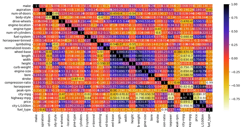
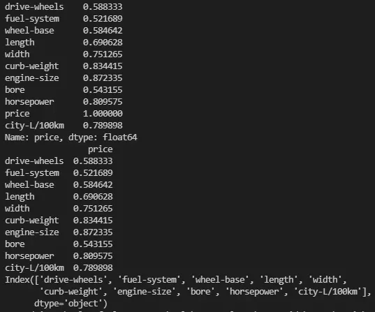
Above snipet shows the most contributing data column indexes which influence the price of the car.
Kmeans:
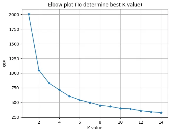
Ideal k value would be 4 or 5 but k=2 is chosen for simplicity in visualisation.
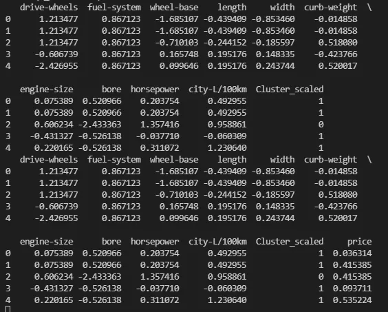
Feature Cluster Plots:
Reference:
https://medium.com/analytics-vidhya/feature-selection-techniques-2614b3b7efcd