EDA on cryptocurrency dataset
- Difference between decision tree and random forest
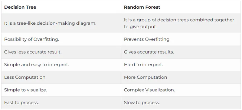
2. List down the advantages and dis-advantages of random forest
Decision tree:
Advantages
Simple and easy to understand.
Don’t need to do much computation.
Can handle both categorical and continuous data.
Easy visualization.
Provides a clear idea of what all features are important for classification.
Disadvantages
Prone to errors like overfitting, error due to bias and variance.
Less accurate predictions.
Random forest:
Advantages
Builds a robust model.
Does not suffer from overfitting problem.
Can use for both classification and regression problems.
Gives highly accurate predictions.
Powerful than other non-linear models.
Disadvantages
Time Consuming. Since it has multiple decision trees, therefore, is slow in generating predictions.
Complex to interpret.
3. What are the other parameters to assess the classifier (apart from parameters taught in the class)
Parameters to access the classfier:
Classification is a supervised learning approach in which a target variable is discrete (or categorical). Evaluating a machine learning model is as important as building it. We are creating models to perform on new, previously unseen data. Hence, a thorough and versatile evaluation is required to create a robust model. When it comes to classification models, evaluation process gets somewhat tricky.
In this post, I will try to provide a detailed guide on how to evaluate a classification model including a range of different metrics with their advantages and shortcomings.
The concepts I will cover:
- Classification accuracy
- Confusion matrix
- Precision and recall
- F1 score
- Sensitivity and specificity
- ROC curve and AUC
Classification accuracy:
Classification accuracy shows how many of the predictions are correct.

In some cases, it represents how good a model is but there are some cases in which accuracy is simply not enough. For example, 93% means that we correctly predicted 93 out of 100 samples. It seems acceptable without knowing the details of the task.
Assume we are creating a model to perform binary classification on a dataset with an unbalanced distribution class. 93% of data points are in class A and 7% in class B.
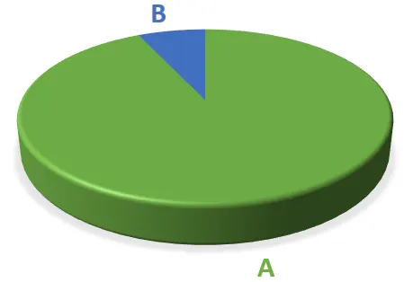
We have a model that only predicts class A. It is hard to even call it a “model” because it predicts class A without any calculation. However, since 93% of the samples are in class A, the accuracy of our model is 93%.
What if it is crucial to detect class B correctly and we cannot afford to misclassify any class B samples (i.e. cancer prediction)? In these cases, we need other metrics to evaluate our model.
Confusion Matrix:
A confusion matrix is not a metric to evaluate a model, but it provides insight into the predictions. It is important to learn confusion matrix in order to comprehend other classification metrics such as precision and recall.
Confusion matrix goes deeper than classification accuracy by showing the correct and incorrect (i.e. true or false) predictions on each class. In case of a binary classification task, a confusion matrix is a 2x2 matrix. If there are three different classes, it is a 3x3 matrix and so on.
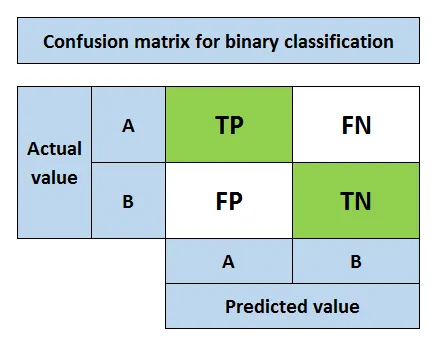
Let’s assume class A is positive class and class B is negative class. The key terms of confusion matrix are as follows:
- True positive (TP): Predicting positive class as positive (ok)
- False positive (FP): Predicting negative class as positive (not ok)
- False negative (FN): Predicting positive class as negative (not ok)
- True negative (TN): Predicting negative class as negative (ok)
Thumb rule:
Second word is what the model predicts.
First word indicates whether the prediction is correct.
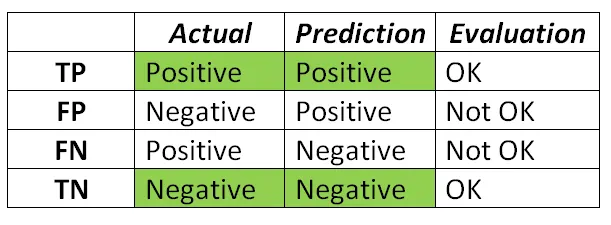
False positive is also knowns as type I error. False negative is also known as type II error.
Confusion matrix is used to calculate precision and recall.
Precision and Recall:
Precision and recall metrics take the classification accuracy one step further and allow us to get a more specific understanding of model evaluation. Which one to prefer depends on the task and what we aim to achieve.
Precision measures how good our model is when the prediction is positive.
The focus of precision is positive predictions. It indicates how many positive predictions are true.
Recall measures how good our model is at correctly predicting positive classes.|
The focus of recall is actual positive classes. It indicates how many of the positive classes the model is able to predict correctly.
We cannot try to maximize both precision and recall because there is a trade-off between them. Increasing precision decreases recall and vice versa. We can aim to maximize precision or recall depending on the task. For an email spam detection model, we try to maximize precision because we want to be correct when an email is detected as spam. We do not want to label a normal email as spam (i.e. false positive). On the other hand, for a tumor detection task, we need to maximize recall because we want to detect positive classes as much as possible.
There is another measure that combines precision and recall into a single number and that is F1 score.
F1 Score:
F1 score is the weighted average of precision and recall.
F1 score is a more useful measure than accuracy for problems with uneven class distribution because it takes into account both false positive and false negatives.
The best value for f1 score is 1 and the worst is 0.
Sensitivity and Specificity:
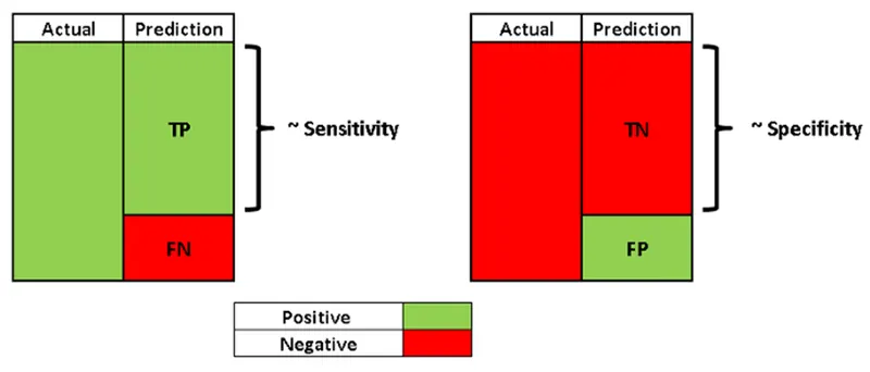
Sensitivity, also known as the true positive rate (TPR), is the same as recall. Hence, it measures the proportion of positive class that is correctly predicted as positive.
Specificity is similar to sensitivity but focused on negative class. It measures the proportion of negative class that is correctly predicted as negative.
ROC Curve and AUC:
ROC (receiver operating characteristics) curve and AOC (area under the curve) measures are best explained with a logistic regression example. If you want to go over a detailed explanation of logistic regression, you can visit this post:
Logistic regression gives the probability of a sample to be positive. Then we set a threshold value for this probability to distinguish positive and negative classes. If the probability is higher than the threshold value, the sample is classified as positive. Therefore, different threshold values result in some samples to be classified differently which in turn change precision and recall metrics.
ROC curve summarizes the performance of the model at different threshold values by combining confusion matrices at all threshold values. X axis of ROC curve is the true positive rate (sensitivity) and y axis of the ROC curve is the false positive rate (1- specificity).
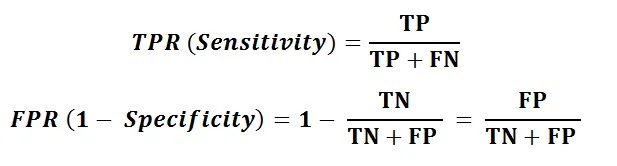
If the threshold is set to 0, the model predicts all samples as positive. In this case, TPR (sensitivity) is 1. However, FPR(1-specificity) is also 1 because there is no negative prediction. If the threshold is set to 1, both TPR and FPR become 0. Hence, it is not a good choice to set the threshold to 0 or 1.
We aim to increase the true positive rate (TPR) while keeping false positive rate (FPR) low. As we can see on the ROC curve, as TPR increases, FPR also increases. So it comes down to decide how many false positives we can tolerate.
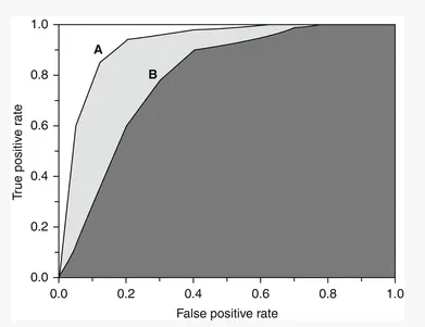
Instead of trying to find the optimum threshold value on ROC curve, we can use another metric called AUC (Area under the curve). AUC is the area under ROC curve between (0,0) and (1,1) which can be calculated using integral calculus. AUC basically aggregates the performance of the model at all threshold values. The best possible value of AUC is 1 which indicates a perfect classifier. The closer the AUC is to 1, the better the classifier is. In the figure below, classifier A is better than classifier B.
4. Perform EDA & all different classifier/regression for the case study and evaluate it based on the performance
Note: I have considered a different dataset apart from the one shown in the video session is because it was mentioned that I can use any datset to run an EDA in week7 video 1.
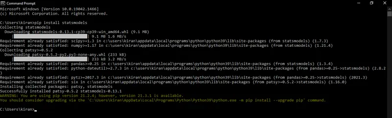
Libraries that were installed before running the program.
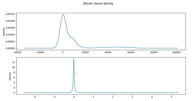
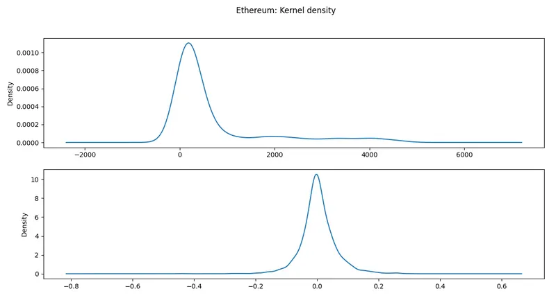
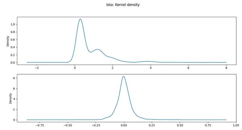
Kernel density:
KDE Plot described as Kernel Density Estimate is used for visualizing the Probability Density of a continuous variable. It depicts the probability density at different values in a continuous variable. We can also plot a single graph for multiple samples which helps in more efficient data visualization.
In this article, we will be using Iris Dataset and KDE Plot to visualize the insights of the dataset.
Exponential Smoothing:
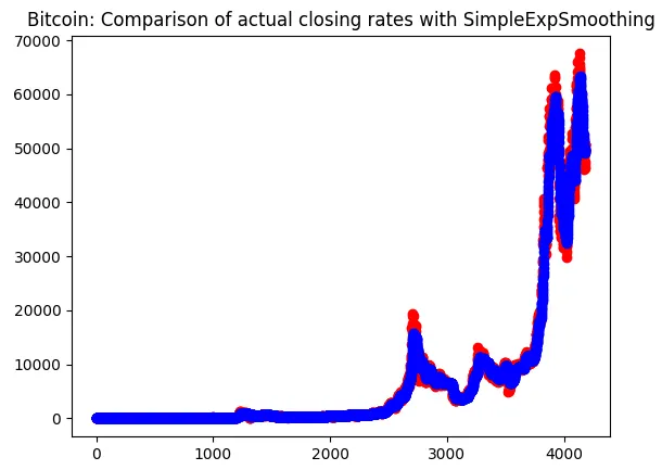
Exponential smoothing is a time series forecasting method for univariate data.
Time series methods like the Box-Jenkins ARIMA family of methods develop a model where the prediction is a weighted linear sum of recent past observations or lags.
Exponential smoothing forecasting methods are similar in that a prediction is a weighted sum of past observations, but the model explicitly uses an exponentially decreasing weight for past observations.
Specifically, past observations are weighted with a geometrically decreasing ratio.
Types of Exponential Smoothing
There are three main types of exponential smoothing time series forecasting methods.
A simple method that assumes no systematic structure, an extension that explicitly handles trends, and the most advanced approach that add support for seasonality.
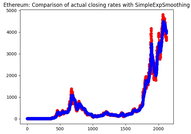
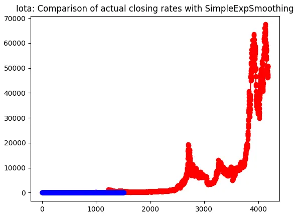
Single Exponential Smoothing:Single Exponential Smoothing or simple smoothing can be implemented in Python via the SimpleExpSmoothing Statsmodels class.
First, an instance of the SimpleExpSmoothing class must be instantiated and passed the training data. The fit() function is then called providing the fit configuration, specifically the alpha value called smoothing_level. If this is not provided or set to None, the model will automatically optimize the value.
This fit() function returns an instance of the HoltWintersResults class that contains the learned coefficients. The forecast() or the predict() function on the result object can be called to make a forecast.
# single exponential smoothing
Lag plot:
A lag plot is a special type of scatter plot with the two variables (X,Y) “lagged.”
A “lag” is a fixed amount of passing time; One set of observations in a time series is plotted (lagged) against a second, later set of data. The kth lag is the time period that happened “k” time points before time i. For example:
Lag1(Y2) = Y1 and Lag4(Y9) = Y5.
The most commonly used lag is 1, called a first-order lag plot.
Plots with a single plotted lag are the most common. However, it is possible to create a lag plot with multiple lags with separate groups (typically different colors) representing each lag.
Lag plots allow you to check for:
- Model suitability.
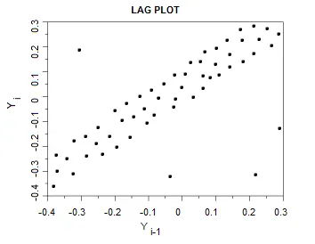
- Outliers (data points with extremely high or low values).
- Randomness (data without a pattern).
- Serial correlation (where error terms in a time series transfer from one period to another).
- Seasonality (periodic fluctuations in time series data that happens at regular periods).
1. Model suitability
The shape of the lag plot can provide clues about the underlying structure of your data.
For example:
A linear shape to the plot suggests that an autoregressive model is probably a better choice.
An elliptical plot suggests that the data comes from a single-cycle sinusoidal model.
2. Outliers
Outliers are easily discernible on a lag plot. The following plot shows four outliers:
3. Randomness
Creating a lag plot enables you to check for randomness. Random data will spread fairly evenly both horizontally and vertically. If you cannot see a pattern in the graph, your data is most probably random. On the other hand a shape or trend to the graph (like a linear pattern) indicates the data is not random.
The following graph shows a random pattern:
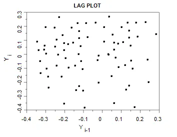
Random plots mean that there is no autocorrelation; if you know Yi you can’t begin to guess at what Yi-1 will be.
4. Serial Correlation / Autocorrelation
If your data shows a linear pattern, it suggests autocorrelation is present. A positive linear trend (i.e. going upwards from left to right) is suggestive of positive autocorrelation; a negative linear trend (going downwards from left to right) is suggestive of negative autocorrelation. The tighter the data is clustered around the diagonal, the more autocorrelation is present; perfectly autocorrelated data will cluster in a single diagonal line.
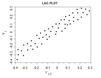
Lag plot suggestive of moderate positive autocorrelation.
5. Seasonality
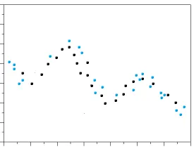
Data can be checked for seasonality by plotting observations for a greater number of periods (lags). Data with seasonality will repeat itself periodically in a sine or cosine-like wave.
DATASET OBTAINED FROM THE BELOW LINK:
Code:
import pandas as pd
import numpy as np
import matplotlib.pyplot as plt
import seaborn as sn
import scipy.stats as stats

bitcoin = pd.read_csv(r'E:ai mlaiml challengechallengesweek6datasettop 100 cryptoTop 100 Crypto Coinsbitcoin.csv')
ethereum = pd.read_csv(r'E:ai mlaiml challengechallengesweek6datasettop 100 cryptoTop 100 Crypto Coinsethereum.csv')
iota = pd.read_csv(r'E:ai mlaiml challengechallengesweek6datasettop 100 cryptoTop 100 Crypto CoinsIOTA.csv')

bitcoin.hist()
plt.show()
ethereum.hist()
plt.show()
iota.hist()
plt.show()

print('Bitcoin head command = ', bitcoin.head())
print('Ethereum head command = ',ethereum.head())
print('Iota head command = ',iota.head())

print('Bitcoin describe command = ',bitcoin.describe())
print('Ethereum describe command = ',ethereum.describe())
print('Iota describe command = ',iota.describe())

# for crypto's closing value description
print(bitcoin['Close'].describe())
print(ethereum['Close'].describe())
print(iota['Close'].describe())

# creating percentage change in the pricing of a crypto
bitcoin['Return'] = bitcoin['Close'].pct_change()
ethereum['Return'] = ethereum['Close'].pct_change()
iota['Return'] = iota['Close'].pct_change()

print(bitcoin.describe())
print(ethereum.describe())
print(iota.describe())

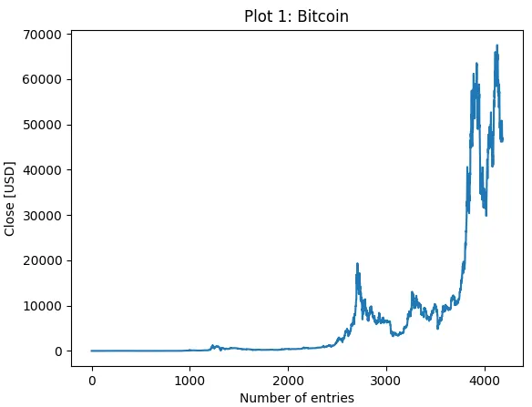
ax1 = bitcoin['Close'].plot(style=['-'])
plt.xlabel('Number of entries')
plt.ylabel('Close [USD]')
plt.title('Plot 1: Bitcoin')
plt.show()
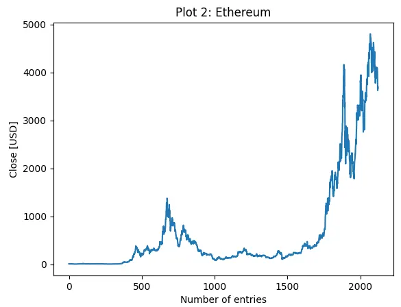
ax2 = ethereum['Close'].plot(style=['-'])
plt.xlabel('Number of entries')
plt.ylabel('Close [USD]')
plt.title('Plot 2: Ethereum')
plt.show()
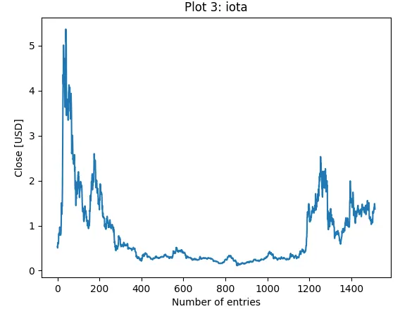
ax3 = iota['Close'].plot(style=['-'])
plt.xlabel('Number of entries')
plt.ylabel('Close [USD]')
plt.title('Plot 3: iota')
plt.show()

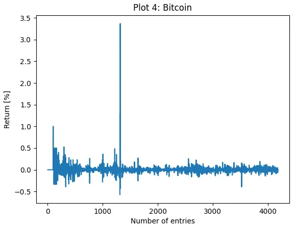
ax1 = bitcoin['Return'].plot(style=['-'])
plt.xlabel('Number of entries')
plt.ylabel('Return [%]')
plt.title('Plot 4: Bitcoin')
plt.show()
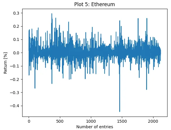
ax2 = ethereum['Return'].plot(style=['-'])
plt.xlabel('Number of entries')
plt.ylabel('Return [%]')
plt.title('Plot 5: Ethereum')
plt.show()
ax3 = iota['Return'].plot(style=['-'])
plt.xlabel('Number of entries')
plt.ylabel('Return [%]')
plt.title('Plot 6: Iota')
plt.show()

# to change style of plot
ax1 = bitcoin['Return'].plot(style='k.')
plt.xlabel('Number of entries')
plt.ylabel('Return [%]')
plt.title('Plot 7: (Bitcoin) Data in points')
plt.show()
ax2 = ethereum['Return'].plot(style='r.')
plt.xlabel('Number of entries')
plt.ylabel('Return [%]')
plt.title('Plot 8: (Ethereum) Data in points')
plt.show()
ax3 = iota['Return'].plot(style='g.')
plt.xlabel('Number of entries')
plt.ylabel('Return [%]')
plt.title('Plot 9: (iota) Data in points')
plt.show()

"""bitcoin['Close'].hist()
plt.title('Bitcoin close rate')
plt.show()
ethereum['Close'].hist()
plt.title('Ethereum close rate')
plt.show()
iota['Close'].hist()
plt.title('Iota close rate')
plt.show()"""

# kernel density is a form of smoothed histogram data
plt.subplot(2, 1, 1)
bitcoin['Close'].plot(kind = 'kde')
plt.subplot(2, 1, 2)
bitcoin['Return'].plot(kind = 'kde')
plt.suptitle('Bitcoin: Kernel density')
plt.show()

plt.subplot(2, 1, 1)
ethereum['Close'].plot(kind = 'kde')
plt.subplot(2, 1, 2)
ethereum['Return'].plot(kind = 'kde')
plt.suptitle('Ethereum: Kernel density')
plt.show()

plt.subplot(2, 1, 1)
iota['Close'].plot(kind = 'kde')
plt.subplot(2, 1, 2)
iota['Return'].plot(kind = 'kde')
plt.suptitle('Iota: Kernel density')
plt.show()

# exponential smoothing
from statsmodels.tsa.holtwinters import SimpleExpSmoothing
model_one = SimpleExpSmoothing(bitcoin['Close']).fit(smoothing_level=0.1, optimized = False)
bitcoin['Close'].plot(marker='o', color='red')
model_one.fittedvalues.plot(marker='o', color='blue')
plt.title('Bitcoin: Comparison of actual closing rates with SimpleExpSmoothing')
plt.show()
model_two = SimpleExpSmoothing(ethereum['Close']).fit(smoothing_level=0.1, optimized = False)
ethereum['Close'].plot(marker='o', color='red')
model_two.fittedvalues.plot(marker='o', color='blue')
plt.title('Ethereum: Comparison of actual closing rates with SimpleExpSmoothing')
plt.show()
model_three = SimpleExpSmoothing(iota['Close']).fit(smoothing_level=0.1, optimized = False)
bitcoin['Close'].plot(marker='o', color='red')
model_three.fittedvalues.plot(marker='o', color='blue')
plt.title('Iota: Comparison of actual closing rates with SimpleExpSmoothing')
plt.show()

from pandas.plotting import lag_plot
lag_plot(bitcoin['Close'])
plt.title('Bitcoin: Lag plot')
plt.show()
lag_plot(ethereum['Close'])
plt.title('Ethereum: Lag plot')
plt.show()
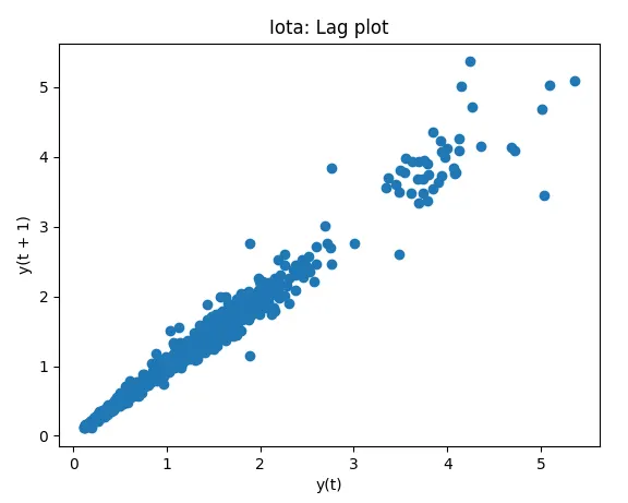
lag_plot(iota['Close'])
plt.title('Iota: Lag plot')
plt.show()

# Bitcoin price prediction
from sklearn.model_selection import train_test_split
X_bit = bitcoin[["Open", "High", "Low", "Volume"]]
Y_bit = bitcoin.Close
print(X_bit)
print(Y_bit)
X_train_bit, X_test_bit, Y_train_bit, Y_test_bit = train_test_split(X_bit, Y_bit, test_size=0.2, random_state=0) # splits data in ratios as test and training data
print(len(X_test_bit))
print(len(Y_train_bit))
print(X_test_bit)
print(Y_train_bit)

# Linear regression
from sklearn.linear_model import LinearRegression
Lr = LinearRegression()
reg = Lr.fit(X_train_bit, Y_train_bit)
print(reg)
print(reg.score(X_test_bit, Y_test_bit))

Y_predict =  Lr.predict(X_test_bit)
print(Y_predict)
print(Y_test_bit)
print(type(Y_test_bit))
print(Y_test_bit.shape)

df1 = pd.DataFrame(Y_test_bit).sort_index(axis = 0)
# assigning a variable & printing index values of Y_test_data
test_data_index = df1.index.values
index_dataframe = pd.DataFrame(test_data_index).sort_index(axis = 0)
print('index  = ', index_dataframe)
print('form of datatype  = ',type(index_dataframe))

df2 = pd.DataFrame(Y_predict, columns=['Predicted close'])
predicted = pd.DataFrame(df2)
predicted.sort_values(by=['Predicted close'], inplace=True)
print('df1 = ', df1)
print('predicted = ', predicted)

"""frames = [df1, predicted, index_dataframe]
result = pd.concat(frames)
print(result)
print(df1.isnull().sum())
print(df2.isnull().sum())"""

plt.scatter(index_dataframe, df1, s=5, zorder=2, label= 'Test data')
plt.scatter(index_dataframe, predicted, s=5, zorder=2, label= 'Predicted data')
plt.legend()
plt.title('Bitcoin: Linear regression prediction vs test data')
plt.xlabel('Index')
plt.ylabel('Close price [USD]')
plt.show()

# Confusion matrix
from sklearn.metrics import confusion_matrix
maxClose = bitcoin['Close'].max()
cutoff = maxClose/2                    # decide on a cutoff limit (cutoff value = half of the max close value)
y_pred_classes = np.zeros_like(df1)    # initialise a matrix full with zeros
y_pred_classes[df1 > cutoff] = 1       # add a 1 if the cutoff was breached
y_test_classes = np.zeros_like(predicted)
y_test_classes[predicted > cutoff] = 1

cm = confusion_matrix(y_test_classes, y_pred_classes)
print(cm)

import seaborn as sn
plt.figure(figsize=(10, 7))
sn.heatmap(cm, annot=True)
plt.xlabel("Predicted")
plt.ylabel("Actual")
plt.show()
Plots:
The below plots show the data in form of a histogram.
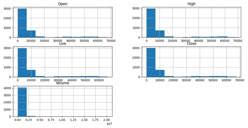
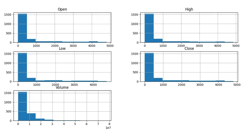
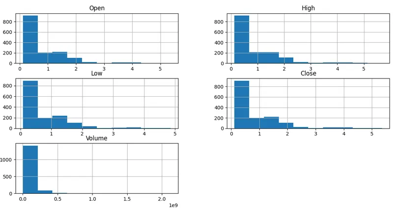
The closing prices of cyyptos are plotted in a graph to visualise the fluctuation in rates.
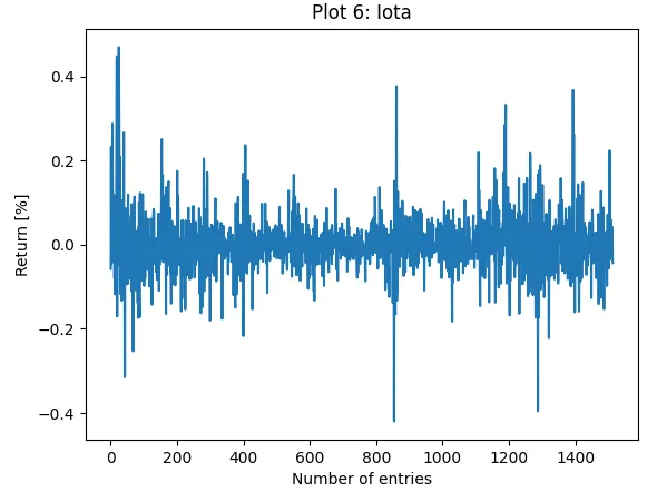
The percentage change for the closing rates are shown in the plots below.
The percentage change is plotted in form of points for better visualisation
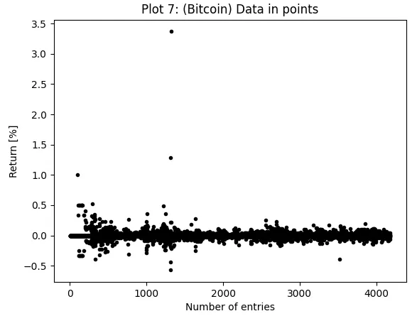
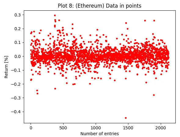
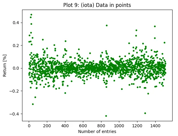
The below plots show the kernel densities of the Close and the return values one on top of the other.
The below plots show the comparison of actual rates with the 'SimpleExpSmoothing'.
The below plots show the 'Lag plots'.
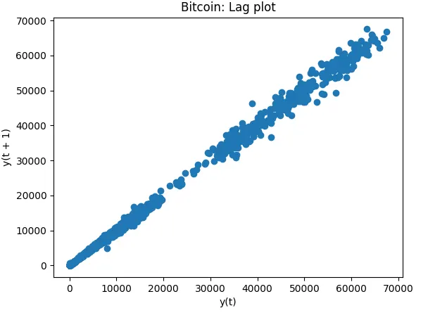
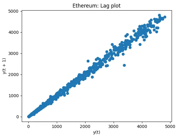
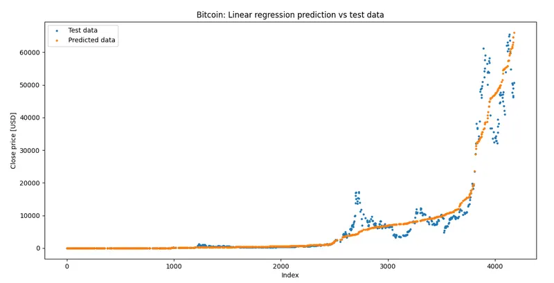
The bwlow plot shows the clear comparison of the data points of test dataset and the predicted datset, thos plot is restricted to only the bitcoin rates.
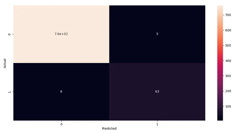
Confusion matrix for the accuracy for the predicted and the actual figures.
References:
To extract index values of test data:
https://towardsdatascience.com/pandas-index-explained-b131beaf6f7b
Confusion matrix:
https://datascience.stackexchange.com/questions/46019/continuous-variable-not-supported-in-confusion-matrix
To select the max value from a dataset:
https://www.geeksforgeeks.org/find-maximum-values-position-in-columns-and-rows-of-a-dataframe-in-pandas/