Week 5 - Curve fitting
Week 5 – Curve Fitting
- What does popt and pcov mean?

For Eg- def func1(t , a , b, c):
return a*pow(t,2)+b*t+c
popt - The curve_fit function is going to calculate the variables a, b, c values and store the values in popt. Hence, popt is going to be our coefficients.
pcov- It is the covariance matrix of the parameters and can be used to get an estimate of the errors on the parameter and the relation the parameters have to each other.
Eg - ([[ 1 , 2 , 3 ],
[ 4 , 5 , 6 ],
[ 7 , 8 , 9 ]])
Here 1, 5, 6 are related to the errors with a, b, c and the diagonal elements [2,3,5,6,7,8] tell us how the parameters are related
- What does np.array(temperature) do?
While we pass the temperature we pass it as a numpy array (np.array). The np.array converts the python list into a numpy array. Here an array of values are created which helps the program to select the particular temperature and calculate the specific heat values to obtain the result.
- What does the * in *popt mean?
A * in the program is a pointer which stores the values or the address of the variables in an array. Here in the program *popt stores in the integer values of the constants and gives them out as well.
- Write code to fit a linear and cubic polynomial for the Cp data. Explain if your results are good or bad.
for biquadratic polynomial
import numpy as np #used for scientific computing
import matplotlib.pyplot as plt #module used to plot graphs
from scipy.optimize import curve_fit #scipy module provides more utility functions for optimization
#using a four degree quadratic equation
def func(t,a,b,c,d,e): #defining the function
return a*pow(t,4)+b*pow(t,3)+c*pow(t,2)+d*t+e #amthematical model used to represent the data, i.e to represent the relation between temperature and specific heat
def read_file():
temperature=[] #empty array for temperature
spc_ht=[] #empty array for specific heat
for line in open('data','r'): #this loop states that we are opening a file called 'data' and reading the file line by line with he;lp of 'r' parameter which reffers to read mode
values = line.split(',') #splitting the line with a comma operator
temperature.append(float(values[0])) #atter splitting there are gonna be two values in the array. first value is temperature value obtained by [0]
spc_ht.append(float(values[1])) #second value is obtained by index [1]
return [temperature,spc_ht]
#main program
temperature , spc_ht = read_file() #reads the data file which contains specific heat of oxygen
popt, pcov = curve_fit(func, temperature, spc_ht) #using the curve_fit function in the scipy module which contains parameters of func(given mathamtical model), temperature and pecific heat values.here popt contains a,b,c,d variables and pcov is the covariance matrix
fit_spe_ht = func(np.array(temperature), *popt) #after having new coeffecients, the defined function is taken again and the numpy temperature array and *popt are passes. here *popt are the coeeficents a,b,c,d
plt.plot(temperature, spc_ht, color='blue',linewidth=3) #plotting temperature against soecific heat with a blue colour
plt.plot(temperature, fit_spe_ht, color='pink',linewidth=3) #plotting temperature against fit specific heat with a pink line
plt.legend(['actual data','curve fit']) #assigning the meaning of the various plot elements
plt.xlabel('temperature K') #labeling x axis as temperature
plt.ylabel('specific heat') #labeling y axis as speific heat
plt.show() #showing the final graph
Explanation of the result:
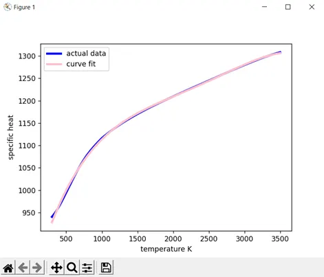
By the obtained result we can say that the results are good as the biquadratic polynomial fit is better than a linear fit or a cubic fit. As we increase the power of the polynomial simultaneously the fit gets better and better.
RESULT-
- What needs to be done in order to make the curve fit perfect?
As we increase the power of the polynomial simultaneously the fit gets better and better.
Fig 1 is a cubic polynomial and Fig 2 is a biquadratic polynomial and Fig 2 has a better curve fit
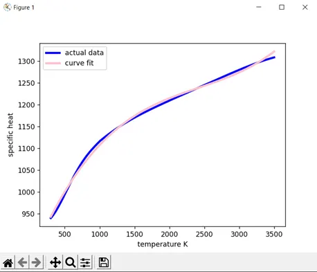
Fig 1 Fig 2
import numpy as np #used for scientific computing
import matplotlib.pyplot as plt #module used to plot graphs
from scipy.optimize import curve_fit #scipy module provides more utility functions for optimization


#using a four degree quadratic equation
def func(t,a,b,c,d,e): #defining the function
	return a*pow(t,3) + b*pow(t,2) + c*t + d #amthematical model used to represent the data, i.e to represent the relation between temperature and specific heat

def read_file():
	temperature=[] #empty array for temperature
	spc_ht=[] #empty array for specific heat
	for line in open('data','r'): #this loop states that we are opening a file called 'data' and reading the file line by line with he;lp of 'r' parameter which reffers to read mode
		values = line.split(',') #splitting the line with a comma operator
		temperature.append(float(values[0])) #atter splitting there are gonna be two values in the array. first value is temperature value obtained by [0]
		spc_ht.append(float(values[1])) #second value is obtained by index [1]
	return [temperature,spc_ht]

#main program
temperature , spc_ht = read_file() #reads the data file which contains specific heat of oxygen
popt, pcov = curve_fit(func, temperature, spc_ht) #using the curve_fit function in the scipy module which contains parameters of func(given mathamtical model), temperature and pecific heat values.here popt contains a,b,c,d variables and pcov is the covariance matrix
fit_spe_ht = func(np.array(temperature), *popt) #after having new coeffecients, the defined function is taken again and the numpy temperature array and *popt are passes. here *popt are the coeeficents a,b,c,d

plt.plot(temperature, spc_ht, color='blue',linewidth=3) #plotting temperature against soecific heat with a blue colour
plt.plot(temperature, fit_spe_ht, color='pink',linewidth=3) #plotting temperature against fit specific heat with a pink line
plt.legend(['actual data','curve fit']) #assigning the meaning of the various plot elements
plt.xlabel('temperature K') #labeling x axis as temperature
plt.ylabel('specific heat') #labeling y axis as speific heat
plt.show() #showing the final graph