Unsupervised Learning - Kmeans Week 11 Challenge
1. How does similarity is calculated if data is categorical in nature ?
ANS With categorical data there are two possibilities only: Either the two data points belong to the same category or they belong to two different categories. If they belong to the same category then the distance between them is considered to be 1. If they belong to two different categories the distance between them is considered to be 0. One thing that must be taken care of while dealing with datasets containing both categorical and numerical data is that, that the numerical data must be scaled using standard scaler or min-max scaler. This will help in a better comparison of numerical and categorical feature distances. Otherwise features having values of larger magnitude will get more weightage.
2. Implement K-means for “Car dataset” and come up with the business insights.
ANS
#K-MEANS CLUSTERING BY ANIL DUBEY - WEEK 11 ASSIGNMENT

#Importing necessary modules

import pandas as pd
import numpy as np
from sklearn.cluster import KMeans
import seaborn as sns
import matplotlib.pyplot as plt

#Importing the dataset.

fname = 'CarPrice_Assignment.csv'
df = pd.read_csv(fname)

print('General information about the dataset:')
print('')
df.info()
print('')
print('')

print(df.describe())
print('')
print('')

print('Data types of all the columns/features:')
print('')
data_types = df.dtypes
print(data_types)
print('')
print('')

print('Let us check the no of unique values in each column of object type:')
for column in df.columns:
  if data_types[column] == 'O':
    print('NO OF UNIQUE VALUES IN COLUMN:',column)
    print(df[column].unique())
    print()

print('Correlation matrix:')

plt.figure(1)
corr_matrix = df.corr()
sns.set(rc={'figure.figsize':(16,15)})
sns.heatmap(corr_matrix,center = 0,cbar = True, annot = True)
plt.title('Correlation Matrix')

'''
Let us find how various features correlate with each other.
The following code block considers those features to be highly correlated with each other,
which have an absolute value of the correlation coefficient greater than 0.7.
'''

line = 1

for col in corr_matrix.columns:

  start = np.where(corr_matrix.index.values==col)[0][0]

  for i in range(start+1,len(corr_matrix.index.values),1):

    if (abs(corr_matrix[col][i]) >= 0.7):

      if (corr_matrix[col][i] > 0):
        print(str(line) + '. ' + col +' increases with ' + corr_matrix.index[i] + ' or vice versa')
        print('')

      else:
        print(str(line) + '. ' + col +' decreases with ' + corr_matrix.index[i] + ' or vice versa')
        print('')

      line = line + 1

print('')
print('')
print('The above analysis shows that price has a strong correlation with carwidth, curbweight, engine size and horsepower.')
print('')
print('')
print('Let us find out the number of cars sold by each manufacturer:')

car_names = df['CarName']
models = []
for names in car_names:
  make = names.split(' ')
  models.append(make[0])

models = pd.DataFrame(models, columns = ['Model Name'])
models['Model Name'].unique()
count = models.groupby(['Model Name']).size()
print(count)
print('')
print('')

#Models with spelling mistakes need correction for proper count.

to_replace = ['Nissan','maxda','porcshce','toyouta','vokswagen','vw']
value = ['nissan','mazda','porsche','toyota','volkswagen','volkswagen']
models.replace(to_replace = to_replace, value = value, inplace = True)
models = pd.DataFrame(models, columns = ['Model Name'])
models['Model Name'].unique()
count = models.groupby(['Model Name']).size()
count.sort_values(ascending = False, inplace = True)
print(count)
print('')
print('')

#Let us obtain a bar chart for better understanding of the above data.
plt.figure(figsize = (30,5))
plt.bar(x = count.index.map(str.capitalize), height= count.values)
plt.xticks(rotation = 45)
plt.title('No of Cars sold by different manufacturers')
plt.ylabel('Number of cars sold')


#The above plot shows that people have preferred Toyota followed by Nissan and Mazda.
#Mercury is the manufacturer which has sold the least no of vehicles.

#Let us replace all the model names by their make for better analysis.

df['CarName'] = models['Model Name']
print('''
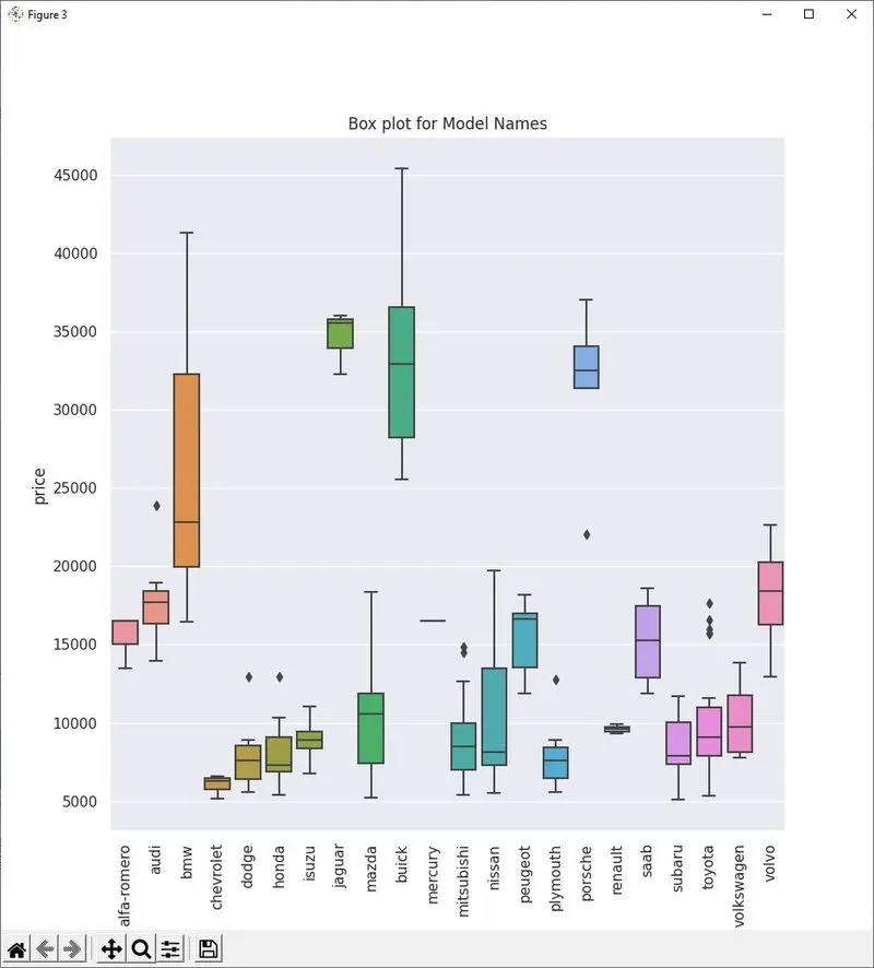
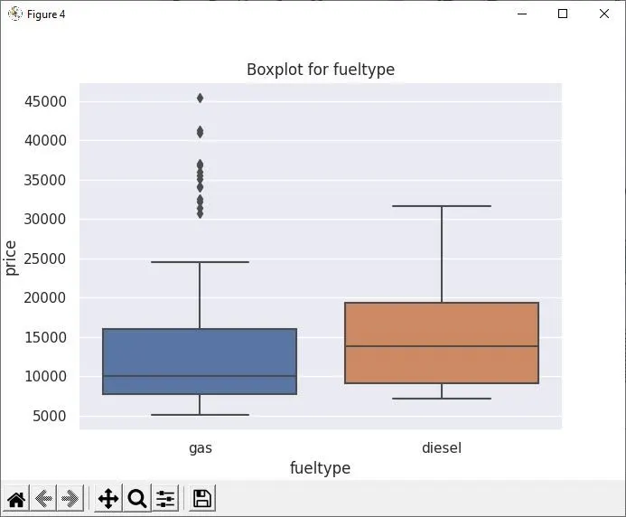
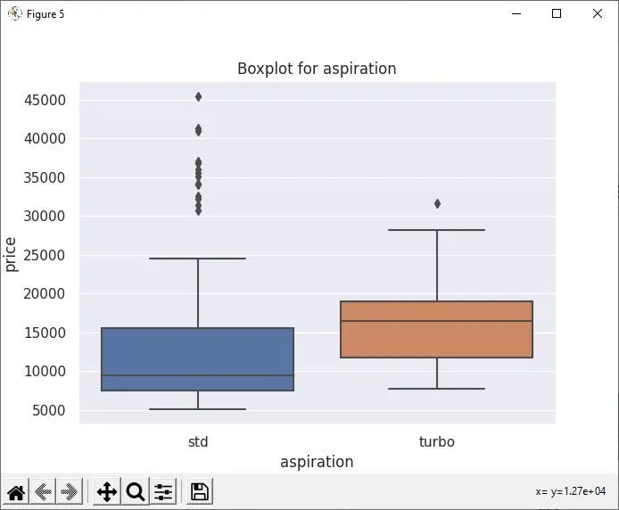
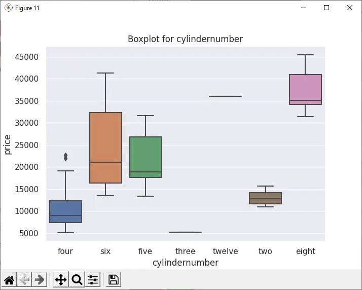
NOW LET US FIND OUT THE VARIATION OF PRICE WITH THE FOLLOWING CATEGORICAL VARIABLES:

NO OF UNIQUE VALUES IN COLUMN: fueltype ['gas' 'diesel']

NO OF UNIQUE VALUES IN COLUMN: aspiration ['std' 'turbo']

NO OF UNIQUE VALUES IN COLUMN: doornumber ['two' 'four']

NO OF UNIQUE VALUES IN COLUMN: carbody ['convertible' 'hatchback' 'sedan' 'wagon' 'hardtop']

NO OF UNIQUE VALUES IN COLUMN: drivewheel ['rwd' 'fwd' '4wd']

NO OF UNIQUE VALUES IN COLUMN: enginelocation ['front' 'rear']

NO OF UNIQUE VALUES IN COLUMN: enginetype ['dohc' 'ohcv' 'ohc' 'l' 'rotor' 'ohcf' 'dohcv']

NO OF UNIQUE VALUES IN COLUMN: cylindernumber ['four' 'six' 'five' 'three' 'twelve' 'two' 'eight']

NO OF UNIQUE VALUES IN COLUMN: fuelsystem ['mpfi' '2bbl' 'mfi' '1bbl' 'spfi' '4bbl' 'idi' 'spdi']

''')

plt.figure(figsize = (8,8))
sns.boxplot(x="CarName", y="price", data=df)
plt.xticks(rotation = 90)
plt.title('Box plot for Model Names')

for column in df.columns:
  if data_types[column] == 'O' and column != "CarName":
    t = 'Boxplot for {}'.format(column)
    plt.figure(figsize = (5,5))
    sns.boxplot(x = column, y = "price", data = df)
    plt.title(t)

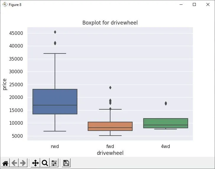
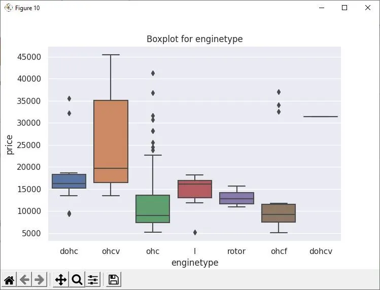
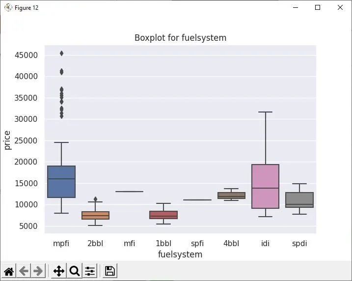
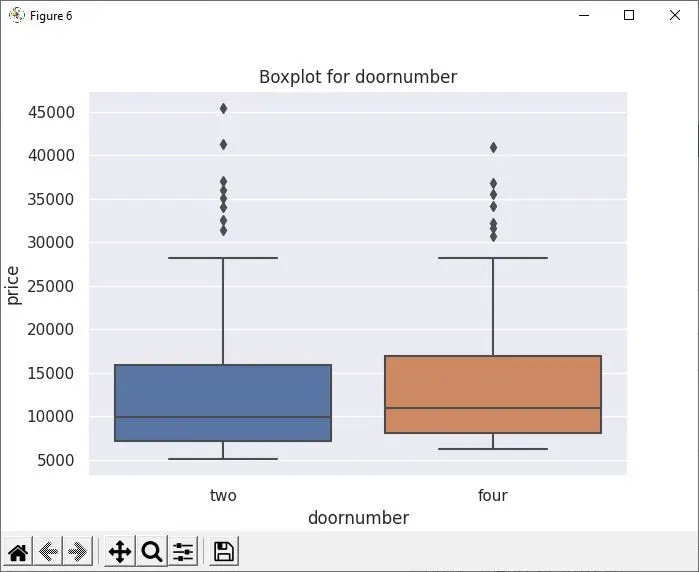
print('''From the above study we can observe that price varies considerably
      with engine location categorical variable, without any overlap. All other
      catogorical variables can not be used to predict the price as the price
      overlaps for all of them.
      ''')

#Now let us apply K-Means using the features identified above i.e. engine location, carwidth, curbweight, engine size and horsepower.

df_kmeans = pd.DataFrame()
df_kmeans =  df[["enginelocation","carwidth", "curbweight", "enginesize", "horsepower","price"]]

#Let us split the dataset into features (X) and target (Y) variables.

from sklearn.model_selection import train_test_split
X = df_kmeans.iloc[:,0:5]
Y = df_kmeans.iloc[:,5]

#As engine location is a categorical variable it neets One Hot Encoding(OHE).

OHE_df = pd.get_dummies(data = X, prefix = {'enginelocation':'el'}, sparse = False, dtype= np.int32)

#Scaling all the continuous features using Standard Scaler between -1 and 1 for applying K-Means

from sklearn.preprocessing import StandardScaler
scaler = StandardScaler()
scaler.fit(OHE_df.iloc[:,0:4])
scaled_X = pd.DataFrame(scaler.transform(OHE_df.iloc[:,0:4]),columns = OHE_df.columns[0:4])
scaled_X["el_front"] = OHE_df["el_front"]
scaled_X["el_rear"] = OHE_df["el_rear"]

print('Scaled X')
print(scaled_X)
print('')
print('')

#Split the dataset into train and test samples

from sklearn.model_selection import train_test_split
x_train, x_test, y_train, y_test = train_test_split(scaled_X,Y,test_size = 0.2, random_state = 2)

#K_Means using all the selected features.

from sklearn.cluster import KMeans
k_range = range(1,11)
sse = []
for k in k_range:
  km = KMeans(n_clusters = k)
  km.fit(scaled_X)
  sse.append(km.inertia_)

print('')
print('SSE for K-Means Clustering using all the features:')
print(sse)
plt.figure()
plt.title('Elbow curve for K-Means using all the features with different cluster size')
plt.plot(k_range,sse)

km = KMeans(n_clusters = 10)
km.fit(scaled_X)
Y_predict1 = km.fit_predict(scaled_X)
df['Cluster'] = Y_predict1

import matplotlib.colors as mcolors
import matplotlib as mpl
mpl.style.use('default')
clust_color = mcolors.CSS4_COLORS.keys()
clust_color = list(clust_color)
choose_color = [2,146,15,7,52,54,82,85,105,142,120,103,129,143,63]
chosen_color = []
for i in choose_color:
  chosen_color.append(clust_color[i])
row,col = df.shape

plt.figure()
plt.xlabel('Engine Size')
plt.ylabel('Price')
plt.title('Scatter plot for Price vs Engine Size')
for r in range(0,row):
  plt.scatter(df['enginesize'][r],df['price'][r],color = chosen_color[df['Cluster'][r]], alpha = 0.6)


#K_Means using engine size and engine location features.

k_range = range(1,11)
sse = []
for k in k_range:
  km = KMeans(n_clusters = k)
  km.fit(scaled_X.iloc[:,[2,4,5]])
  sse.append(km.inertia_)

print('')
print('SSE for K-Means Clustering using engine size and engine location features:')
print(sse)
plt.figure()
plt.title('Elbow curve for K-Means using engine size and engine location features')
plt.plot(k_range,sse)

km = KMeans(n_clusters = 10)
km.fit(scaled_X.iloc[:,[2,4,5]])
Y_predict2 = km.fit_predict(scaled_X.iloc[:,[2,4,5]])
df['Cluster'] = Y_predict2

import matplotlib.colors as mcolors
import matplotlib as mpl
mpl.style.use('default')
clust_color = mcolors.CSS4_COLORS.keys()
clust_color = list(clust_color)
choose_color = [2,146,15,7,52,54,82,85,105,142,120,103,129,143,63]
chosen_color = []
for i in choose_color:
  chosen_color.append(clust_color[i])
row,col = df.shape

plt.figure()
plt.xlabel('Engine Location')
plt.ylabel('Price')
plt.title('Scatter plot for Price vs Engile Location')
for r in range(0,row):
  plt.scatter(df['enginelocation'][r],df['price'][r],color = chosen_color[df['Cluster'][r]], alpha = 0.6)


#K-Means using car width, engine size and horsepower.

k_range = range(1,11)
sse = []
for k in k_range:
  km = KMeans(n_clusters = k)
  km.fit(scaled_X.iloc[:,[0,2,3]])
  sse.append(km.inertia_)

print('')
print('SSE for K-Means Clustering using Car Width, Engine Size and Horsepower:')
print(sse)
plt.figure()
plt.title('Elbow curve for K-Means using car width, engine size and horsepower features')
plt.plot(k_range,sse)

km = KMeans(n_clusters = 10)
km.fit(scaled_X.iloc[:,[0,2,3]])
Y_predict3 = km.fit_predict(scaled_X.iloc[:,[0,2,3]])
df['Cluster'] = Y_predict3

import matplotlib.colors as mcolors
import matplotlib as mpl
mpl.style.use('default')
clust_color = mcolors.CSS4_COLORS.keys()
clust_color = list(clust_color)
choose_color = [2,146,15,7,52,54,82,85,105,142,120,103,129,143,63]
chosen_color = []
for i in choose_color:
  chosen_color.append(clust_color[i])
row,col = df.shape

fig = plt.figure()
ax = fig.add_subplot(111,projection ="3d")
ax.set_xlabel('Car Width')
ax.set_ylabel('Engine Size')
ax.set_zlabel('Horse Power')
ax.set_title('Scatter plot for Car Width, Engine Size and Horse Power')
for r in range(0,row):
  ax.scatter(df["carwidth"][r], df["enginesize"][r], df["horsepower"][r], color = chosen_color[df['Cluster'][r]], alpha = 0.6)

#K-Means using only engine size and horsepower as features.

k_range = range(1,11)
sse = []
for k in k_range:
  km = KMeans(n_clusters = k)
  km.fit(scaled_X.iloc[:,[2,3]])
  sse.append(km.inertia_)
print('')
print('SSE for K-Means using engine size and horsepower features:')
print(sse)
plt.title('Elbow curve for K-Means using engine size and horsepower features')
plt.plot(k_range,sse)

km = KMeans(n_clusters = 10)
km.fit(scaled_X.iloc[:,[2,3]])
Y_predict4 = km.fit_predict(scaled_X.iloc[:,[2,3]])
df['Cluster'] = Y_predict4

import matplotlib.colors as mcolors
import matplotlib as mpl
mpl.style.use('default')
clust_color = mcolors.CSS4_COLORS.keys()
clust_color = list(clust_color)
choose_color = [2,146,15,7,52,54,82,85,105,142,120,103,129,143,63]
chosen_color = []

for i in choose_color:
  chosen_color.append(clust_color[i])

row,col = df.shape
plt.figure()
plt.xlabel('Engine Size')
plt.ylabel('Horsepower')
plt.title('Scatter plot for Horsepower vs Engine Size')
for r in range(0,row):
  plt.scatter(df['enginesize'][r],df['horsepower'][r],color = chosen_color[df['Cluster'][r]], alpha = 0.6)

#K-Means using curbweight and engine location as parameters.

k_range = range(1,11)
sse = []
for k in k_range:
  km = KMeans(n_clusters = k)
  km.fit(scaled_X.iloc[:,[1,4,5]])
  sse.append(km.inertia_)
print('')
print('SSE for K-Means using curbweight and enginelocation features:')
print(sse)
plt.figure()
plt.title('Elbow curve for K-Means using curbweight and enginelocation features:')
plt.plot(k_range,sse)

km = KMeans(n_clusters = 10)
km.fit(scaled_X.iloc[:,[1,4,5]])
Y_predict5 = km.fit_predict(scaled_X.iloc[:,[1,4,5]])
df['Cluster'] = Y_predict5

import matplotlib.colors as mcolors
import matplotlib as mpl
mpl.style.use('default')
clust_color = mcolors.CSS4_COLORS.keys()
clust_color = list(clust_color)
choose_color = [2,146,15,7,52,54,82,85,105,142,120,103,129,143,63]
chosen_color = []

for i in choose_color:
  chosen_color.append(clust_color[i])
row,col = df.shape

plt.figure()
plt.xlabel('Curb Weight')
plt.ylabel('Engine Location')
plt.title('Scatter plot for Engine Location vs Curb Weight')
for r in range(0,row):
  plt.scatter(df['curbweight'][r],df['enginelocation'][r],color = chosen_color[df['Cluster'][r]], alpha = 0.6)

plt.show()
Kindly ignore the warning shown for the maximum number of figures if you are running the above code snippet. Its better to run the .ipynb file attached with the answer to evaluate the performance of the code written.
The major conclusions or insights from the study carried out above are as follows:
1. There are a total of 205 instances in the data set provided with 23 features and one target (Price). No null values were found.(The data set is also attached with this answer.)
2. There are a total of 10 categorical features and the rest are numerical. The numerical features which are highly correlated with each other (data having a correlation coeff. of more than 0.7 in absolute value were assumed to be highly correlated) are as follows:
1. wheelbase increases with carlength or vice versa
2. wheelbase increases with carwidth or vice versa
3. wheelbase increases with curbweight or vice versa
4. carlength increases with carwidth or vice versa
5. carlength increases with curbweight or vice versa
6. carlength decreases with highwaympg or vice versa
7. carwidth increases with curbweight or vice versa
8. carwidth increases with enginesize or vice versa
9. carwidth increases with price or vice versa
10. curbweight increases with enginesize or vice versa
11. curbweight increases with horsepower or vice versa
12. curbweight decreases with citympg or vice versa
13. curbweight decreases with highwaympg or vice versa
14. curbweight increases with price or vice versa
15. enginesize increases with horsepower or vice versa
16. enginesize increases with price or vice versa
17. horsepower decreases with citympg or vice versa
18. horsepower decreases with highwaympg or vice versa
19. horsepower increases with price or vice versa
20. citympg increases with highwaympg or vice versa
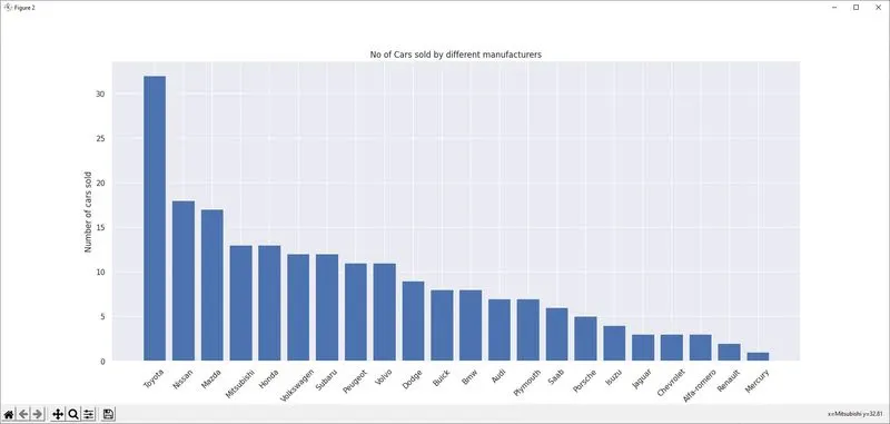
3. Toyota has sold the highest no of vehicles whereas Mercury has sold the least no of vehicles as visible in the figure below.
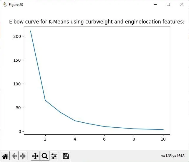
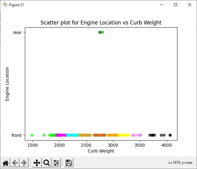
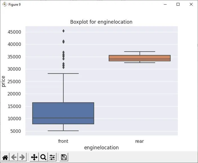
4. Among the categorical variables, all the features have a lot of overlap in the price of the vehicles for different values. Only engine location is the categorical variable that can be used to predict the price because the price for vehicles with different locations of engines has a very small overlap.
5. Based on the above finding carwidth, curbweight, engine size, horsepower and engine location features were selected for K_means clustering analysis. The best performance was shown by curbweight and engine location features resulting in 10 well-segregated clusters. The scatter plot with elbow curve is presented below: