Project - Data Handling and Interpolation
Interpolation theory:
As early as 1987, when developing intermediate versions of an existing typeface during an internship, I realized that the optically correct in-between weights are on a hollow curve that produces values which are lower than those on the straight line of the “average values”. In other words: if the verticals of the Regular weight have a value of 40 units and those of the Bold weight 70, then the SemiBold verticals should not be 55 units wide but slightly less, in order to give the optical impression of being exactly “in the middle”.
My tests resulted in a formula and a graph that precisely define the optimum value for any possible intermediate weight.
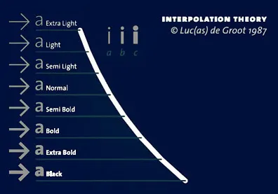
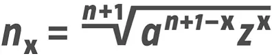
Anisotropic Topology-dependent Interpolation Theory :
The 1987 Interpolation Theory has its limitations. It is one-dimensional. Yet the world has more dimensions; it is the same with type. On Earth the options for moving vertically are rather limited, while one can walk endlessly when moving forward or backward. Type behaves similarly. Therefore, the fine-tuning of the Interpolation Theory led to an anisotropic version, i.e.: a system that works differently in the x and in the y directions. In this case it means that the stroke weights grow slower on the vertical axis than on the horizontal one.
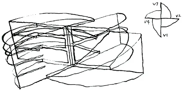
Limited growth :
In order to explore this phenomenon I made two proof weights: an extremely bold one and a very light one. Now what happens if what interpolates between these extremes? It turns out that at a certain point the horizontals cannot get any thicker, because then the letter will disappear. However, there’s much more leeway in the vertical strokes. Here, too, the optically optimum proportions cannot be calculated by simple interpolation. When the proportion between verticals and horizontals is 1:1 in the light typeface and 3:1 in the bold one, it is not self-evident that in the intermediate weight, 2:1 is the proportion that looks best. Here, too, linear interpolation won’t do for calculating the in-between values. A slightly lower contrast will work better.
Topology of single letters :
Moreover, the possibilities for growth of the horizontals depends on the topology of the single letters: when there is only one horizontal stroke, as in “L”, it has more room to expand than strokes that must share the same vertical space with 1, 2 or 3 other strokes. Each of these four topologies needs its own interpolation curve. Therefore, the new version of the Interpolation Formula is not only anisotropic, but also topology-dependent.
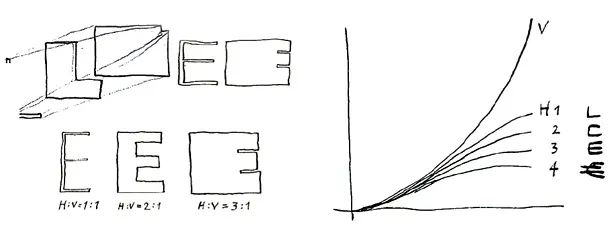
When a letter has only one horizontal stroke (“L”), that stroke can expand almost up to the glyph’s full height in increasing weights. With two strokes (“F” or “C”), less than half the height is available for each stroke, etc. One of the most difficult glyphs in this respect is the Euro sign, as it is among the few glyphs in which four horizontal strokes must share the vertical space available.
The interpolation theory in use :
I will now describe seven more or less complicated real-life cases, with the numbers that I as designer need to see, as inspiration.
Weight Example 1 :
In the following example, there are three masters: Hair 34, Regular and UltraBlack. The table shows the thickness of the vertical n-strokes and the interpolation perthousands going twice from 0–1000, corresponding to the axis going from 0–1000. So in this case there was no mapping curve in the FontLab 5 file, instead I used the percentages to get a good-looking interpolation range. (Yes I use intermediate masters in FontLab 5, the first axis goes from Hair 34 to Regular, Regular exists twice, the second axis goes from Regular to UltraBlack.)
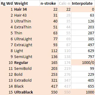
I think the gray values are calculated according to the formula, for the whole range, but since the weights had to be compatible with an earlier version of the font, I had to adjust the curve.
To do that I always set out the values in Adobe Illustrator and use a Bezier curve to make it look nice and smooth. Of course it would be awesome to get that functionality in FontLab, to start with a Bezier curve that represents my interpolation formula, with the possibility to edit the graph like any Bezier curve, and even insert extra points, like in the following screenshot from Illustrator:
Weight Example 2 :
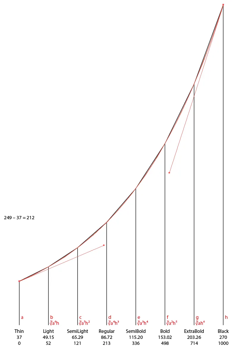
The red line is the Bezier curve going exactly through the positions that are calculated according to my formula, depicted at the bottom in red. Below the weight names are the (unrounded) stroke weights of the “n”, and below that, the per-thousands values on the axis. If I feel the need to modify the curve, e.g. to make the Regular a bit darker, I would play with the red Bezier curve, adjust the heights of the vertical black lines accordingly to find the stem weights, and then calculate the new interpolation perthousands.
Weight Example 3 :
Some curve adjustment is often necessary, as I will illustrate with the following even more complex graph. This Taz example is from a huge weight range with two intermediate masters.
In this table, the intermediate masters are not shown. They do not correspond to any of the known instances. The first intermediate master is somewhere around ExtraLight, the second intermediate master is close to SemiBold. And that is fine, because all I want to know are the desired stem weights, so that I can find the correct interpolation values.
Because the UltraBlack in the three widths is unlikely to have the same color, and the hairline with four font units cannot have the same color in the three widths by definition (the extended Hairline has less lines per centimeter so it appears much lighter than the condensed hairline), I needed to adjust the curves quite a bit to make sure the Regular weights in the three widths would fit together. That was decided by making prints and discuss it with several trained eyes. I have also made a Font Density Calculator to help with these decisions. One can also say the curves are different because I wanted to keep the same amount of weights for all three widths, even though they have different scopes and densities. The basic principle of the formula is still in all curves.
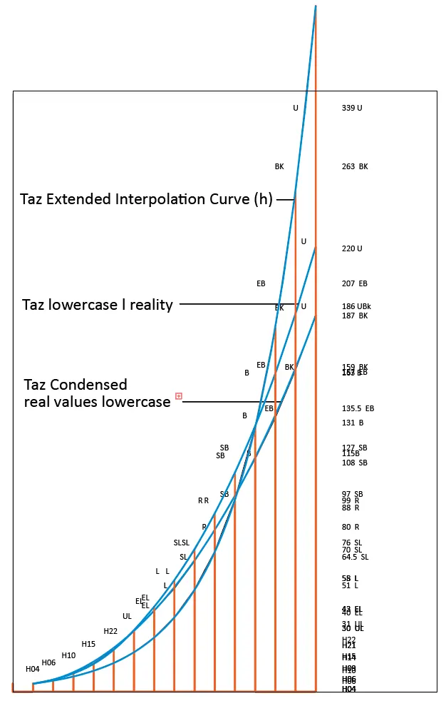
In variable fonts we cannot have different weight interpolation curves for different positions on the width axis, which is disappointing, but we found a workaround:
Weight Example 4 :
According to my interpolation formula, the curves for ExtraCondensed and ExtraExtended of the Calibri Variable would have to be different from the curve of the Regular width:
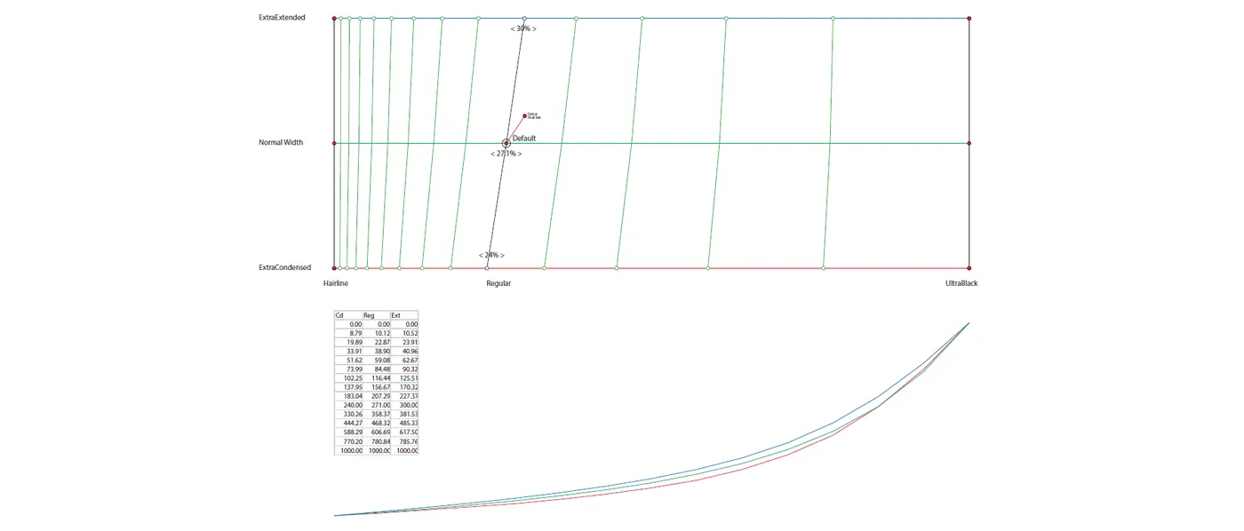
But that is not possible, so we simply interpolated new intermediate Masters for Condensed and Extended so they would all be at 27.1% of the whole range, and thus did not correspond anymore to the actual Condensed Regular and Extended Regular. But that is hidden from the user, and that the curves are slightly different from the actual formula is impossible to notice.
Project :
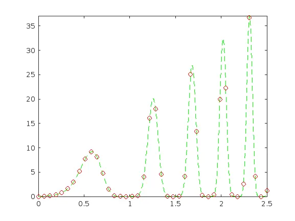
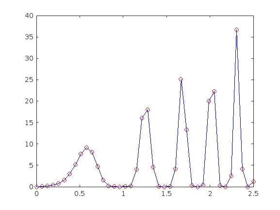
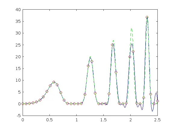
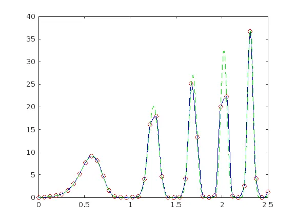
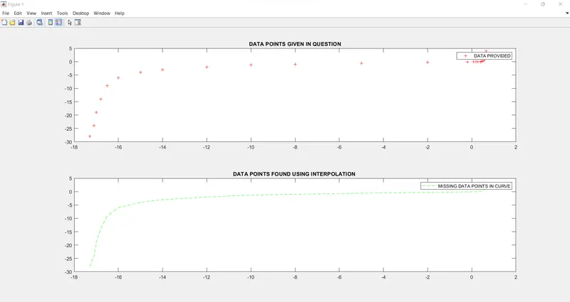
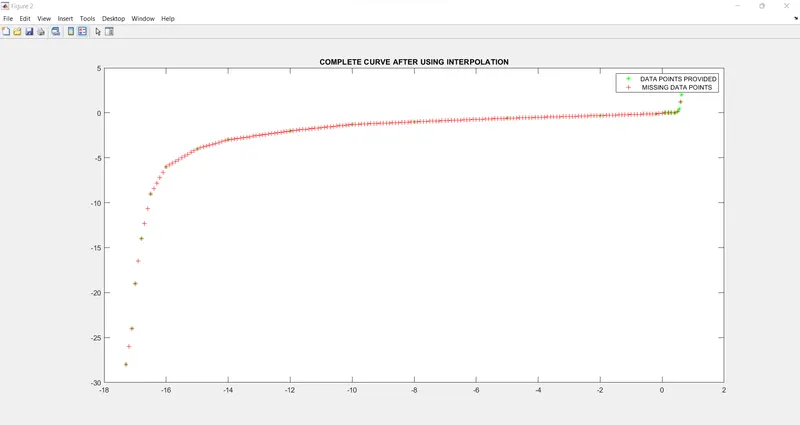
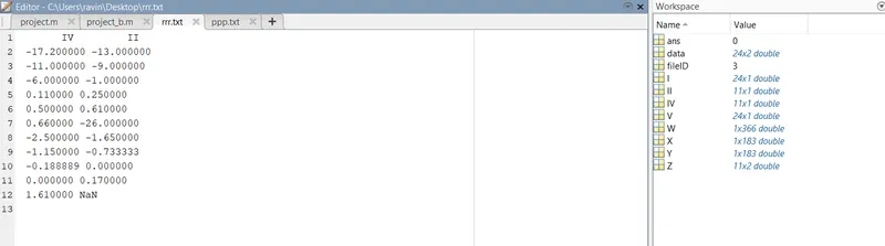
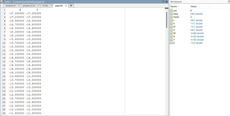
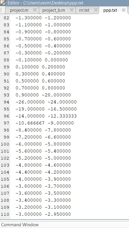
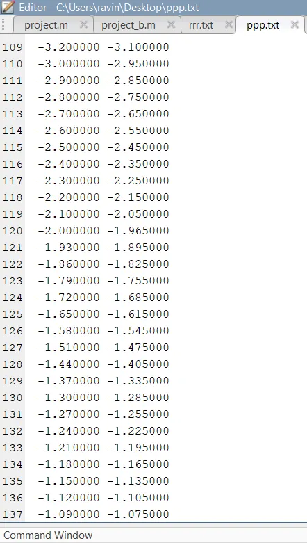
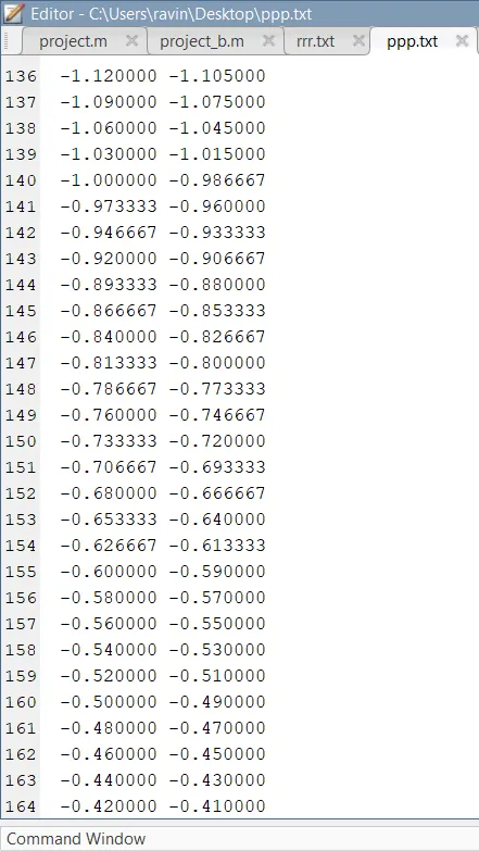
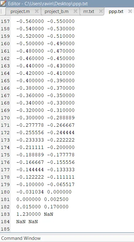
In a laboratory experiment, data of voltage and current has been recorded and the same is attached in an excel file.Read the excel file in the Matlab program and perform the interpolation in the range of -17.3:0.1:0.9. Generate the interactive plot for the interpolated data and store them in a text file.?
Ans:
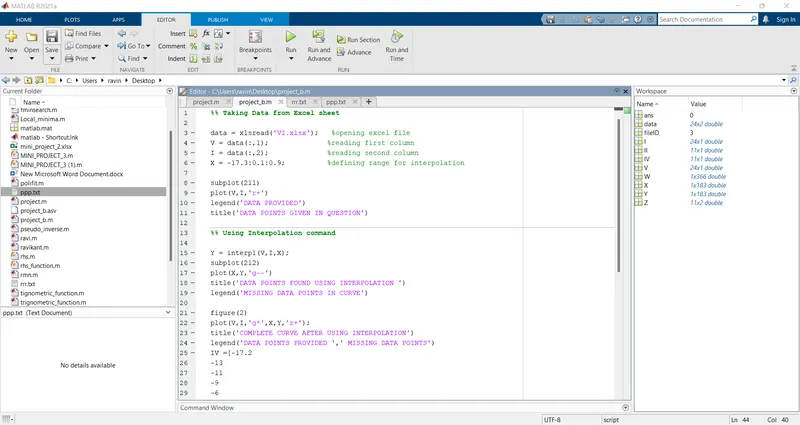
%% Taking Data from Excel sheet
data = xlsread('VI.xlsx'); %opening excel file
V = data(:,1); %reading first column
I = data(:,2); %reading second column
X = -17.3:0.1:0.9; %defining range for interpolation
subplot(211)
plot(V,I,'r+')
legend('DATA PROVIDED')
title('DATA POINTS GIVEN IN QUESTION')
%% Using Interpolation command
Y = interp1(V,I,X);
subplot(212)
plot(X,Y,'g--')
title('DATA POINTS FOUND USING INTERPOLATION ')
legend('MISSING DATA POINTS IN CURVE')
figure(2)
plot(V,I,'g*',X,Y,'r+');
title('COMPLETE CURVE AFTER USING INTERPOLATION')
legend('DATA POINTS PROVIDED ',' MISSING DATA POINTS')
IV =[-17.2
-13
-11
-9
-6
-1
0.11
0.25
0.5
0.61
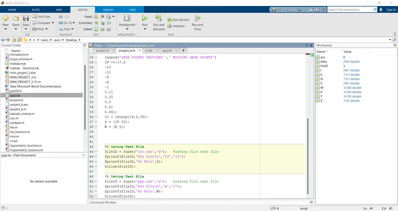
0.66];
II = interp1(V,I,IV);
Z = [IV II];
W = [X Y];
%% Saving Text File
fileID = fopen('rrr.txt','w'); %saving file text file
fprintf(fileID,'%8s %10s\n','IV','II');
fprintf(fileID,'%f %f\n',Z);
fclose(fileID);
%% Saving Text File
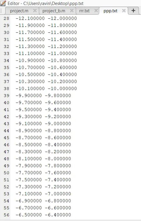
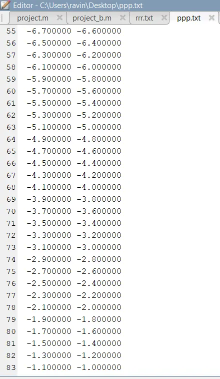
fileID = fopen('ppp.txt','w'); %saving file text file
fprintf(fileID,'%8s %10s\n','X','Y');
fprintf(fileID,'%f %f\n',W);
fclose(fileID);
Interpolation and Extrapolation :
The primary differences can be noted between interpolation and extrapolation are given in the below table.
| Interpolation | Extrapolation |
| It is the method of using our function to predict the value of the dependent variable for an independent variable that lies within the data set. | It is the method of using our function to predict the value of the dependent variable for an independent variable that lies outside the range of our data. |
| This works within the given data set. | This works beyond the given data set. |
Help users to determine what data might exist outside of their collected data.
Similarly, for scientists, engineers, photographers and mathematicians to fit the data for analysing the trend and so on.