Project 2
During the descriptive analytics of the automobile dataset as a part of the previous assignment, it was found that the categorical variable "enginelocation" and continuous variables "carwidth", "curbweight", "enginesize", "horsepower", "citympg" and "highwaympg" may be used for predicting the price of the vehicles.
Utilising the descriptive analytics performed previously, continuous variables "carwidth", "curbweight", "enginesize" and "horsepower" have been chosen for predicting the class of the vehicle through clustering analysis of the dataset.
Three clustering algorithms have been applied to the dataset: K-Means clustering, Mean-Shift clustering and Hierarchical Clustering. The clustering was attempted to classify the dataset into classes based on the price of the vehicle i.e. Cheap Vehicles, Medium Cost Vehicles and Expensive Vehicles or just into two classes of Cheap and Expensive Vehicles. Any more clusters were observed to be having too much overlapping prices, thus negating the purpose of price-based clustering of the dataset.
Let us see in brief how each of the above-mentioned algorithms work.
K-MEANS
This is one of the most commonly used clustering algorithms. In this algorithm, we must specify the number of clusters we want. Datapoints equal to the number of clusters are randomly selected from the dataset. These selected points act as the centroid for each cluster. The distance of each datapoint from each centroid is calculated. The data point closest to a given centroid is assigned to that centroid (cluster). After each data point is assigned to a cluster, new centroids are computed by taking the mean of each feature of all the data points which belong to the same cluster. This process continues till the centroids stop changing.
MEAN-SHIFT
K-Means assumes the clusters to be spherical and we also need to specify the number of clusters we want. The mean shift algorithm is non-parametric because we need not specify the number of clusters previously. Rather the algorithm itself determines the no of clusters (called as high-density regions) based on a parameter called as "bandwidth" of a "weighing function". A great explanation of the "mean" and "shift" in mean shift is provided in [1]. It is very important to estimate the bandwidth parameter properly. If the bandwidth used is too large, then the local mean point will be the same as the global mean point i.e. we will have just one cluster. If the bandwidth is too small, then we will have many unnecessary clusters. To obtain the "bandwidth" parameter of the weighing function in mean-shift we have used the estimate_bandwidth function.
HIERARCHICAL CLUSTERING
Hierarchical clustering forms clusters by successively merging datapoints into clusters (Agglomerative clustering) or successively dividing the dataset considered as a single cluster into a number of clusters (Divisive Clustering). We have used agglomeration clustering from sklearn here. In this approach, each datapoint is considered a single cluster. So there are N clusters initally. The two closest datapoints are merged to form N-1 clusters. Then 2 closest clusters are taken and merged to form N-2 clusters. The various algorithms to calculate distance between two clusters are: Single Linkage, Complete Linkage, Average Linkage, Ward's Method and Centroid Linkage. One may refer [2] to know more on linkages and Agglomerative Clustering.
We also need to evaluate whether the clusters obtained are good enough.Three evaluation metrics used in the present study for evaluation of the clustering methods used are Silhouette Score, Davies Bouldin Score and Calinski Harabasz Score.
Solouhette Score: It is a way to measure, how close each point in a cluster is to the points in its neighbouring clusters. It ranges from -1 to +1 where a high value indicates that the object (a single data point) is well matched to its own cluster and poorly matched to its neighbouring clusters. If most of the data points have a high value then the clustering configuration is appropriate. If many points have a low or negative value then the configuration may have too few or too many clusters.
Davies Bouldin Score: It is base on the ratio of within cluster to between cluster distances. Zero is the lowest possible value and the values closer to zero indicate a better partition.
Calinski Harabasz Score: It is also called as Variance Ratio Criteria. It is defined as the ratio of the sum of the inter-cluster dispersion to the sum of the intra-cluster dispersion for all the clusters. The dispersion is nothing but um of the sqaured distances. A higher score implies better clustering since it would imply thet the observations within a cluster are closer to each other whereas the clusters are well seperated.
One may refer [3] to know more about evaluation of clustering obtained by different algorithms.
The code written in IDLE is attached below with necessary comments wherever required (Kindly substitute the file path 'fname' by the path in your PC.):
import pandas as pd
import numpy as np
import matplotlib.pyplot as plt
import seaborn as sns

fname = r"C:\Users\Desktop\CarPrice_Assignment.csv"

df = pd.read_csv(fname)

#Selecting the quantitative features showing a high correlation with the
#'price' for clustering as per exploratory data analysis in assignment 11
df_cluster = df[["carwidth", "curbweight", "enginesize", "horsepower","price"]]

#Scaling the features using standard scaler
from sklearn.preprocessing import StandardScaler
scaler = StandardScaler()
scaler.fit(df_cluster)
df_scaled = pd.DataFrame(data = scaler.transform(df_cluster), columns = df_cluster.columns)

#==========================K-MEANS CLUSTERING====================================
print('K-MEANS CLUSTERING EVALUATION:')
#Plotting the elbow curve
from sklearn.cluster import KMeans
k_range = range(1,11)
sse = []
for k in k_range:
  km = KMeans(n_clusters = k)
  km.fit(df_scaled.iloc[:,0:4])
  sse.append(km.inertia_)

print('SSE for different cluster no:')
print(sse)
plt.figure(1)
plt.plot(k_range,sse)
plt.title('Elbow curve')
plt.xlabel('No of clusters')
plt.ylabel('SSE')

'''
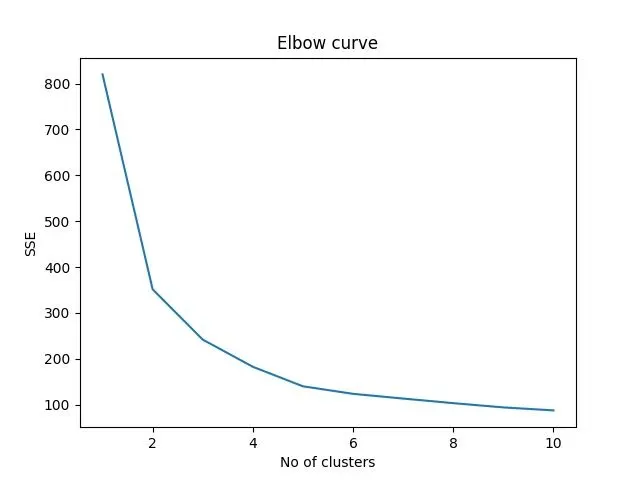
As we would like 2 clusters such as Low and High or
3 clusters of price such as Low, Medium and High but not more than that,
we would attempt to obtain best division (without much overlap in box plot)
into 2 or 3 clusters
'''

#Prediction using 3 clusters
km = KMeans(n_clusters = 3)
km.fit(df_scaled.iloc[:,0:4])
Y_predict = km.fit_predict(df_scaled.iloc[:,0:3])
df_scaled['Cluster'] = Y_predict

#Colour map for diverse choice of colours for each cluster number
import matplotlib.colors as mcolors
import matplotlib as mpl
mpl.style.use('default')
clust_color = mcolors.CSS4_COLORS.keys()
clust_color = list(clust_color)
choose_color = [2,146,15,7,52,54,82,85,105,142,120,103,129,143,63]
chosen_color = []
for i in choose_color:
  chosen_color.append(clust_color[i])
row,col = df_scaled.shape

#Scatter plot for the clusters
plt.figure(2)
ax = plt.axes(projection ="3d")
c1 = df_cluster.columns[0]
c2 = df_cluster.columns[1]
c3 = df_cluster.columns[2]
ax.set_xlabel(c1)
ax.set_ylabel(c2)
ax.set_zlabel(c3)
plt.title('Scatter plot for K-Means')
for r in range(0,row):
  ax.scatter3D(df_scaled[c1][r], df_scaled[c2][r], df_scaled[c3][r], color = chosen_color[df_scaled['Cluster'][r]], alpha = 0.6)

centers = km.cluster_centers_
n_cluster_km = km.n_clusters

for c in range(n_cluster_km):
  ax.scatter3D(centers[c,0], centers[c,1], centers[c,2], color = 'r', marker = '*')


#Clustering metrics
from sklearn import metrics

ss_km = metrics.silhouette_score(df_scaled.iloc[:,0:3], Y_predict, metric='euclidean')
chs_km = metrics.calinski_harabasz_score(df_scaled.iloc[:,0:3], Y_predict)
dbs_km = metrics.davies_bouldin_score(df_scaled.iloc[:,0:3], Y_predict)

print('Silhoutte Score for kmeans:',ss_km)
print('Calinski Harabasz Score for kmeans:',chs_km)
print('Davies Bouldin Score for kmeans:',dbs_km)
print(' ')

#Evaluating the clustering performance wrt price using Box Plot
final_df = df.copy()
final_df['Cluster'] = Y_predict
plt.figure(3)
plt.title('Price clusters: K-Means')
sns.boxplot(x = 'Cluster', y = "price", data = final_df)

plt.show()

#==========================MEAN-SHIFT CLUSTERING==========================
print('MEAN SHIFT CLUSTERING EVALUATION')
from sklearn.cluster import MeanShift, estimate_bandwidth

X = df_scaled.iloc[:,0:4]

quant = np.arange(0.1,0.9,0.1)
band = []


#Estimating the bandwith parameter for mean shift using estimate_bandwidth function
for i in range(len(quant)):
  bandwidth = estimate_bandwidth(X, quantile = quant[i])
  band.append(bandwidth)


n_clusters_ms = []
ms_result = pd.DataFrame(columns = ['Quantile','Estimated Bandwidth','Clusters'])


for i in range(len(quant)):
  ms = MeanShift(bandwidth = band[i], bin_seeding=True)
  ms.fit(X)
  labels = ms.labels_
  centers = ms.cluster_centers_
  labels_unique = np.unique(labels)
  n_clusters_ms.append(len(labels_unique))
  ms_result.loc[i] = [quant[i],band[i],n_clusters_ms[i]]


print('Estimating the quantile for mean-shift:')
print(ms_result)
print(' ')

#Mean shift clustering
bandwidth = estimate_bandwidth(X, quantile = 0.6)
ms = MeanShift(bandwidth = bandwidth, bin_seeding=True)
ms.fit(X)
labels = ms.labels_
centers = ms.cluster_centers_
labels_unique = np.unique(labels)
n_cluster_ms = len(labels_unique)
print("Estimated bandwidth: {0:.5f}".format(bandwidth))
print("Number of estimated clusters : %d" % n_cluster_ms)

#Estimating the clustering metrics
ss_ms = metrics.silhouette_score(X, labels, metric = 'euclidean')
chs_ms = metrics.calinski_harabasz_score(X, labels)
dbs_ms = metrics.davies_bouldin_score(X, labels)

print('Silhoutte Score for Mean Shift:',ss_ms)
print('Calinski Harabasz Score for Mean Shift:',chs_ms)
print('Davies Bouldin Score for Mean Shift:',dbs_ms)
print(' ')

df_scaled['Cluster'] = labels

#Scatter plot for mean shift
plt.figure(4)
ax = plt.axes(projection ="3d")
c1 = df_cluster.columns[0]
c2 = df_cluster.columns[1]
c3 = df_cluster.columns[2]
ax.set_xlabel(c1)
ax.set_ylabel(c2)
ax.set_zlabel(c3)
plt.title('Scatter plot for Mean-Shift')
for r in range(0,row):
  ax.scatter3D(df_scaled[c1][r], df_scaled[c2][r], df_scaled[c3][r], color = chosen_color[df_scaled['Cluster'][r]], alpha = 0.6)

for c in range(n_cluster_ms):
  ax.scatter3D(centers[c,0], centers[c,1], centers[c,2], color = 'r', marker = '*')

#Box plot for clustering evaluation
final_df = df.copy()
final_df['Cluster'] = labels
plt.figure(5)
sns.boxplot(x = 'Cluster', y = "price", data = final_df)
plt.title('Price clusters: Mean-Shift')
plt.show()

#=============================HIERARCHICAL CLUSTERING==============================
print('HIERARCHICAL CLUSTERING EVALUATION:')
from sklearn.cluster import AgglomerativeClustering
from scipy.cluster.hierarchy import dendrogram

#Estimating the distance threshold hyperparameter's value for obtaining 3 or 2 clusters
df_hc = pd.DataFrame(columns = ['Distance_threshold','Silhoutte','Calinski_Harabasz','DBScore','n_Cluster'])
dist = [0.1,0.5,1,2,3,4,5,6,7,8,9,10,11,12]

for num, d in enumerate(dist):
  clustering = AgglomerativeClustering(n_clusters = None, distance_threshold = d ,compute_full_tree = True, compute_distances = True).fit(X)
  labels = clustering.labels_
  n_cluster_hc = len(np.unique(labels))
  ss_hc = metrics.silhouette_score(X, labels, metric = 'euclidean')
  chs_hc = metrics.calinski_harabasz_score(X, labels)
  dbs_hc = metrics.davies_bouldin_score(X, labels)
  df_hc.loc[num] = [d,ss_hc,chs_hc,dbs_hc,n_cluster_hc]

print(df_hc)
print(' ')

clustering = AgglomerativeClustering(n_clusters = None, distance_threshold = 12.0, compute_full_tree = True, compute_distances = True).fit(X)
labels = clustering.labels_

#Function below is available in matplotlib examples for plotting dendrogram
def plot_dendrogram(model, **kwargs):
    # Create linkage matrix and then plot the dendrogram

    # create the counts of samples under each node
    counts = np.zeros(model.children_.shape[0])
    n_samples = len(model.labels_)
    for i, merge in enumerate(model.children_):
        current_count = 0
        for child_idx in merge:
            if child_idx < n_samples:
                current_count += 1  # leaf node
            else:
                current_count += counts[child_idx - n_samples]
        counts[i] = current_count

    linkage_matrix = np.column_stack([model.children_, model.distances_, counts]).astype(float)

    # Plot the corresponding dendrogram
    dendrogram(linkage_matrix, **kwargs)

#Plotting the Dendogram for Hierarchical clustering
plt.figure(6)
plt.title("Hierarchical Clustering Dendrogram")
plot_dendrogram(clustering, truncate_mode="level", p=3)
plt.xlabel("Number of points in node (or index of point if no parenthesis).")

labels_unique = np.unique(clustering.labels_)
center = pd.DataFrame(columns = X.columns)
n_cluster_hc = len(labels_unique)
df_scaled['Cluster'] = clustering.labels_

for k in range(n_cluster_hc):
  dfc = df_scaled.where(df_scaled['Cluster'] == k, axis = 0)
  dfc.dropna(inplace = True)
  dfc.drop(columns = df_scaled.columns[4:], inplace = True)
  cen = dfc.apply(np.mean, axis = 0, raw = True).values
  center.loc[k] = cen

#Scatter plot for Hierarchical Clustering
plt.figure(7)
ax = plt.axes(projection ="3d")
c1 = df_cluster.columns[0]
c2 = df_cluster.columns[1]
c3 = df_cluster.columns[2]
ax.set_xlabel(c1)
ax.set_ylabel(c2)
ax.set_zlabel(c3)
plt.title('Scatter plot for Hierarchical Clustering')

r,c = X.shape

for r in range(0,row):
  ax.scatter3D(df_scaled[c1][r], df_scaled[c2][r], df_scaled[c3][r], color = chosen_color[df_scaled['Cluster'][r]], alpha = 0.6)

for k in range(n_cluster_hc):
  ax.scatter3D(center.iloc[k,0], center.iloc[k,1], center.iloc[k,2], color = 'r', marker = '*',alpha = 1.0)

#Evaluating the Hierarchical clustering using box plot
final_df = df.copy()
final_df['Cluster'] = clustering.labels_
plt.figure(8)
sns.boxplot(x = 'Cluster', y = "price", data = final_df)
plt.title('Price Clusters: Hierarchical Clustering')
plt.show()

#Evaluating the clustering metrics
ss_hc = metrics.silhouette_score(X, labels, metric = 'euclidean')
chs_hc = metrics.calinski_harabasz_score(X, labels)
dbs_hc = metrics.davies_bouldin_score(X, labels)

print('Silhoutte Score for Hierarchical Clustering:',ss_hc)
print('Calinski Harabasz Score for Hierarchical Clustering:',chs_hc)
print('Davies Bouldin Score for Hierarchical Clustering:',dbs_hc)

print(' ')
print('RESULT SUMMARY:')
df_result = pd.DataFrame(index = ['silhouette_score', 'calinski_harabasz', 'DBScore','no_cluster'], columns = ['KM','MS','HC'])
df_result.loc['silhouette_score'] = [ss_km, ss_ms, ss_hc]
df_result.loc['calinski_harabasz'] = [chs_km, chs_ms, chs_hc]
df_result.loc['DBScore'] = [dbs_km, dbs_ms, dbs_hc]
df_result.loc['no_cluster'] = [n_cluster_km, n_cluster_ms, n_cluster_hc]
n_cluster_hc
print(df_result)
The output produced by the above code is as follows:
Screenshot:
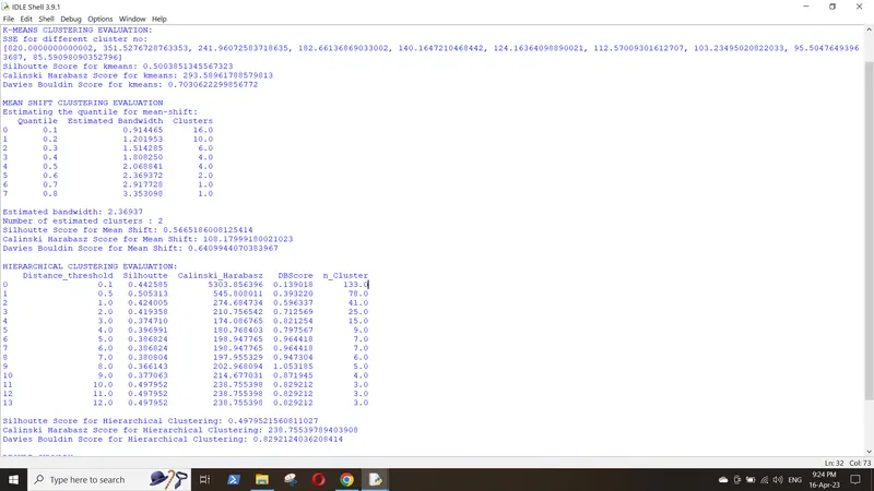
The final scores for each algorithm is given in the table below:
K-Means Mean-Shift Hierarchical
silhouette_score 0.50 0.57 0.49
calinski_harabasz 293.59 108.18 238.76
DBScore 0.70 0.64 0.83
no_cluster 3 2 3
Elbow curve for K-Means:
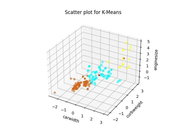
Scatter Plot for K-Means (The red stars indicate cluster centres):
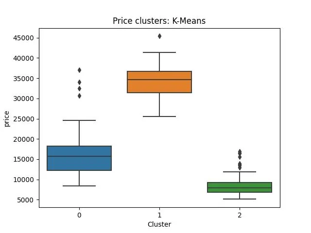
Box plot showing price clusters identified by K-Means Clustering (High Medium and Low price vehicles):
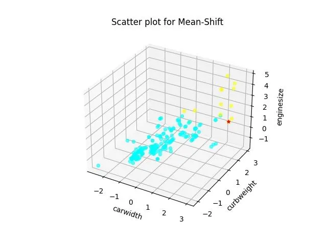
Scatter Plot for Mean-Shift:
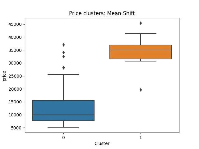
Box plot showing price clusters determined by mean-shift:
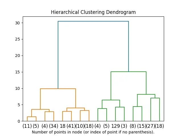
Dendrogram for Hierarchical Clustering:
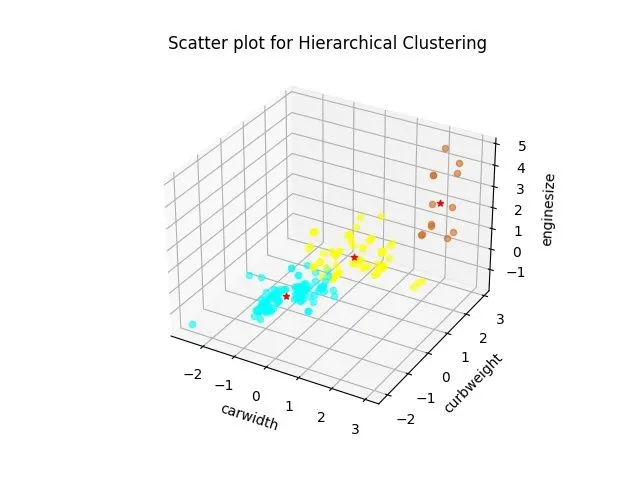
Scatter Plot for Hierarchical Clustering:
Box plot showing the clusters determined by Hierarchical Clustering:
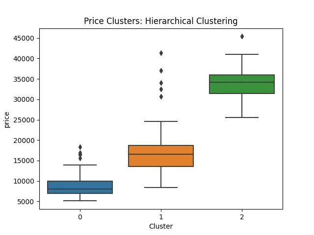
It could be observed from the above figures that the Mean-Shift algorithm properly divides the dataset into two clusters (High Price and Low Price Vehicles) with minimum overlap of the datapoints in each cluster. Other to algorithms divide the dataset into three clusters (High, Medium and Low price vehicles) but a significant overlap of prices between Medium and Low price clusters could be observed. Thus we can successfully predict the class of the car based on price using any of the clustering method discussed above.
[2]. https://scikit-learn.org/stable/modules/clustering.html#hierarchical-clustering
[3]. https://scikit-learn.org/stable/modules/clustering.html#clustering-performance-evaluation