Project 1
1.Data cleaning on Automobile 1985 dataset and perform descriptive analytics.
Imported the Automobile 1985 dataset into the Jupitor notebook
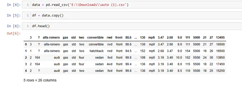
As we can see that there are missing values present and also the columns are not labelled.
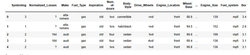
Labelled the column.
checked the info of the table.
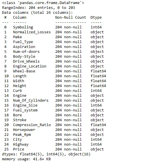
So there are 26 columns with 204 records.
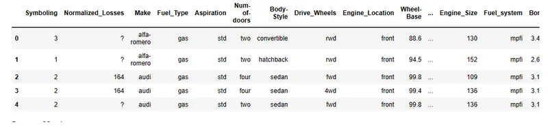
As we can see there are missing values, using isnull function not able to detect the nan values. By inspecting the individual columns we can find using unique funtion and then replaced with nan value. So that we can replaced the Nan value with mean
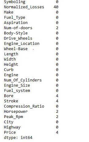
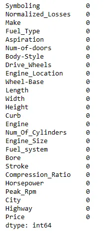
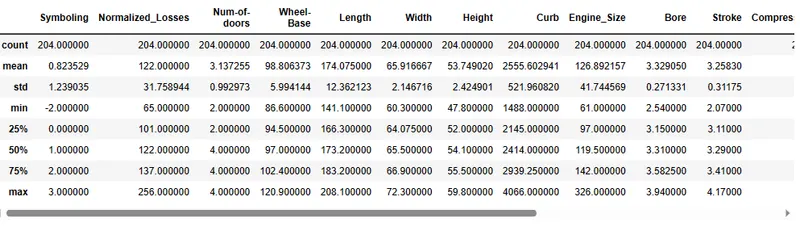
This summary is helpful for quickly understanding the distribution and basic statistics of the numerical data in DataFrame, such as the range of values, central tendency (mean), and spread (standard deviation).
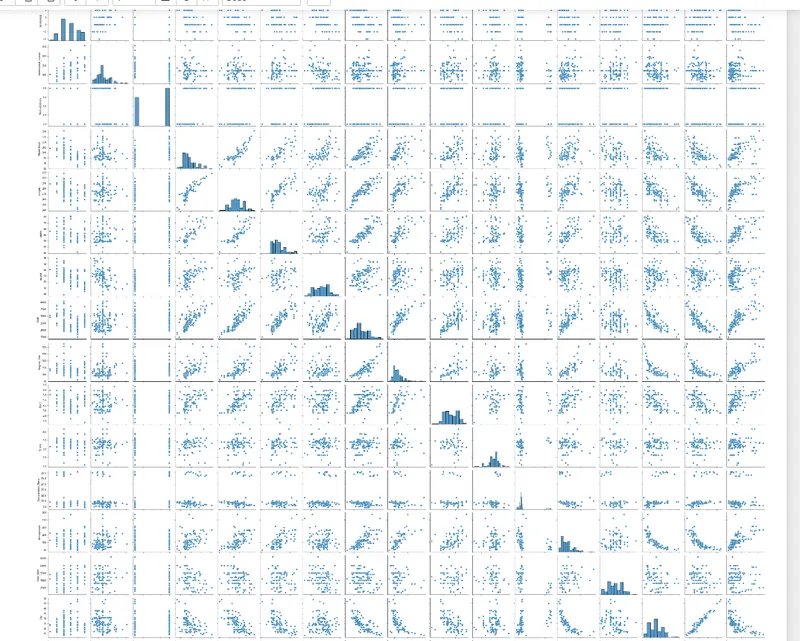
A pair plot, also known as a scatter plot matrix, is used to visualize the pairwise relationships between variables in a dataset. It is a grid of scatter plots where each variable is plotted against every other variable in the dataset. Pairplot provide a comprehensive view of the relationships between variables. They can help identify linear or non-linear relationships, clusters, outliers, and other patterns that may exist in the data. Pair plots are also helpful for feature selection and identifying variables that may have a strong influence on the target variable.
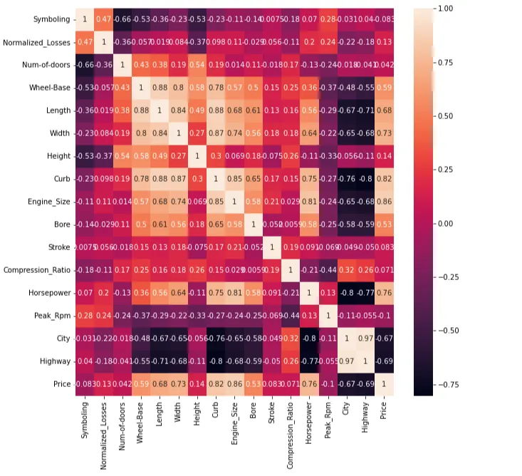
Using Heatmap to visualize the correlation between the variables.
As we have objective data type in our dataframe we use one hot encoding and label encoding to convert the data to interger type so that our model can read the data.
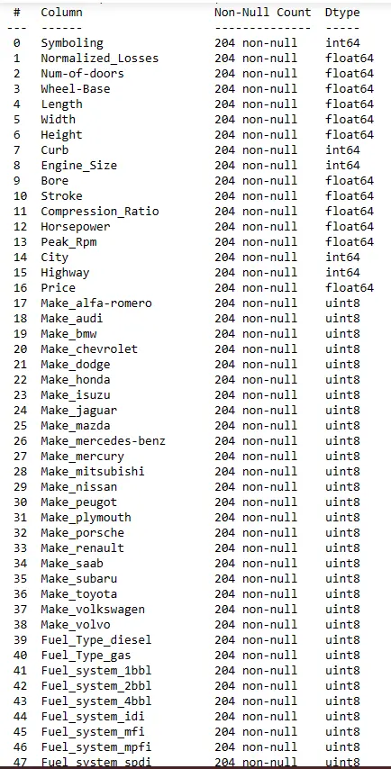
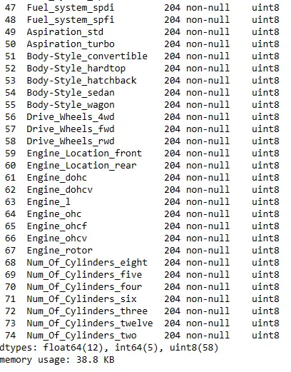
All the data type is converted to integer data type.
Visualize the data type using box plot to spot the outliers and the range of the data.
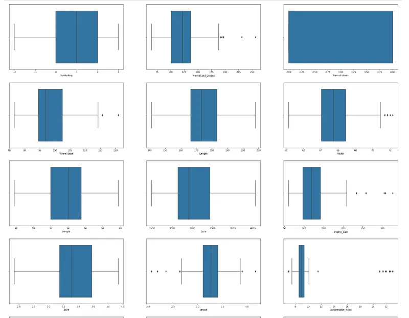
To check for the outliers
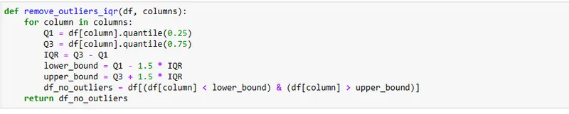
Used the loop find the outliers.

From the above the data we can see that there is no outliers present.
Now the data is cleaned and ready to be trained and predict according to the business requirement.