Unsupervised Learning - Kmeans
Unsupervised Learning
Kmeans
1. Calculating Similarity id Data is Categorical in Nature
The simplest way to find similarity between two categorical attributes is to assign a similarity of 1 if the values are identical and similarity of 0 if the values are not identical. Another method involves converting the categorical data into label encoding using for loop which runs for the length of the array which contains the list of column names of categorical data
2. K-means for Car Dataset
This data set consists of three types of entities:
(a) the specification of an auto in terms of various characteristics,
(b) its assigned insurance risk rating,
(c) its normalized losses in use as compared to other cars. The second rating corresponds to the degree to which the auto is more risky than its price indicates. Cars are initially assigned a risk factor symbol associated with its price. Then, if it is more risky (or less), this symbol is adjusted by moving it up (or down) the scale. Actuarians call this process "symboling". A value of +3 indicates that the auto is risky, -3 that it is probably pretty safe. The third factor is the relative average loss payment per insured vehicle year. This value is normalized for all autos within a particular size classification (two-door small, station wagons, sports/specialty, etc…), and represents the average loss per car per year.
Note: Several of the attributes in the database could be used as a "class" attribute.
Number of Instances: 205
Number of Attributes: 29 total
-- 18 continuous
-- 1 integer
-- 10 nominal.
The steps we are going to follow in this case are:'
- Data pre-processing.
- Finding the optimum value of K usng Elbow method.
- Training the K-means algorithm on the training dataset and Visualising the clusters.
Data pre-processing
The first step will be data pre-processing. In this step we will prepare out dataset for the algorithm to implement. To do that we will follow the following steps.
Importing the necessary libraries
import pandas as pd
import numpy as np
import matplotlib.pyplot as plt
import seaborn as sns
from sklearn.cluster import KMeans
Importing the dataset
df = pd.read_csv('C:/Users/Shivaani/Desktop/Skill-Lync/Machine Learning Fundamentals in Depth/Week_11 Programs/auto_clean.csv')
df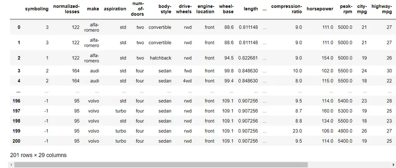
Finding the shape of the dataset
df.shape(201,16)
Describing the dataset
df.describe()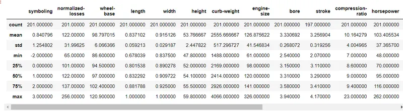
Info on the dataset
df.info()<class 'pandas.core.frame.DataFrame'> RangeIndex: 201 entries, 0 to 200 Data columns (total 29 columns): # Column Non-Null Count Dtype --- ------ -------------- ----- 0 symboling 201 non-null int64 1 normalized-losses 201 non-null int64 2 make 201 non-null object 3 aspiration 201 non-null object 4 num-of-doors 201 non-null object 5 body-style 201 non-null object 6 drive-wheels 201 non-null object 7 engine-location 201 non-null object 8 wheel-base 201 non-null float64 9 length 201 non-null float64 10 width 201 non-null float64 11 height 201 non-null float64 12 curb-weight 201 non-null int64 13 engine-type 201 non-null object 14 num-of-cylinders 201 non-null object 15 engine-size 201 non-null int64 16 fuel-system 201 non-null object 17 bore 201 non-null float64 18 stroke 197 non-null float64 19 compression-ratio 201 non-null float64 20 horsepower 201 non-null float64 21 peak-rpm 201 non-null float64 22 city-mpg 201 non-null int64 23 highway-mpg 201 non-null int64 24 price 201 non-null float64 25 city-L/100km 201 non-null float64 26 horsepower-binned 200 non-null object 27 diesel 201 non-null int64 28 gas 201 non-null int64 dtypes: float64(11), int64(8), object(10) memory usage: 45.7+ KB
Extracting Independent Features from the dataset.
As this dataset has so many features we cannot perform the K-Means Clustering to every features. So what we will do in this case is first, we will remove all the features that contains non-numerical values and secondly, we will plot a heat map of correlation between the features.
Here will plot the correlation heatmap and will choose the least correlated feautres with the 'price' feature.
The correlation coefficient has values between -1 to 1
— A value closer to 0 implies weaker correlation (exact 0 implying no correlation)
— A value closer to 1 implies stronger positive correlation
— A value closer to -1 implies stronger negative correlation.
df = df.drop(columns = df[['make', 'aspiration', 'num-of-doors','body-style', 'drive-wheels','engine-location','engine-type', 'num-of-cylinders','fuel-system','stroke','horsepower-binned', 'diesel', 'gas']])
df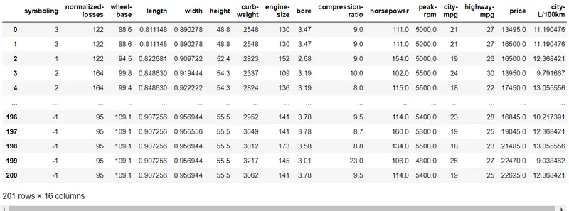
Plotting the heatmap of correlations
plt.subplots(figsize = ([15,15]))
sns.heatmap(df.corr(),cmap = 'YlGnBu',annot = True)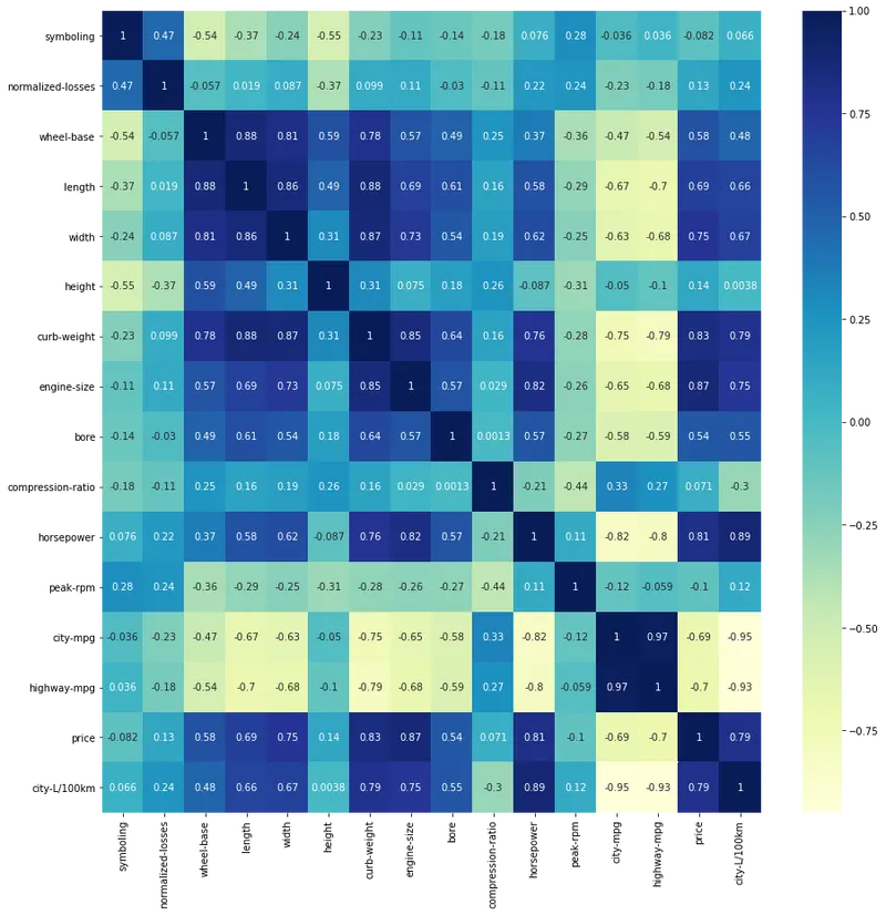
As observing the above heat map, we can see that the closest independency of the features with 'price' are 'compression-ratio' and 'peak-rpm'.
We are not choosing 'symboling' feature as it is already a categorical attribute.
Finding the optimum value of K using Elbow Method
In this process we will be plotting the Elbow plot of 'compression-ratio vs price' and 'peak-rpm vs price'.
Creating a new dataframe
Creating a new dataframe where only these 3 features are going to exist.
final_df = df[['peak-rpm','compression-ratio','price']]
final_df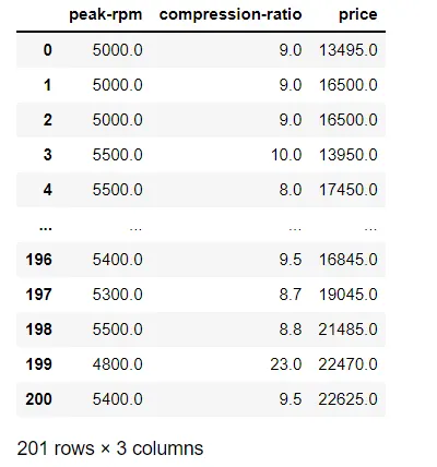
Scaling down the dataframe
We need to scale down the new dataframe so that it will become computationaly cheap and also it will create symmetric axes while plotting.
from sklearn.preprocessing import MinMaxScaler
scaler = MinMaxScaler()
scaler.fit(final_df)
scaled_df = pd.DataFrame(scaler.transform(final_df),columns = final_df.columns)
scaled_df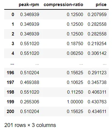
Elbow plot for 'compression-ratio vs price'
k_rng = range(1,10)
sse1 = []
for k1 in k_rng:
    km1 = KMeans(n_clusters = k1)
    km1.fit(scaled_df[['price','compression-ratio']])
    sse1.append(km1.inertia_)

plt.xlabel('Price of the Vehicle')
plt.ylabel('Compression ratio of the engine')
plt.plot(k_rng,sse1,marker = 'o')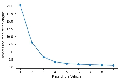
The optimum value of K = 3.
Elbow plot for 'peak-rpm vs price'
k_rng = range(1,10)
sse2 = []
for k2 in k_rng:
    km2 = KMeans(n_clusters = k2)
    km2.fit(scaled_df[['price','peak-rpm']])
    sse2.append(km2.inertia_)

plt.xlabel('Price of the Vehicle')
plt.ylabel('Peak RPM of the Vehicle')
plt.plot(k_rng,sse1,marker = 'o')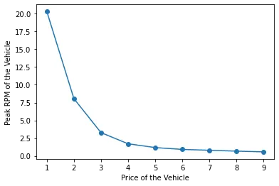
The optimum value of K = 3 in this case also
Implementing K-Means Clustering Algorithm
In this process we are going to implement the K-Means Clustering algorithm to our scaled dataframe.
K-Means Clustering between 'price' and 'compression-ratio'
km1 = KMeans(n_clusters = 3)
y_predict = km1.fit_predict(scaled_df[['price','compression-ratio']])
PC_df = scaled_df[['price','compression-ratio']]
PC_df['Cluster(P vs C)'] = y_predict
PC_df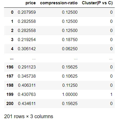
Finding the centroids of the clusters.
km1.cluster_centers_array([[0.26612755, 0.9378125 ],
[0.14474805, 0.1170256 ],
[0.73417242, 0.10458333]])
Visulasing the Clusters between 'price' and 'compression-ratio'
Drawing the scatter plot for 3 different clusters with their centroids.
PC_df1 = PC_df[PC_df['Cluster(P vs C)'] == 0]
PC_df2 = PC_df[PC_df['Cluster(P vs C)'] == 1]
PC_df3 = PC_df[PC_df['Cluster(P vs C)'] == 2]
plt.subplots(figsize = ([15,10]))
plt.scatter(PC_df1['price'],PC_df1['compression-ratio'],color = 'red')
plt.scatter(PC_df2['price'],PC_df2['compression-ratio'],color = 'green')
plt.scatter(PC_df3['price'],PC_df3['compression-ratio'],color = 'blue')
plt.scatter(km1.cluster_centers_[:,0],km1.cluster_centers_[:,1],marker = '*',s = 200,color = 'purple')
plt.xlabel('Price of the Vehicle')
plt.ylabel('Compression ratio of the Engine')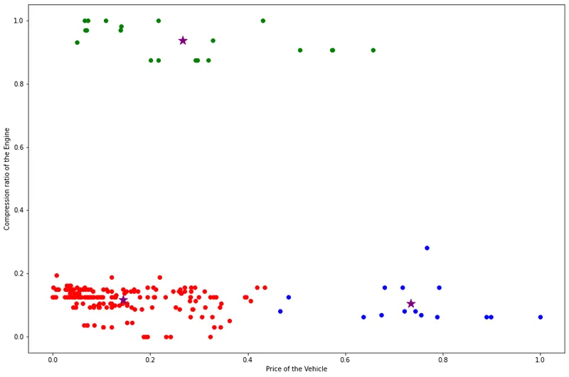
K-Means Clustering between 'price' and 'peak-rpm'
Now we are going to form 3 clusters between 'price' and 'peak-rpm'(as K = 3).
km2 = KMeans(n_clusters = 3)
y_predict = km2.fit_predict(scaled_df[['price','peak-rpm']])
PP_df = scaled_df[['price','peak-rpm']]
PP_df['Cluster(P vs P)'] = y_predict
PP_df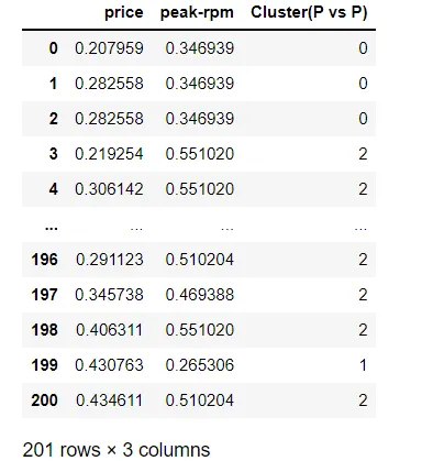
Finding the centroids of the clusters.
km2.cluster_centers_array([[0.13510909, 0.24295432],
[0.69942171, 0.31149302],
[0.16046059, 0.54144414]])
Visualising the Clusters between 'price' and 'compression-ratio'
Drawing the scatter plot for 3 different clusters with their centroids.
PP_df1 = PP_df[PP_df['Cluster(P vs P)'] == 0]
PP_df2 = PP_df[PP_df['Cluster(P vs P)'] == 1]
PP_df3 = PP_df[PP_df['Cluster(P vs P)'] == 2]
plt.subplots(figsize = ([15,10]))
plt.scatter(PP_df1['price'],PP_df1['peak-rpm'],color = 'red')
plt.scatter(PP_df2['price'],PP_df2['peak-rpm'],color = 'green')
plt.scatter(PP_df3['price'],PP_df3['peak-rpm'],color = 'blue')
plt.scatter(km2.cluster_centers_[:,0],km2.cluster_centers_[:,1],marker = '*',s = 200,color = 'purple')
plt.xlabel('Price of the Vehicle')
plt.ylabel('Peak rated RPM of the Engine')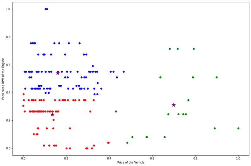
Summary and Conclusion:
- K-Means Clustering algorithm was explained.
- The dataset was trained through K-Means Clustering algorithm.
- The dataset was reduced to only 3 major independent attributes.
- The optimum value of K came out to be 3 in both the cases.
- The centroids of the clusters was calculated.
- The Scatter plot was plotted with 3 different clusters along with their centroids.