Project 2 - Supply and Demand Gap Analysis
REPORT ON
SUPPLY AND DEMAND GAP ANALYSIS
SUBMITTED BY NANDHUMON T K
AIM
The aim of this project is to conduct a supply and demand gap analysis using Uber request data in Power BI. The goal is to identify patterns and trends in the supply and demand of Uber rides and analyze any gaps or imbalances between the two. By leveraging Power BI's data visualization capabilities, we can create interactive reports and dashboards to gain valuable insights and make data-driven decisions.
INTRODUCTION
In the modern era, transportation services have undergone a significant transformation with the advent of ride-hailing platforms like Uber. These platforms have revolutionized the way people commute by providing convenient and on-demand transportation solutions. However, ensuring a seamless experience for both riders and drivers relies heavily on maintaining a delicate balance between supply and demand.
The goal of this project is to conduct a comprehensive supply and demand gap analysis of Uber request data using Power BI. By leveraging the power of data visualization and analysis, we aim to gain valuable insights into the dynamics between the availability of drivers (supply) and the number of ride requests (demand) in different locations and time periods. The supply and demand dynamics play a crucial role in the success and efficiency of any transportation service. Understanding the gap between supply and demand is essential for optimizing operations, improving customer satisfaction, and maximizing revenue. In this project, we will analyze Uber request data using Power BI to gain insights into the supply and demand gap, helping Uber make data-driven decisions to enhance their services.
The primary objective of this project is to perform a comprehensive supply and demand gap analysis using Uber request data. By leveraging the powerful data visualization capabilities of Power BI, we aim to identify patterns, trends, and areas of improvement in Uber's supply and demand dynamics.
By performing a supply and demand gap analysis using Uber request data in Power BI, this project aims to provide valuable insights into the efficiency and optimization of Uber's operations. The analysis will help Uber identify areas of improvement, enhance customer satisfaction, and drive business growth by ensuring a better match between supply and demand.
PROBLEM STATEMENT
The problem at hand is to perform a supply and demand gap analysis using Uber request data in Power BI. Uber, being a popular ride-hailing service, experiences varying levels of demand from customers at different times and locations. To efficiently manage their operations and provide satisfactory service, Uber needs to understand the supply and demand dynamics across various regions and time periods.
The objective of this project is to utilize Power BI, a powerful business intelligence tool, to analyze the Uber request data and identify the gaps between supply (available drivers) and demand (customer requests) in different areas. The analysis will help Uber gain insights into the following aspects:
- Demand Patterns: Identify the peak hours and days of the week when customer demand is the highest. Determine the regions or specific locations where demand is consistently high or low. Understand the factors influencing demand fluctuations.
- Supply Allocation: Evaluate the availability and allocation of drivers in different areas and time periods. Determine if there are any supply shortages or surplus in specific regions. Identify areas where the supply may not be meeting the demand.
- Gap Identification: Compare the demand and supply data to identify gaps and imbalances. Quantify the extent of the gaps and understand the impact on customer experience and operational efficiency. Determine the areas or time periods where the gaps are most significant.
- Operational Insights: Gain actionable insights to optimize resource allocation and improve operational efficiency. Identify opportunities for surge pricing or incentives to attract more drivers during peak demand periods. Determine strategies to address supply shortages and reduce customer wait times.
By performing a comprehensive supply and demand gap analysis using Power BI, Uber will be able to make data-driven decisions to enhance their service quality, improve customer satisfaction, and optimize their operational processes. The analysis will enable Uber to better allocate resources, identify potential expansion opportunities, and provide a seamless experience to their customers.
METHODOLOGY
Data Preparation:
Clean and prepare the data for analysis. This may involve tasks such as removing duplicates, handling missing values, standardizing formats, and transforming data into a suitable structure for Power BI. Ensure that the data is reliable and accurate.
Data Interpretation:
In the “Uber Request Data” Table consists of cabs availability in the corresponding time slots with pickup points, which available for the analysis. The table also contain data of drop time and drivers’ id for the rides along with the status of the trips.
Analysis and Visualization:
Design visualizations to represent supply and demand trends over time, by location, or any other relevant dimensions. Created filters and slicers to enable interactive exploration of the data, allowing users to drill down into specific time periods or locations.
Created bar charts, column charts, pie and donut chart for the analysis
Dashboard Creation:
Attach all these created visualization into a page and give the insights for it.
ANALYSIS
Created following visualization for the supply and demand gap analysis for the uber request data.
- A column chart for the Total Number of request and status
- A donut chart for the analysis of the pickup points
- A bar chart for the total rides and the status of the rides
- A column chart for the status of the request time slot
- A pie chart for the demand and supply
- A column chart for the total rides based on pickup point wise status
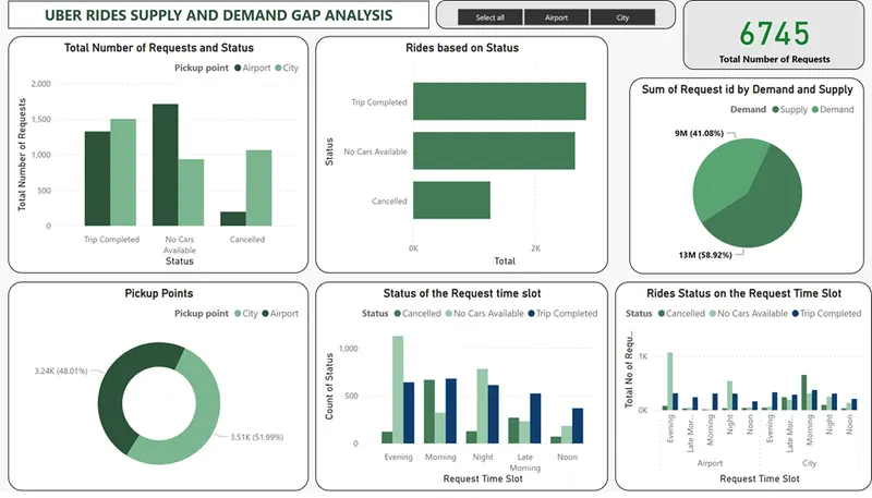
There are total of 6745 ride requests are come from the customers from the uber request data.
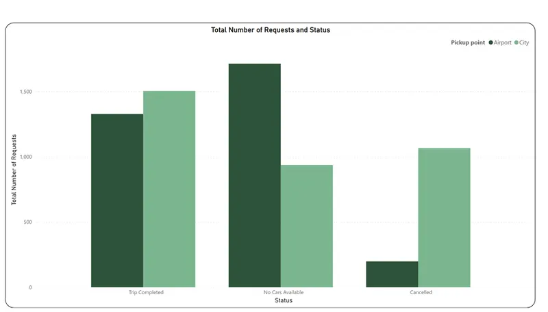
From the above graph we can get the idea about the total number of requests and their status. In there is no car available from airport to city. Most of the cancellation was happened in the city. Also comparatively trips completion is little higher in the city.
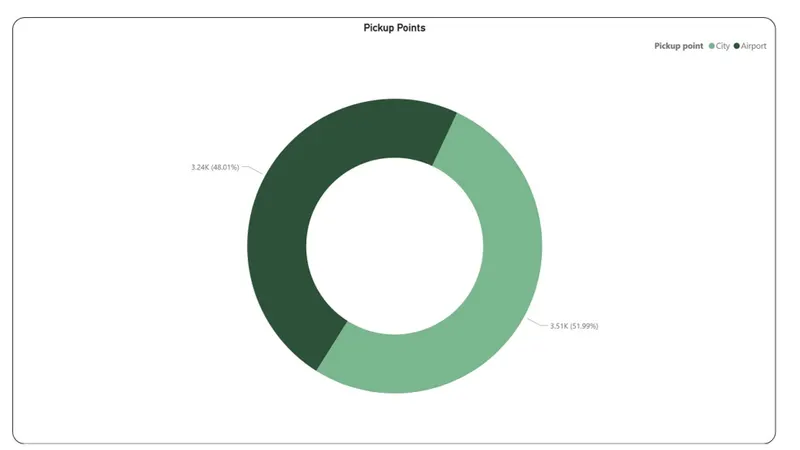
Most of the requests happen from the city than the airport.
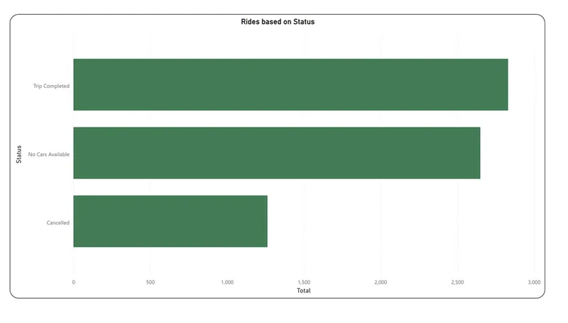
Based on the above graph, the most of trips are completed as compared to the other status like availability of the cars and cancellation.

From the above graph which gives the status of the requests with respect to the time slots. In the evening there in no car available as compared to the other time slots. In the morning the cancellation rate and the trips completion rate both are approximately same. The cancellation is very low in the noon.
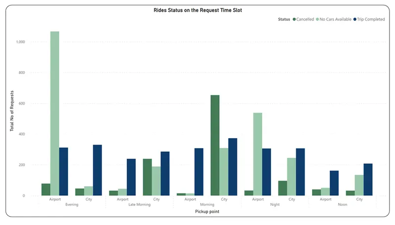
The above graph based on the time slot wise status from the pick-up points. There are no cars available from the airport to city in the evening. Cancellation rate is high in city during morning.
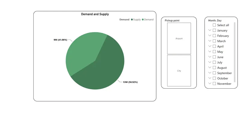
Which will give the idea about the demand and supply in the uber request. From the Demand (Trip Completed) is lower than the supply (Except Trip Completed in the status).
INSIGHTS
Total Number of Requests and Status:
- The column chart provides an overview of the total number of requests and their status.
- It shows that there is a high number of cancellations in the city, indicating a potential supply-demand gap.
- Trips completion is relatively higher in the city, suggesting better availability of cars compared to other statuses.
Pickup Points Analysis:
- The donut chart helps analyze the distribution of pickup points.
- It indicates that most of the requests originate from the city rather than the airport.
Total Rides and Status:
- The bar chart displays the total number of rides based on their status.
- It reveals that a significant number of trips are completed compared to other statuses like car availability and cancellation.
- This suggests that there may be a supply-demand gap, especially regarding car availability and cancellations.
Status of Request Time Slot:
- The column chart demonstrates the status of requests based on different time slots.
- It reveals that there is no car availability in the evening compared to other time slots.
- Cancellation and trip completion rates are approximately the same in the morning.
- Cancellation rates are low during the noon period.
Demand and Supply Analysis:
- The pie chart represents the demand and supply of Uber rides.
- It indicates that the demand (Trip Completed) is lower compared to the supply (except for Trip Completed status).
- This implies that there may be an excess supply of cars compared to the demand, leading to issues such as cancellations.
Total Rides Based on Pickup Point Wise Status:
- The column chart shows the total number of rides based on pickup points and their status.
- It highlights that there are no cars available from the airport to the city in the evening.
- Cancellation rates are high in the city during the morning period.
RECOMMENDATIONS
- Analyze the reasons for the high cancellation rate in the city: Investigate why there is a high cancellation rate in the city during the morning. This could indicate potential issues such as unavailability of drivers, traffic congestion, or other factors impacting the service. Understanding the root causes can help Uber address these issues and improve customer satisfaction.
- Explore ways to increase the supply during peak demand: Identify time slots with high demand and low supply, such as the evening time slot when there are no cars available from the airport to the city. Consider strategies to incentivize drivers to be available during these peak hours, such as offering higher fares or bonuses. Increasing the supply during high-demand periods can help reduce the supply-demand gap and improve overall service quality.
- Optimize driver allocation between the airport and the city: Since most requests come from the city rather than the airport, analyze whether there is an imbalance in the allocation of drivers between these two locations. Adjusting the distribution of drivers to match the demand can help reduce wait times for passengers and improve overall efficiency.
- Monitor and address supply shortages: Keep a close eye on the supply-demand gap to identify trends and patterns over time. If there are consistent supply shortages, consider expanding driver recruitment efforts or implementing initiatives to attract more drivers to areas with high demand. Regularly monitoring and addressing supply shortages can help maintain a balance between supply and demand.
- Evaluate the impact of time slots on ride completion: Analyze the relationship between time slots and trip completion rates. Identify any patterns or trends that may affect trip completion, such as specific time slots where completion rates are lower. This analysis can provide insights into potential factors influencing driver availability and help Uber optimize driver schedules.
- Consider customer feedback: Alongside the data analysis, gather feedback from customers regarding their experience with Uber services. This feedback can provide valuable insights into customer satisfaction, identify pain points, and help prioritize improvements.
CONCLUSIONS
- Total Number of Requests and Status: The column chart provides an overview of the total number of requests and their corresponding status. It is observed that there is no car available for trips from the airport to the city. The majority of cancellations occur in the city. However, the rate of trip completions is relatively higher in the city.
- Pickup Points Analysis: The donut chart illustrates the distribution of pickup points. It indicates that the majority of requests originate from the city rather than the airport.
- Total Rides and Status: The bar chart displays the total number of rides and their respective status. It is evident that a significant number of trips are completed compared to other status categories such as car availability and cancellations.
- Request Time Slot Analysis: The column chart represents the status of requests across different time slots. It reveals that there is a lack of car availability in the evening compared to other time slots. In the morning, the cancellation rate and trip completion rate are approximately the same, while cancellations are minimal during the noon.
- Total Rides Based on Pickup Point and Status: The column chart showcases the total rides based on the pickup points and their respective status. It indicates that there are no cars available from the airport to the city in the evening, and cancellations are high in the city during the morning.
- Demand and Supply Analysis: The pie chart provides insights into the demand and supply dynamics in the Uber request data. It reveals that the demand (trip completions) is lower than the supply across all status categories except for "Trip Completed."
The analysis suggests that there is a supply and demand gap in the Uber service. The main issues identified include a lack of car availability from the airport to the city, a higher cancellation rate in the city during the morning, and a relatively lower demand compared to the supply (except for trip completions). These findings can help Uber identify areas for improvement in order to optimize their service and bridge the supply and demand gap.