Project 1 - COVID-19 Vaccinations Trend Analysis
Project 1 - COVID-19 Vaccinations Trend Analysis
Aim
This project aims to thoroughly analyze data on the number of vaccinated individuals and the number of people who are fully vaccinated, both by year and by country. The goal of this analysis is to gain a deeper understanding of the vaccination efforts around the world and to identify any trends or patterns that may be present in the data.
To achieve this goal, a comprehensive approach was taken, including data cleaning, interpretation, and visualization. This allowed for the identification of key insights and trends within the data and helped to provide a more complete understanding of the vaccination efforts.
Overall, the goal of this project is to contribute to the ongoing efforts to combat the COVID-19 pandemic by providing valuable insights and recommendations based on a thorough analysis of the available data.
Introduction
The COVID-19 pandemic has had a significant impact on global health and economic systems, and vaccinations are a key strategy for controlling the spread of the disease. In this project, we will analyze data on COVID-19 vaccinations to better understand trends in vaccination rates and the effectiveness of different vaccination strategies. By examining data on vaccinated individuals and fully vaccinated populations by year and country, we hope to identify patterns and trends that may inform future efforts to increase vaccination rates and control the spread of COVID-19.
Problem statement
The problem statement for this project was to determine the number of people who have been fully vaccinated against COVID-19, as well as to examine the total number of vaccinations by year and by country. Additionally, the analysis sought to identify the number of people vaccinated per hundred in order to better understand the vaccination efforts.
To address this problem, a thorough analysis of the data was conducted, including data cleaning, interpretation, and visualization. This allowed for the identification of key trends and patterns within the data, and helped to provide insights into the vaccination efforts around the world.
Overall, the goal of this project was to better understand the current state of the vaccination efforts and to identify areas where improvements can be made. By analyzing the data in a thorough and systematic manner, it was possible to gain a more complete understanding of the situation and to make informed recommendations for the future.
Methodology:-
- Step 1: Data cleaning
The first step in the methodology for this project was data cleaning. In order to ensure that the dataset was accurately representing the desired information, it was necessary to clean the data and replace any missing values. This was accomplished using the "transform data" feature in Power BI, specifically the "duplicates" function.
- Step 2: Data interpretation
During the data interpretation step of this project, the cleaned dataset was analyzed in order to gain a better understanding of its contents. It was found that the dataset was largely complete and contained a total of 86512 rows and 15 columns. Any null values that were present were replaced with 0 in order to ensure the accuracy of the data.
Additionally, it was noted that the dataset separated the countries of the United Kingdom and Northern Ireland. However, it is important to note that the United Kingdom includes England, Scotland, Wales, and Northern Ireland. In order to more accurately reflect the data, Northern Ireland was replaced with the United Kingdom in order to better represent the data. This was done in order to ensure that the results of the analysis were as accurate as possible.
- Step 3: Visualization
The final step in the methodology was visualization, in which relevant graphs and charts were created using Power BI Desktop software. These visualizations helped to more clearly convey the insights and trends present in the data. Overall, the combination of data cleaning, interpretation, and visualization allowed for a thorough analysis of the dataset and the creation of meaningful insights.
Analysis
During the analysis phase of this project, several key insights were identified and visualized using various data sheets.
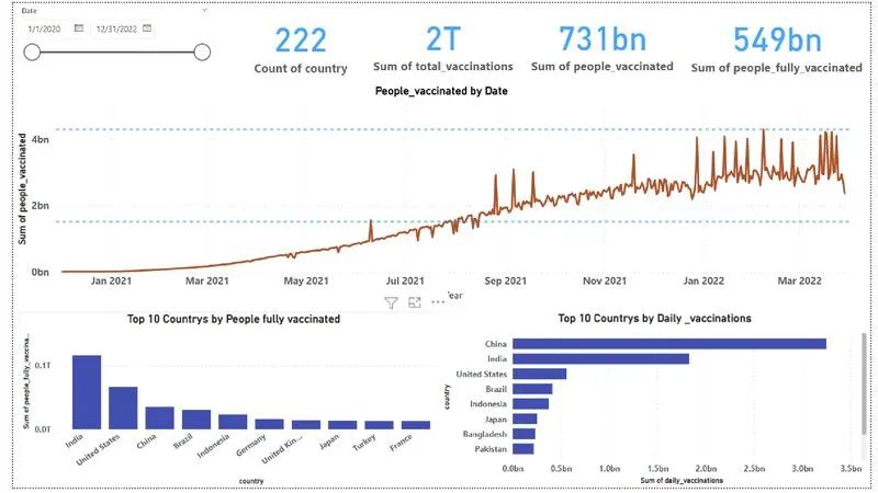
First, a card visualization was created showing the total number of vaccinations and fully vaccinated people for each country in the dataset. This provided a high-level overview of the vaccination efforts in each country.
A line chart was then created to show the total number of people vaccinated by year, with max and average line indicators. This visualization allowed for a comparison of the vaccination rates over time and helped identify any trends or changes.
A slicer was also created to allow for the analysis of the data on a month-by-month basis. This allowed for a more granular examination of the data and helped identify any seasonal patterns.
Column charts were used to visualize the total number of fully vaccinated people and the total number of daily vaccinations for the top 10 countries. This allowed for a comparison of the vaccination efforts among the top-performing countries.
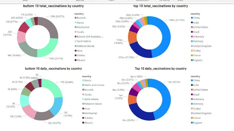
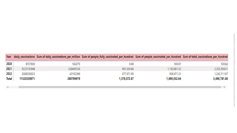
The highest daily vaccination rate was found to be 9223133948, which occurred at some point between 2020 and 2022. A visualization was also created to show the top and bottom 10 countries in terms of daily vaccinations, which helped identify the leaders and laggards in the race to fight COVID-19.
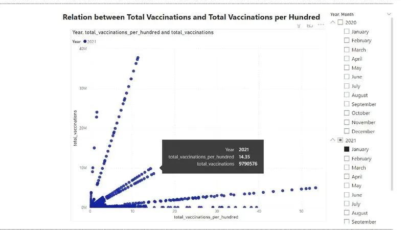
A scatterplot was created to show the relationship between total vaccinations and total vaccinations per hundred people. This helped to identify any correlations or trends between these two variables.
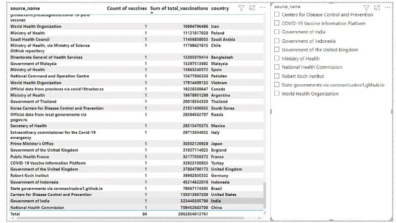
In this highest number of vaccinations delivered by which organisation is founded and it is mentioned below
source_name Sum of total_vaccinations
National Health Commission 7,09,45,26,63,700.00
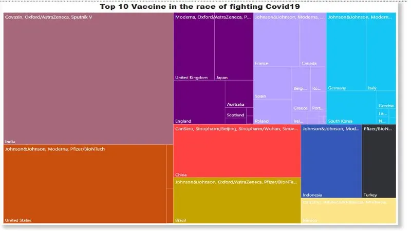
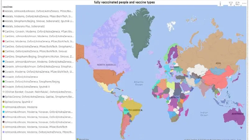
A filled map visualization was used to show the fully vaccinated people and vaccine type for each country. This provided a geographic perspective on the vaccination efforts and helped identify the top sources of vaccines (India and China).
Overall, the analysis of the data sheets provided a thorough understanding of the vaccination efforts and allowed for the identification of key insights and trends.
insights
The final report provides valuable insights into the vaccination efforts around the world. By analyzing the data, it is possible to identify the top 10 sources of vaccines, as well as the countries with the highest rates of fully vaccinated individuals.
This information can be used to inform future decisions and strategies related to vaccination efforts. For example, governments and health organizations can use the data to identify areas where vaccination efforts may need to be increased or improved.
Overall, the analysis of this data has provided a thorough understanding of the vaccination efforts and has helped to identify key trends and patterns within the data. By using the insights gained from this analysis, it is possible to make informed decisions and take effective action to address the challenges posed by COVID-19. So, we can conclude that the analysis of the data has been a valuable and informative process, and it is hoped that the insights gained will be useful in the ongoing efforts to combat the pandemic.
recommendations:-
Based on the analysis of the dataset, the following recommendations are made:
-
In order to improve the accuracy and usefulness of the data analysis, it is important to ensure that the datasets used are of high quality and are properly cleaned and organized.
-
Expanding the scope of the analysis to include data from a wider range of countries or regions can provide a more complete picture of the vaccination efforts around the world.
-
By analyzing data from various categories or geographic regions, it is possible to gain a deeper understanding of the trends and patterns within the data.
-
Working with larger datasets can provide more opportunities for in-depth analysis and can help identify trends and patterns that may not be apparent in smaller datasets.
conclusion
In conclusion, the final dashboard provides a comprehensive overview of the vaccination efforts around the world. As shown on the dashboard, the top country in terms of vaccinations is clearly identified, as are the top 10 countries with the most vaccines. The dashboard also shows that the vaccination rate peaked in 2022 and that the top two sources of vaccines were India and China.
Overall, the dashboard is a useful tool for analyzing and understanding the data, and it can be used to identify trends and patterns within the data. By taking a closer look at the dashboard, it is possible to gain a deeper understanding of the vaccination efforts and how they have evolved over time. This information can be used to inform future decisions and strategies related to vaccination efforts.
power piont link
https://1drv.ms/p/s!AtChEQM3R9BLaWBe1H8jmg01EKs?e=pCXJ3f