Data Cleaning on Automobile 1985 Dataset
Data Cleaning on Automobile 1985 Dataset
No. of data points: 205
Number of Attributes: 26 total
-- 15 continuous
-- 1 integer
-- 10 nominal
Attribute Information:
- symboling: -3, -2, -1, 0, 1, 2, 3
- normalized-losses: continuous from 65 to 256
- make: alfa-romero, audi, bmw, chevrolet, dodge, honda, isuzu, jaguar, mazda, mercedes-benz, mercury, mitsubishi, nissan, peugot, plymouth, porsche, renault, saab, subaru, toyota, volkswagen, volvo
- fuel-type: diesel, gas
- aspiration: std, turbo
- num-of-doors: four, two
- body-style: hardtop, wagon, sedan, hatchback, convertible
- drive-wheels: 4wd, fwd, rwd
- engine-location: front, rear
- wheel-base: continuous from 86.6 120.9
- length: continuous from 141.1 to 208.1
- width: continuous from 60.3 to 72.3
- height: continuous from 47.8 to 59.8
- curb-weight: continuous from 1488 to 4066
- engine-type: dohc, dohcv, l, ohc, ohcf, ohcv, rotor
- num-of-cylinders: eight, five, four, six, three, twelve, two
- engine-size: continuous from 61 to 326
- fuel-system: 1bbl, 2bbl, 4bbl, idi, mfi, mpfi, spdi, spfi
- bore: continuous from 2.54 to 3.94
- stroke: continuous from 2.07 to 4.17
- compression-ratio: continuous from 7 to 23
- horsepower: continuous from 48 to 288
- peak-rpm: continuous from 4150 to 6600
- city-mpg: continuous from 13 to 49
- highway-mpg: continuous from 16 to 54
- price: continuous from 5118 to 45400
Code:
Importing Libraries
import pandas as pd
import numpy as np
import matplotlib.pyplot as plt
plt.rcParams["patch.force_edgecolor"] = True
%matplotlib inline
import seaborn as sns
sns.set_style('whitegrid')
import warnings
warnings.filterwarnings('ignore')
from collections import defaultdict
from scipy.sparse import hstack
from sklearn.preprocessing import Normalizer, OneHotEncoder
from sklearn.model_selection import train_test_split
from sklearn.cluster import KMeans
from sklearn.manifold import TSNE
from sklearn.linear_model import LogisticRegression
from sklearn.metrics import confusion_matrix
Importing the dataset
df = pd.read_csv('auto.csv')
df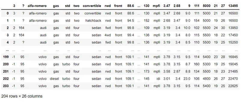
Naming the columns
df.columns = ['symboling','normalized_loss','make','fuel_type','aspiration','num_of_doors','body_style','drive_wheels','engine_location','wheel_base','length','width','height','curb_weight','engine_type','num_of_cylinders','engine_size','fuel_system','bore','stroke','compression_ratio','horsepower','peak_rpm','city_mpg','highway_mpg','price']Viewing the dataset
df.head()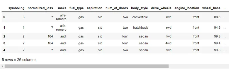
Information on the data
data.info()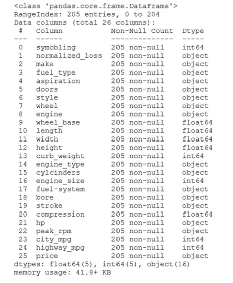
Observation
1. There are 205 data points in the data
2. No missing values
3. 25 independent variables and 1 target variable 'Price'
4. We have a regression problem
Looking into categorical and nuerical features separately:
# Looking into numerical features
df.select_dtypes(include='number').head()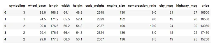
# Looking into categorical features
df.select_dtypes(exclude='number').head()
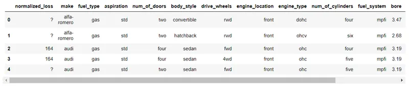
Observation
Features like 'normalized_loss', 'bore', 'stroke', 'horsepower', 'peak_rpm' are actually numerical features but interpreted as categorical.
Converting the above into real numerical features
1. normalized_loss
plt.figure(figsize=(15,10))
sns.countplot(df['normalized_loss'])
plt.title("Loss values")
plt.show()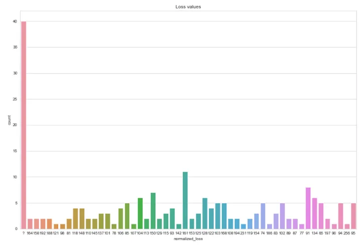
There are entries with '?' in it
def return_number(value):
    if '?' in value:
        return 0
    else:
        return float(value)
df['normalized_loss'] = df['normalized_loss'].apply(lambda x: return_number(x))df['normalized_loss'].describe()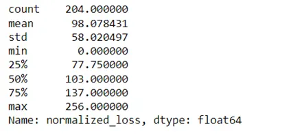
Distribution
sns.displot(df.normalized_loss, kde=True)
plt.title("Distribution of Loss Values")
plt.show()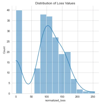
Outliers Handling
df['normalized_loss'] = df['normalized_loss'].apply(lambda x: df['normalized_loss'].median() if (x>170) else x)sns.displot(df.normalized_loss, kde=True)
plt.title("Distribution of Loss Values")
plt.show()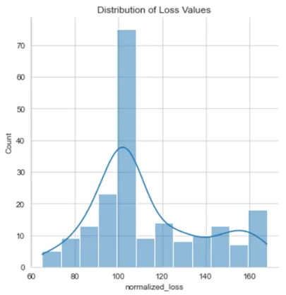
2. bore
plt.figure(figsize=(15,10))
sns.countplot(df['bore'])
plt.title("Bore values")
plt.show()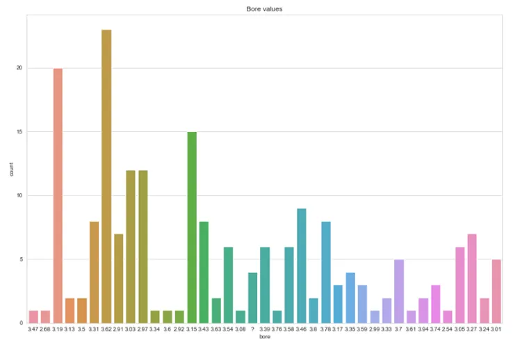
df['bore'] = df['bore'].apply(lambda x: return_number(x))df['bore'].describe()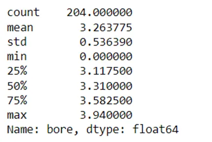
Distribution
sns.displot(df.bore, kde=True)
plt.title("Distribution of Bore Values")
plt.show()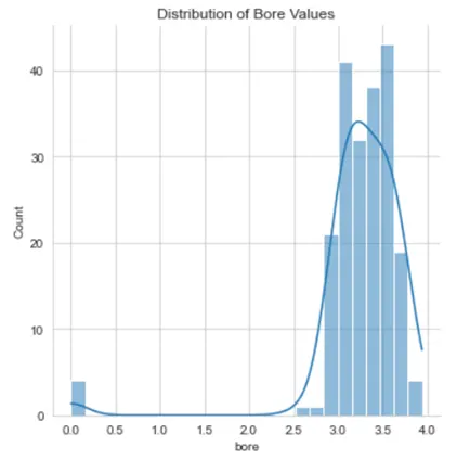
Handling Outliers
df['bore'] = df['bore'].apply(lambda x: df['bore'].median() if (x==0) else x)sns.displot(df.bore, kde=True)
plt.title("Distribution of Bore Values")
plt.show()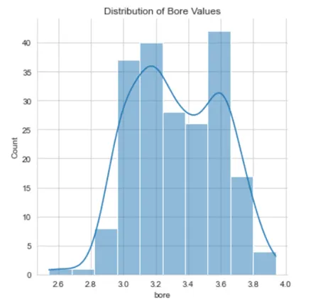
3. stroke
plt.figure(figsize=(15,10))
sns.countplot(df['stroke'])
plt.title("Stroke values")
plt.show()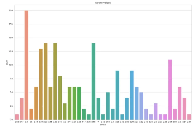
df['stroke'] = df['stroke'].apply(lambda x: return_number(x))df['stroke'].describe()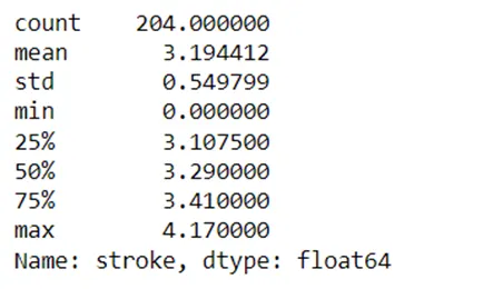
Distribution
sns.displot(df.stroke, kde=True)
plt.title("Distribution of Stroke Values")
plt.show()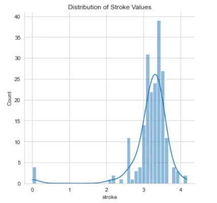
Handling Outliers
df['stroke'] = df['stroke'].apply(lambda x: df['stroke'].median() if (x<2.50) else x)sns.displot(df.stroke, kde=True)
plt.title("Distribution of Stroke Values")
plt.show()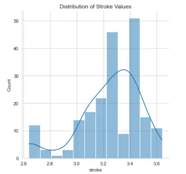
4. horsepower
plt.figure(figsize=(15,10))
sns.countplot(df['horsepower'])
plt.title("Horsepower values")
plt.show()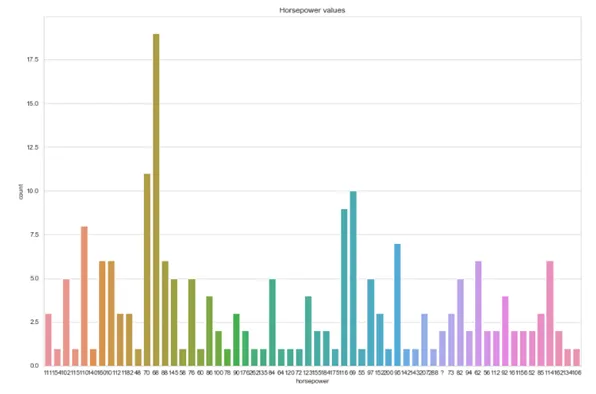
df['horsepower'] = df['horsepower'].apply(lambda x: return_number(x))df['horsepower'].describe()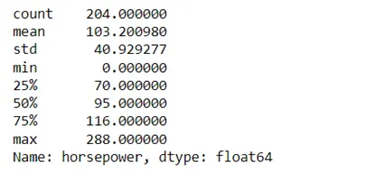
Distribution
sns.displot(df.horsepower, kde=True)
plt.title("Distribution of Horsepower Values")
plt.show()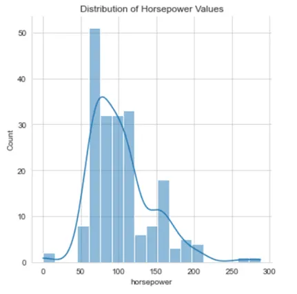
Handling Outliers
df['horsepower'] = df['horsepower'].apply(lambda x: df['horsepower'].median() if (x==0 or x>250) else x)sns.displot(df.horsepower, kde=True)
plt.title("Distribution of Horsepower Values")
plt.show() 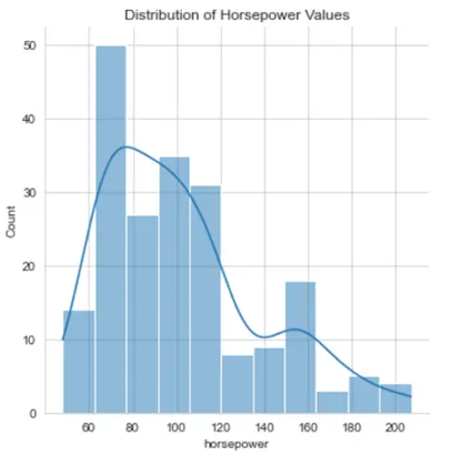
5. peak_rpm
plt.figure(figsize=(15,10))
sns.countplot(df['peak_rpm'])
plt.title("Peak rpm")
plt.show()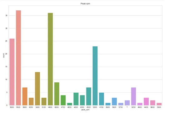
df['peak_rpm'] = df['peak_rpm'].apply(lambda x: return_number(x))df['peak_rpm'].describe()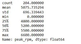
Distribution
sns.displot(df.peak_rpm, kde=True)
plt.title("Distribution of Peak rpm Values")
plt.show()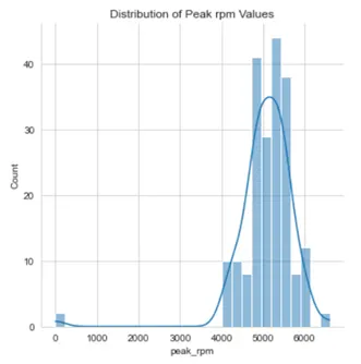
Handling Outliers
df['peak_rpm'] = df['peak_rpm'].apply(lambda x: df['peak_rpm'].median() if (x==0 or x>6300) else x)sns.displot(df.peak_rpm, kde=True)
plt.title("Distribution of Peak rpm Values")
plt.show() 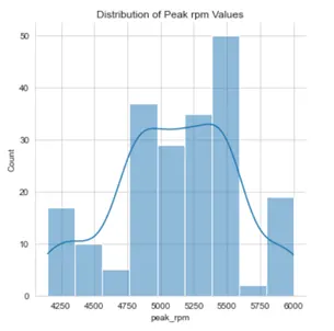
Checking the categorical and numerical features
df.select_dtypes(include='number').head()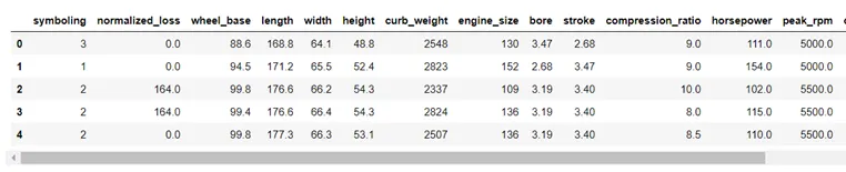
df.select_dtypes(exclude='number').head()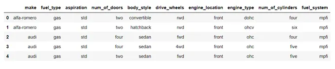
Analysing Numerical Features
plt.figure(figsize=(15,10))
sns.heatmap(df.select_dtypes(include='number').corr(), annot=True)
plt.title("Correlation of all the Numerical Features")
plt.show()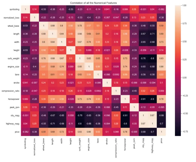
Observations
1. Miles per gallon is separetely mentioned for city and highway and they are having high correlation with themselves.
2. height, weight, width etc., are having high correlation in themselves.
Performing Feature Engineering on the Observed Features
Combining both 'mpg' features
df['mpg'] = (df['city_mpg'] + df['highway_mpg'])/2
df.drop(['city_mpg','highway_mpg'], axis=1, inplace=True)
Combining all the dimensional features
df['vol'] = (df['width']*df['length']*df['height'])/(12.54**3)
df.drop(['width','length','height'], axis=1, inplace=True)
Looking into the data
df.select_dtypes(include='number').head()
plt.figure(figsize=(15,10))
sns.heatmap(df.select_dtypes(include='number').corr(), annot=True)
plt.title("Correlation of all the Numerical Features")
plt.show()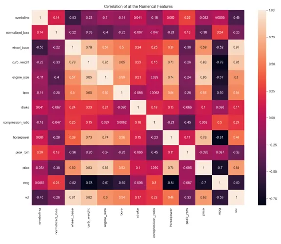
Feature Engineering on Remaining Features
df['weight'] = (df['wheel_base']*df['curb_weight']*df['engine_size'])/3
df.drop(['wheel_base','curb_weight','engine_size'], axis=1, inplace=True)
df['size'] = (df['vol']*df['weight'])/9.81
df.drop(['vol','weight'], axis=1, inplace=True)df['force'] = (df['horsepower'])/(df['bore']*df['stroke'])
df.drop(['horsepower','bore','stroke'], axis=1, inplace=True)plt.figure(figsize=(10,7))
sns.heatmap(df.select_dtypes(include='number').corr(), annot=True)
plt.title("Correlation of all the Numerical Features")
plt.show()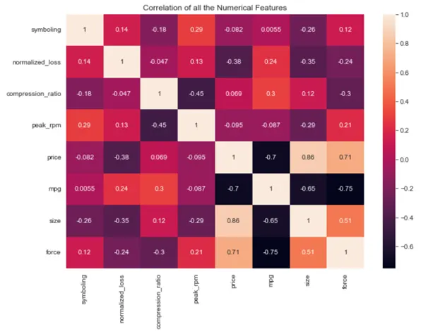
Dropping the Features with Less Correlation with 'price' and 'mpg'
df.drop(['symboling','normalized_loss','compression_ratio','peak_rpm'], axis=1, inplace=True)plt.figure(figsize=(10,7))
sns.heatmap(df.select_dtypes(include='number').corr(), annot=True)
plt.title("Correlation of all the Numerical Features")
plt.show()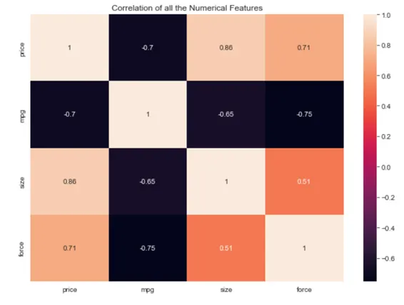
Observtions
1. The newly created features have high correlation with miles per gallons and price.
2. So we can predict the values of 'price' or 'mpg' using 'force' and 'size' for better results
Analysing Categorical Features
df.select_dtypes(exclude='number').head()
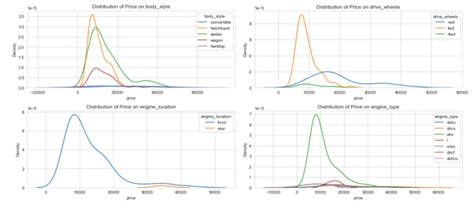
Plotting 'price' Variation with Categorical Features
fig, axes = plt.subplots(4,2)
fig.set_figheight(15)
fig.set_figwidth(15)

for ax,col in zip(axes.flatten(), cat_columns):
    sns.kdeplot(ax=ax, data=df, x='price', hue=col)
    ax.set_title("Distribution of Price on " + str(col))
    plt.tight_layout()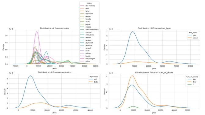
Observations
1. Features like 'make', 'engine_type' and 'style' has highly overlapping distributions.
2. From this it is understood that the categorical features are less useful to predict the 'price'.
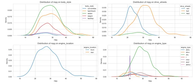
Plotting 'mpg' Variation with Categorical Features
fig, axes = plt.subplots(4,2)
fig.set_figheight(15)
fig.set_figwidth(15)

for ax,col in zip(axes.flatten(), cat_columns):
    sns.kdeplot(ax=ax, data=df, x='mpg', hue=col)
    ax.set_title("Distribution of mpg on " + str(col))
    plt.tight_layout()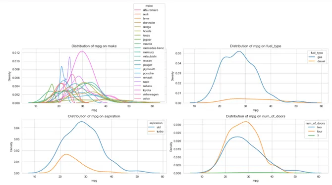
Observations
1. Features like 'make', 'door_style' and 'engine_type' has highly overlapping distributions.
2. From this it is understood that the categorical features are less useful to predict the 'miles per gallon'.