Project 2 - Supply and Demand Gap Analysis
AIM
The objective of this case study is to follow the primary steps of a data analysis project.
- Data Understanding
- Data Import and Cleaning process
- Choose recommended graphs for visualization and know the purpose of those graphs
Introduction
Zomato kicked off essentially as a rebranded version of the food directory services Foodiebay. Goyal and Chaddah, both IIT graduates and both working as analysts at Bain and Company back then, had started Foodiebay in 2008.
In a matter of just nine months, FoodieBay became the largest restaurant directory in Delhi NCR. After two successful years, the company was rebranded Zomato and since then there was no looking back.
With support from its investors and multiple rounds of consecutive funding, Zomato built not only its valuation but also an interesting portfolio of investors which includes Info Edge India, Sequoia, Vy Capital, Singapore-based investment firm Temasek, and Alibaba’s Ant Financial. Ant Financial’s $200 Mn investment earlier this year led Zomato to cross the $1 Bn valuation.
Problem Statement
The ultimate goal of this project is to examine the data in such a way that they can accurately assess their business performance.
Methodology
We will Use Power BI Tool For Data Visualizations in which we will going to use a dataset From Kaggle and will generate beautiful insights.
Analysis
Import Data
- Let’s start with the Get Dataoption under the Home As this is a CSV file, select the Text/CSV option from the drop-down list
- Select the file named csv
- After selecting the file, data will be displayed in the below format
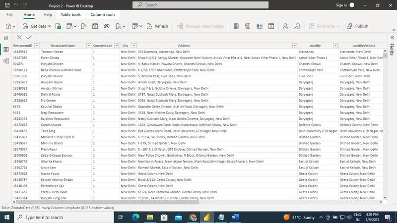
- Click on Load and save data.
Data Cleaning
After importing, it is obvious to go for the data cleaning process.
- Click on Transform Dataunder the Home tab and go to Power Query Editor.
- In Power Query Editor,go to the View tab, enable Column Distribution, Column Quality and Column Profile.
- It will help you to find out missing values, any data errors, any data type mismatch, any outliers
- Based on the above findings, you can take appropriate actions.
- For example, in this data, We have found Error. So for removing errors we have click on remove rows -> remove errors.
- Now click on the Close & Apply button and return to the main Power BI Desktop pane.
Now you are ready to create visualizations. But one thing to remember, based on our visualization requirements, we will create different calculated measures or calculated columns.
Select Theme
Before proceeding to report, you can select one theme for your project. It will help you choose the proper colour combination. For each theme, there have some suggested colours, however, you can very well select any other colour also.
Go to View tab -> Under Themes Select Executive ( you can select based on your choice)
Create Snapshot View
For any summary report or dashboard, it is a good idea to have some snapshot views.
At a glance, the user will get some idea about the current scenario of the business/data.
- Click on Card visual → Added to the canvas area.
- Select field No. Of Countries, No. of Cities & No. of Restaurants.
- Click on Format → Go to Data label and Category Label. Change Color, Font family and Text size. Add some background color to it.
- To derive No. of restaurants → Select the Country column and change to Count (Distinct) from the drop-down.
- Using Format painter, copy the same format for all the Card visuals.
Add Slicer for Country code , Price range and Has Online service.
- Add Slicer visual beside the card visuals.
- Add slicers For sorting data.
- Normally Client are interested to know how many countries or cities are receiving delivery.
Create Clustered Bar Chart “Top 10 Restaurant by city”
- Add Bar Chart to the canvas area.
- Add Cities in Axis and Restaurant id in Values.
- As it is also a comparison analysis, so you can use a bar This time I am using Clustered Bar Chart.
- In the Filters section, select Top N filter type from Cities, add show items 10and by value Restaurant id.
In the Format section, you can do the following changes
- a) choose one Data Colors,
- b) enable Data labels, update Display units based on your choice so that values can be visible properly and easy to follow the data variations.
- c) if you want, you can modify the title, or font size or different text style.
Create Matrix table
- Add matrix Table in canvas area.
- Add Restaurant name , average rating and Average cost for two.
- In this analysis, you want to get some idea overall good restaurants in city .
In the Format section, you can do the following changes
- a) choose one Data Colors
- b) change thetheme
- c) if you want, you can modify the title, or font size or different text style.
Insights
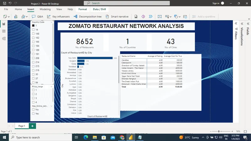
Recommendations
- You can try other types of analysis using this data set.
- Play with different formatting to make it more presentable.
- Add some page background to look more professional.
Conclusions
we have completed a guided case study in Power BI based on the Zomato data set.