Project 2
import pandas as pd
import numpy as np
import matplotlib.pyplot as plt
import seaborn as sns
from sklearn.cluster import KMeans
import plotly.express as exp
In [3]:
df = pd.read_csv('Country-data.csv')
In [4]:
df
Out[4]:
| country | child_mort | exports | health | imports | income | inflation | life_expec | total_fer | gdpp | |
|---|---|---|---|---|---|---|---|---|---|---|
| 0 | Afghanistan | 90.2 | 10.0 | 7.58 | 44.9 | 1610 | 9.44 | 56.2 | 5.82 | 553 |
| 1 | Albania | 16.6 | 28.0 | 6.55 | 48.6 | 9930 | 4.49 | 76.3 | 1.65 | 4090 |
| 2 | Algeria | 27.3 | 38.4 | 4.17 | 31.4 | 12900 | 16.10 | 76.5 | 2.89 | 4460 |
| 3 | Angola | 119.0 | 62.3 | 2.85 | 42.9 | 5900 | 22.40 | 60.1 | 6.16 | 3530 |
| 4 | Antigua and Barbuda | 10.3 | 45.5 | 6.03 | 58.9 | 19100 | 1.44 | 76.8 | 2.13 | 12200 |
| ... | ... | ... | ... | ... | ... | ... | ... | ... | ... | ... |
| 162 | Vanuatu | 29.2 | 46.6 | 5.25 | 52.7 | 2950 | 2.62 | 63.0 | 3.50 | 2970 |
| 163 | Venezuela | 17.1 | 28.5 | 4.91 | 17.6 | 16500 | 45.90 | 75.4 | 2.47 | 13500 |
| 164 | Vietnam | 23.3 | 72.0 | 6.84 | 80.2 | 4490 | 12.10 | 73.1 | 1.95 | 1310 |
| 165 | Yemen | 56.3 | 30.0 | 5.18 | 34.4 | 4480 | 23.60 | 67.5 | 4.67 | 1310 |
| 166 | Zambia | 83.1 | 37.0 | 5.89 | 30.9 | 3280 | 14.00 | 52.0 | 5.40 | 1460 |
167 rows × 10 columns
In [5]:
df.corr()
Out[5]:
| child_mort | exports | health | imports | income | inflation | life_expec | total_fer | gdpp | |
|---|---|---|---|---|---|---|---|---|---|
| child_mort | 1.000000 | -0.318093 | -0.200402 | -0.127211 | -0.524315 | 0.288276 | -0.886676 | 0.848478 | -0.483032 |
| exports | -0.318093 | 1.000000 | -0.114408 | 0.737381 | 0.516784 | -0.107294 | 0.316313 | -0.320011 | 0.418725 |
| health | -0.200402 | -0.114408 | 1.000000 | 0.095717 | 0.129579 | -0.255376 | 0.210692 | -0.196674 | 0.345966 |
| imports | -0.127211 | 0.737381 | 0.095717 | 1.000000 | 0.122406 | -0.246994 | 0.054391 | -0.159048 | 0.115498 |
| income | -0.524315 | 0.516784 | 0.129579 | 0.122406 | 1.000000 | -0.147756 | 0.611962 | -0.501840 | 0.895571 |
| inflation | 0.288276 | -0.107294 | -0.255376 | -0.246994 | -0.147756 | 1.000000 | -0.239705 | 0.316921 | -0.221631 |
| life_expec | -0.886676 | 0.316313 | 0.210692 | 0.054391 | 0.611962 | -0.239705 | 1.000000 | -0.760875 | 0.600089 |
| total_fer | 0.848478 | -0.320011 | -0.196674 | -0.159048 | -0.501840 | 0.316921 | -0.760875 | 1.000000 | -0.454910 |
| gdpp | -0.483032 | 0.418725 | 0.345966 | 0.115498 | 0.895571 | -0.221631 | 0.600089 | -0.454910 | 1.000000 |
In [7]:
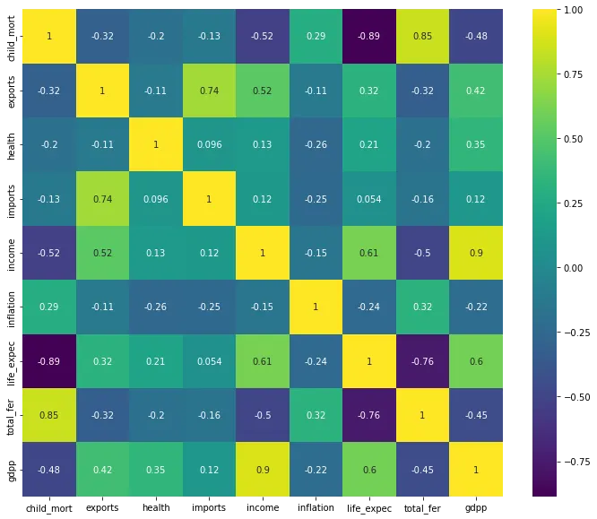
fig = plt.figure(figsize=(12,10))
ax = sns.heatmap(df.corr(),annot = True,cmap='viridis')
plt.show()
In [11]:
from sklearn.preprocessing import MinMaxScaler
scalar = MinMaxScaler()
In [12]:
scaled_data = scalar.fit_transform(df.drop('country',axis = 1))
In [14]:
scaled_df = pd.DataFrame(data = scaled_data,columns=df.columns[1:])
scaled_df['country'] = df['country']
scaled_df
Out[14]:
| child_mort | exports | health | imports | income | inflation | life_expec | total_fer | gdpp | country | |
|---|---|---|---|---|---|---|---|---|---|---|
| 0 | 0.426485 | 0.049482 | 0.358608 | 0.257765 | 0.008047 | 0.126144 | 0.475345 | 0.736593 | 0.003073 | Afghanistan |
| 1 | 0.068160 | 0.139531 | 0.294593 | 0.279037 | 0.074933 | 0.080399 | 0.871795 | 0.078864 | 0.036833 | Albania |
| 2 | 0.120253 | 0.191559 | 0.146675 | 0.180149 | 0.098809 | 0.187691 | 0.875740 | 0.274448 | 0.040365 | Algeria |
| 3 | 0.566699 | 0.311125 | 0.064636 | 0.246266 | 0.042535 | 0.245911 | 0.552268 | 0.790221 | 0.031488 | Angola |
| 4 | 0.037488 | 0.227079 | 0.262275 | 0.338255 | 0.148652 | 0.052213 | 0.881657 | 0.154574 | 0.114242 | Antigua and Barbuda |
| ... | ... | ... | ... | ... | ... | ... | ... | ... | ... | ... |
| 162 | 0.129503 | 0.232582 | 0.213797 | 0.302609 | 0.018820 | 0.063118 | 0.609467 | 0.370662 | 0.026143 | Vanuatu |
| 163 | 0.070594 | 0.142032 | 0.192666 | 0.100809 | 0.127750 | 0.463081 | 0.854043 | 0.208202 | 0.126650 | Venezuela |
| 164 | 0.100779 | 0.359651 | 0.312617 | 0.460715 | 0.031200 | 0.150725 | 0.808679 | 0.126183 | 0.010299 | Vietnam |
| 165 | 0.261441 | 0.149536 | 0.209447 | 0.197397 | 0.031120 | 0.257000 | 0.698225 | 0.555205 | 0.010299 | Yemen |
| 166 | 0.391918 | 0.184556 | 0.253574 | 0.177275 | 0.021473 | 0.168284 | 0.392505 | 0.670347 | 0.011731 | Zambia |
167 rows × 10 columns
In [17]:
exp.histogram(data_frame = df,x = 'gdpp',nbins = 167, opacity = 0.75,barmode ='overlay')
020k40k60k80k100k051015202530
gdppcount
In [18]:
exp.scatter(data_frame=df,x = 'child_mort',y = 'health',color = 'country')
05010015020024681012141618
countryAfghanistanAlbaniaAlgeriaAngolaAntigua and BarbudaArgentinaArmeniaAustraliaAustriaAzerbaijanBahamasBahrainBangladeshBarbadosBelarusBelgiumBelizeBeninBhutanBoliviaBosnia and HerzegovinaBotswanaBrazilBruneiBulgariaBurkina FasoBurundiCambodiaCameroonCanadaCape VerdeCentral African RepublicChadChileChinaColombiaComorosCongo, Dem. Rep.Congo, Rep.Costa RicaCote d'IvoireCroatiaCyprusCzech RepublicDenmarkDominican RepublicEcuadorEgyptEl SalvadorEquatorial GuineaEritreaEstoniaFijiFinlandFranceGabonGambiaGeorgiaGermanyGhanaGreeceGrenadaGuatemalaGuineaGuinea-BissauGuyanaHaitiHungaryIcelandIndiaIndonesiaIranIraqIrelandIsraelItalyJamaicaJapanJordanKazakhstanKenyaKiribatiKuwaitKyrgyz RepublicLaoLatviaLebanonLesothoLiberiaLibyaLithuaniaLuxembourgMacedonia, FYRMadagascarMalawiMalaysiaMaldivesMaliMaltaMauritaniaMauritiusMicronesia, Fed. Sts.MoldovaMongoliaMontenegroMoroccoMozambiqueMyanmarNamibiaNepalNetherlandsNew ZealandNigerNigeriaNorwayOmanPakistanPanamaParaguayPeruPhilippinesPolandPortugalQatarRomaniaRussiaRwandaSamoaSaudi ArabiaSenegalSerbiaSeychellesSierra LeoneSingaporeSlovak RepublicSloveniaSolomon IslandsSouth AfricaSouth KoreaSpainSri LankaSt. Vincent and the GrenadinesSudanSurinameSwedenSwitzerlandTajikistanTanzaniaThailandTimor-LesteTogoTongaTunisiaTurkeyTurkmenistanUgandaUkraineUnited Arab EmiratesUnited KingdomUnited StatesUruguayUzbekistanVanuatuVenezuelaVietnamYemenZambiachild_morthealth
In [20]:
df = scaled_df.drop('country',axis = 1)
In [21]:
ssd = []
K = range(1,10)
for k in K:
km = KMeans(n_clusters = k)
km = km.fit(df)
ssd.append(km.inertia_)
C:\Users\DELL\anaconda3\lib\site-packages\sklearn\cluster\_kmeans.py:881: UserWarning:

KMeans is known to have a memory leak on Windows with MKL, when there are less chunks than available threads. You can avoid it by setting the environment variable OMP_NUM_THREADS=1.
In [22]:
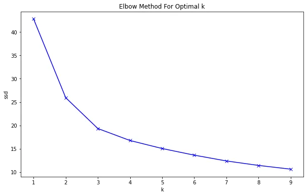
plt.figure(figsize = (10,6))
plt.plot(K, ssd, 'bx-')
plt.xlabel('k')
plt.ylabel('ssd')
plt.title('Elbow Method For Optimal k')
plt.show()
In [23]:
kmean = KMeans(n_clusters = 3)
kmean.fit(df)
Out[23]:
KMeans(n_clusters=3)
In [24]:
pred = kmean.labels_
print(pred)
[1 2 2 1 2 2 2 0 0 2 2 2 2 2 2 0 2 1 2 2 2 2 2 0 2 1 1 2 1 0 2 1 1 2 2 2 1
 1 1 2 1 2 0 0 0 2 2 2 2 1 1 2 2 0 0 1 1 2 0 1 0 2 2 1 1 2 1 2 0 2 2 2 1 0
 0 0 2 0 2 2 1 1 0 2 1 2 2 1 1 2 2 0 2 1 1 2 2 1 0 1 2 2 2 2 2 2 1 2 1 2 0
 0 1 1 0 2 1 2 2 2 2 2 0 0 2 2 1 2 2 1 2 2 1 0 0 0 1 2 0 0 2 2 1 2 0 0 2 1
 2 1 1 2 2 2 2 1 2 0 0 0 2 2 2 2 2 1 1]
In [25]:
exp.scatter(data_frame = df,x = 'gdpp', y = 'income',color=kmean.labels_)
00.20.40.60.8100.20.40.60.81
00.511.52colorgdppincome
In [27]:
from sklearn.decomposition import PCA
pca = PCA(n_components = 2)
pca_model = pca.fit_transform(df)
data_transform = pd.DataFrame(data = pca_model,columns = ['PCA1','PCA2'])
data_transform['Cluster'] = pred
In [28]:
data_transform.head()
Out[28]:
| PCA1 | PCA2 | Cluster | |
|---|---|---|---|
| 0 | -0.599078 | 0.095490 | 1 |
| 1 | 0.158474 | -0.212092 | 2 |
| 2 | 0.003686 | -0.135867 | 2 |
| 3 | -0.650235 | 0.275975 | 1 |
| 4 | 0.200711 | -0.064662 | 2 |
In [32]:
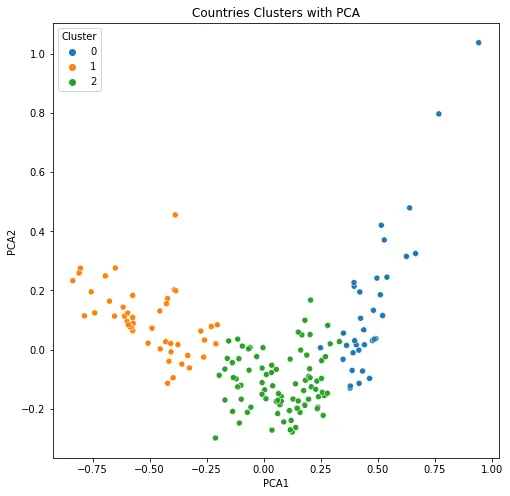
plt.figure(figsize = (8,8))
g = sns.scatterplot(data = data_transform, x = 'PCA1', y = 'PCA2', palette = sns.color_palette()[:3],hue = 'Cluster')
title = plt.title('Countries Clusters with PCA')