Project 2
1. Importing Dataset:
In[1]:
# 'Importing the required Libraries'
from os import execl
import numpy as np
import pandas as pd
import matplotlib.pyplot as plt
from sklearn.cluster import KMeans
import seaborn as sns

# 'Importing the dataset using pandas'
df=pd.read_csv("auto-mpg_kaggle.csv")

# 'Printing the first 5 rows in the Data Frame'
df.head()
Out[1]:
| mpg | cylinders | displacement | horsepower | weight | acceleration | model year | origin | car name | |
|---|---|---|---|---|---|---|---|---|---|
| 0 | 18.0 | 8 | 307.0 | 130 | 3504 | 12.0 | 70 | 1 | chevrolet chevelle malibu |
| 1 | 15.0 | 8 | 350.0 | 165 | 3693 | 11.5 | 70 | 1 | buick skylark 320 |
| 2 | 18.0 | 8 | 318.0 | 150 | 3436 | 11.0 | 70 | 1 | plymouth satellite |
| 3 | 16.0 | 8 | 304.0 | 150 | 3433 | 12.0 | 70 | 1 | amc rebel sst |
| 4 | 17.0 | 8 | 302.0 | 140 | 3449 | 10.5 | 70 | 1 | ford torino |
In[2]:
# "Describing the Data frame"
df.describe()
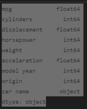
print(df.dtypes)
Out[2]:
| mpg | cylinders | displacement | horsepower | weight | acceleration | model year | origin | |
|---|---|---|---|---|---|---|---|---|
| count | 398.000000 | 398.000000 | 398.000000 | 398.000000 | 398.000000 | 398.000000 | 398.000000 | 398.000000 |
| mean | 23.514573 | 5.454774 | 193.425879 | 104.185930 | 2970.424623 | 15.568090 | 76.010050 | 1.572864 |
| std | 7.815984 | 1.701004 | 104.269838 | 38.292729 | 846.841774 | 2.757689 | 3.697627 | 0.802055 |
| min | 9.000000 | 3.000000 | 68.000000 | 46.000000 | 1613.000000 | 8.000000 | 70.000000 | 1.000000 |
| 25% | 17.500000 | 4.000000 | 104.250000 | 75.000000 | 2223.750000 | 13.825000 | 73.000000 | 1.000000 |
| 50% | 23.000000 | 4.000000 | 148.500000 | 93.500000 | 2803.500000 | 15.500000 | 76.000000 | 1.000000 |
| 75% | 29.000000 | 8.000000 | 262.000000 | 125.000000 | 3608.000000 | 17.175000 | 79.000000 | 2.000000 |
| max | 46.600000 | 8.000000 | 455.000000 | 230.000000 | 5140.000000 | 24.800000 | 82.000000 | 3.000000 |
2. EDA: Finding Correlation between Parameters:
In[3]:
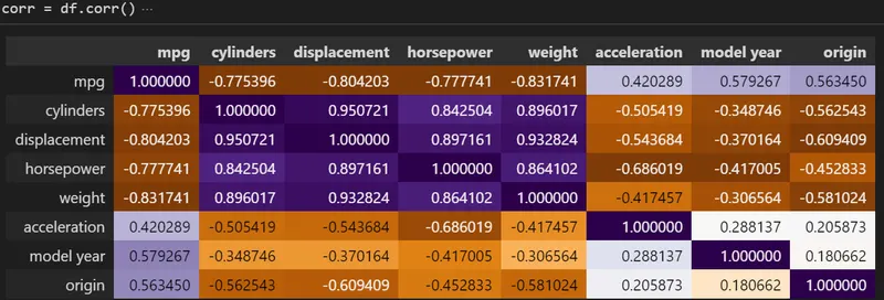
# 'Finding the Correlation between the input parameters to predict the output'
corr = df.corr()
corr.style.background_gradient(cmap='PuOr')
Out[3]:
In[4]:
# 'Heatsink correlation'
sns.heatmap(df.corr(), annot = True)
plt.savefig("auto-mpg_kaggle.jpg")
plt.show()
Out[4]:
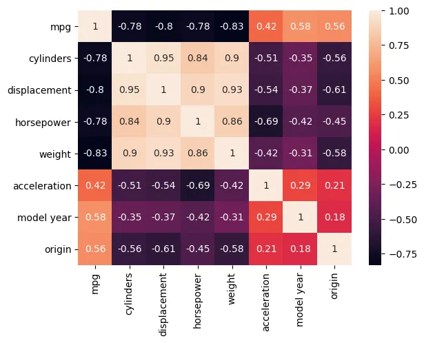
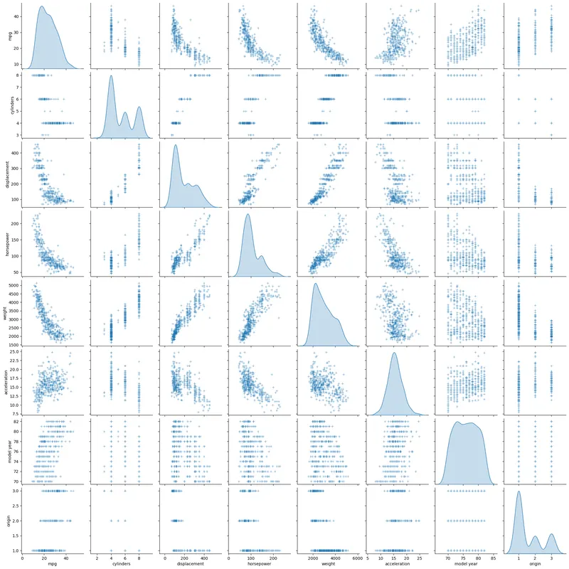
From the above two correlation technique it is clear that the following parameters will have more weight in predicting the perfect clusters:
1. No.of cylinders.
2. Displacement.
3. Horse Power.
4. Weight.
In[5]:
# 'Pair plot'
sns.pairplot(df, diag_kind = "kde", markers = "+")
plt.show()
Out[5]:
In[6]:
# 'Dropping the colums which are not useful'
df_1 = df.drop(columns=["model year", "car name"])
df_1.head()
Out[6]:
| mpg | cylinders | displacement | horsepower | weight | acceleration | origin | |
|---|---|---|---|---|---|---|---|
| 0 | 18.0 | 8 | 307.0 | 130 | 3504 | 12.0 | 1 |
| 1 | 15.0 | 8 | 350.0 | 165 | 3693 | 11.5 | 1 |
| 2 | 18.0 | 8 | 318.0 | 150 | 3436 | 11.0 | 1 |
| 3 | 16.0 | 8 | 304.0 | 150 | 3433 | 12.0 | 1 |
| 4 | 17.0 | 8 | 302.0 | 140 | 3449 | 10.5 | 1 |
In[7]:
# 'Implementing the all the colums in standard format'
scaler = StandardScaler()
df_scaled = scaler.fit_transform(df_1)
df_scaled
Out[7]:
array([[-0.7064387 , 1.49819126, 1.0906037 , ..., 0.63086987, -1.29549834, -0.71514478],
[-1.09075062, 1.49819126, 1.5035143 , ..., 0.85433297, -1.47703779, -0.71514478],
[-0.7064387 , 1.49819126, 1.19623199, ..., 0.55047045, -1.65857724, -0.71514478],
...,
[ 1.08701694, -0.85632057, -0.56103873, ..., -0.79858454, -1.4407299 , -0.71514478],
[ 0.57460104, -0.85632057, -0.70507731, ..., -0.40841088, 1.10082237, -0.71514478],
[ 0.95891297, -0.85632057, -0.71467988, ..., -0.29608816, 1.39128549, -0.71514478]])
3. Clustering:
3a.K-Means Clustering:
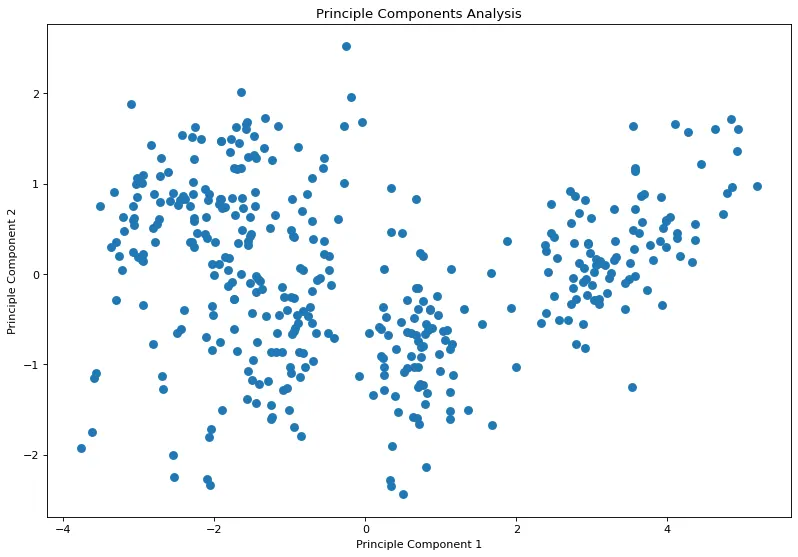
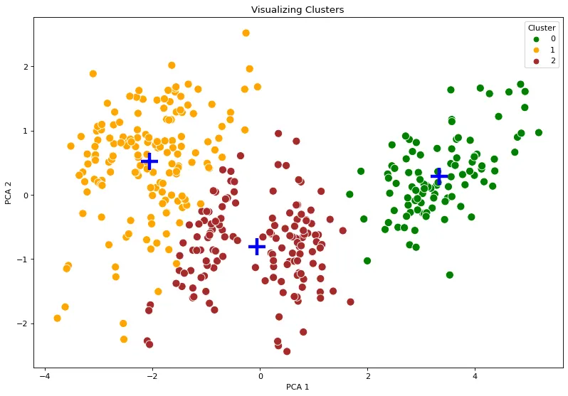
To reduce the feature size using the PCA technique.
In[8]:
# Reducing the Number of Features in the Dataset using PCA
pca = PCA(2)
pca_data = pca.fit_transform(df_scaled)

plt.rcParams["figure.figsize"] = (12, 8)
plt.rcParams["figure.dpi"] = 80
plt.scatter(x=pca_data[:,0], y=pca_data[:,1], lw=2)
plt.xlabel("Principle Component 1")
plt.ylabel("Principle Component 2")
plt.title("Principle Components Analysis")
plt.show()
Out[8]:
In[9]:
# 'To find the optimum clusters by Elbow Curve method'
k_range=range(1,10)
sse=[]
for k in k_range:
    km=KMeans(n_clusters=k)
    km.fit(df_scaled)
    sse.append(km.inertia_)
print(sse)
plt.plot(k_range,sse)
plt.show()
Out[9]:
[2786.0000000000014, 1242.5014943571473, 844.2488691571539, 670.6355481197716, 567.9699640996866, 502.44711077200765, 445.74932889207753, 408.4932093481778, 384.2047906386553]
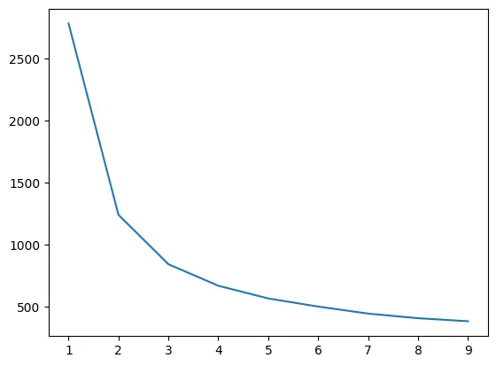
From the above elbow curve the optimum no.of clusters will be 3.
In[10]:
# 'K-Means Clustering'
kmeans = KMeans(n_clusters = 3, init = 'k-means++', random_state = 42)
y_kmeans = pd.Series(kmeans.fit_predict(df_scaled))
y_kmeans

centroids = kmeans.cluster_centers_
centroids_pca = pca.transform(centroids)

pca_dataframe = pd.DataFrame(pca_data, columns=["PCA 1", "PCA 2"])
pca_dataframe["Cluster"] = y_kmeans
pca_dataframe.sample(10)

plt.rcParams["figure.figsize"] = (12, 8)
plt.rcParams["figure.dpi"] = 80
sns.scatterplot(x="PCA 1", y="PCA 2", hue="Cluster", data=pca_dataframe, palette=['green','orange','brown'], s=100)
plt.scatter(x=centroids_pca[:, 0], y=centroids_pca[:, 1], marker="+", s=500, linewidths=3, lw=4,, zorder=10)
plt.title("Visualizing Clusters")
plt.show()
Out[10]:
In[11]:
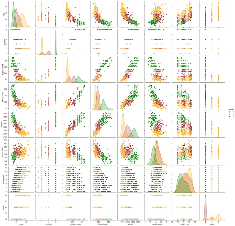
# 'Pair plot after Clustering'
df["Cluster"] = y_kmeans

sns.pairplot(df, hue="Cluster", palette=['green','orange','brown'])
plt.show()
Out[11]:
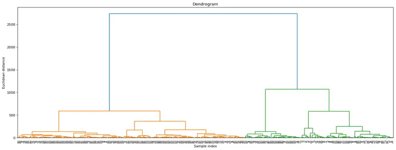
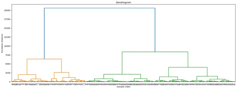
3b.Hierarchical clustering:
In[12]:
# 'Hierarchical clustering'
import scipy.cluster.hierarchy as sc
from scipy.cluster.hierarchy import dendrogram , linkage

#Linkage Matrix
Z = linkage(df_1, method = 'ward')

#plotting dendrogram
dendro = dendrogram(Z)
plt.title('Dendrogram')
plt.ylabel('Euclidean distance')
plt.show()
Out[12]: