Project 1 - COVID-19 Vaccinations Trend Analysis
AIM
The objective of this case study is to follow the primary steps of a data analysis project.
- Data Understanding
- Data Import and Cleaning process
- Create Relationship
- Choose recommended graphs for visualization and know the purpose of those graphs
Introduction
we are going to explore COVID vaccine data and try to find out the inference of how the immunization process is going on worldwide.
Problem Statement
How we can Detect the Number of countries Vaccinated or are safe to Travel and how much countries are left in Vaccination?
Methodology
We will Use Power BI Tool For Data Visualizations in which we will going to use a data provided by Skill Lync name “Country vaccinations” and will generate beautiful insights.
Analysis
Import Data
- Let’s start with the Get Dataoption under the Home As this is a CSV file, select the Text/CSV option from the drop-down list
- Select the file named csv
- After selecting the file, data will be displayed in the below format
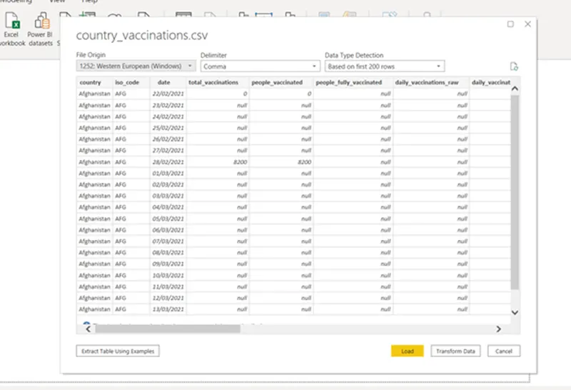
- Click on Load and save data.
Data Cleaning
After importing, it is obvious to go for the data cleaning process.
- Click on Transform Data under the Home tab and go to Power Query Editor.
- In Power Query Editor,go to the View tab, enable Column Distribution, Column Quality and Column Profile.
- It will help you to find out missing values, any data errors, any data type mismatch, any outliers
- Based on the above findings, you can take appropriate actions.
- For example, in this data, we have daily vaccinations rawwhich has 90% empty rows that means it has missing Whereas daily vaccinations has less than 1% empty rows. Both columns have the same purpose. So, we can remove daily vaccinations raw.
- Right Click on Country → Click on Replace Values and replace “England” with “United Kingdom”.
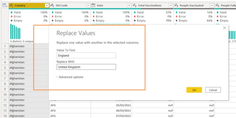 Now click on the Close & Applybutton and return to the main Power BI Desktop pane.
Create Date Table
- First, create one Date table before proceeding to any calculation.
- Here you will use the DAX function and this date table will help you to do Time Intelligence
- Go to the Modelling tab → Click on the New table
- Write “Date Table = CALENDARAUTO ()” and the automatic date table is now in place.
Create Relationship
Now you have two tables and it’s time to create a relationship between them.
- Click on “Model” from the left side navigation bar.
- Click on the date columnof the country vaccinations table, then drag & drop to the date column of the Date Table.
- A many to one relationship is created.
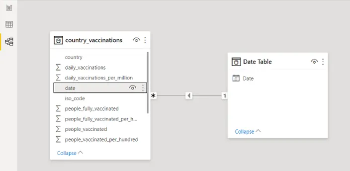
Now you are ready to create visualizations. But one thing to remember, based on our visualization requirements, we will create different calculated measures or calculated columns.
Select Theme
Before proceeding to report, you can select one theme for your project. It will help you choose the proper colour combination. For each theme, there have some suggested colours, however, you can very well select any other colour also.
Go to View tab -> Under Themes Select Executive ( you can select based on your choice)
Create Snapshot View
For any summary report or dashboard, it is a good idea to have some snapshot views.
At a glance, the user will get some idea about the current scenario of the business/data.
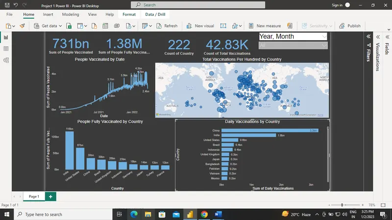
- Click on Card visual → Added to the canvas area.
- Select field People Fully Vaccinated
- Click on Format → Go to Data label and Category Label. Change Color, Font family and Text size. Add some background color to it.
- Follow the same process for Total Vaccinations, People Vaccinated and Total Country.
- To derive Total Country → Select the Country column and change to Count (Distinct) from the drop-down.
- Using Format painter, copy the same format for all the Card visuals.
Add Year, Month Slicer
- Add Slicer visual beside the card visuals.
- Add Date Hierarchy → Keep only Year and Month.
- Normally people are interested to know how the vaccine process is going month on month.
Create Line Graph “People Vaccinated by Date”
- Add Line Chart to the canvas area.
- Add Date in Axis and People Vaccinated in Values. As it is a trend analysis (based on date, that’s why it is called trend), it is preferable to use a line graph to show how data varies over time.
- In the Format section, you can do the following changes
- a) choose one Data Colors,
- b) enable Data labels, update Display units based on your choice so that values can be visible properly and easy to follow the data variations. But across all reports, try to keep the same display units, it will help any user to understand the data variations.
- c) if you want, you can modify the title, or font size or different text style.
Create Clustered Column Chart “Top 10 Country by People Fully Vaccinated”
- Add Bar Chart to the canvas area.
- Add Country in Axis andPeople Fully Vaccinated in Values.
- To display anycomparison analysis, it is preferable to use a clustered column chart.
- In theFilters section, select Top N filter type from Country, add show items 10 and By value People Fully Vaccinated.
In the Format section, you can do the following changes
a) choose one Data Colors,
b) enable Data labels, update Display units based on your choice so that values can be visible properly and easy to follow the data variations.
c) if you want, you can modify the title, or font size or different text style.
Create Clustered Bar Chart “Top 10 Country by Daily Vaccinations”
- Add Bar Chart to the canvas area.
- Add Country in Axis and Daily Vaccinations in Values.
- As it is also a comparison analysis, so you can use a bar This time I am using Clustered Bar Chart.
- In the Filters section, select Top N filter type from Country, add show items 10and by value Daily Vaccinations.
In the Format section, you can do the following changes
- a) choose one Data Colors,
- b) enable Data labels, update Display units based on your choice so that values can be visible properly and easy to follow the data variations.
- c) if you want, you can modify the title, or font size or different text style.
Create Map Visual “Total Vaccinations by Country”
- Add Map visual to the canvas area.
- Add Country in Location andTotal Vaccinations in Size.
- In this analysis, you want to get some idea overall vaccinations process across all countries. For this, map visual is ideal.
In the Format section, you can do the following changes
- a) choose one Data Colors
- b) change theMap stylesto Grayscale, update Bubbles size
- c) if you want, you can modify the title, or font size or different text style.
Insights
Recommendations
- You can try other types of analysis using this data set.
- Play with different formatting to make it more presentable.
- Add some page background to look more professional.
Conclusions
we have completed a guided case study in Power BI based on the Given data set.