Project 1 - COVID-19 Vaccinations Trend Analysis
COVID-19 Vaccinations Trend Analysis
Aim:
The aim of this project is to analyse the trend of COVID-19 vaccinations and to determine the effectiveness of the vaccines based on different countries and year and also the fully vaccinated people by country in 2021-2022.
Introduction:
The COVID-19 pandemic has had a wide-reaching impact on the world, and it has been necessary for governments around the world to take steps to mitigate the spread of the virus. Vaccination is one of the most effective ways to control the virus and has been implemented in many countries. In this project, we will analyse the trends of vaccination in different countries and to determine the effectiveness of the vaccine. By examining data, it shows total vaccinated peoples, daily vaccinated people’s details and also shows a website detail. Through the analysis of data, we can find the total vaccinated details.
Problem Statement:
The purpose of this project is to analyse the trend of vaccinations for COVID-19 across different countries and regions in order to understand the effectiveness of different approaches and strategies adopted by the governments to contain the virus. The project will analyse the data related to the number of vaccinations given to people’s daily, total vaccinations by each year, how many peoples are fully vaccinated based on country, the population which has received at least one dose of the vaccine and the different vaccines used and their availability to different countries. The analysis will provide insights into the effectiveness of the strategies adopted by the governments and will help them in taking informed decisions for containing the virus and achieving herd immunity.
Methodology:
The dataset contains information for the period December 2020 to March 2022.
Data Exploration:
Data exploration is the first step of data analysis and it is used to explore and visualized data to take any necessary actions. Based on our understanding of the data we can go with the appropriate data cleaning.
Data Importing:
To Import the data into Power BI, Let’s start with the Get Data option under the home tab. As this is a CSV file, select the Text/CSV option from the drop-down list and the select the file named. After selecting the file, data will be displayed Click on Load and save data.
Data Cleaning:
After importing there are 86512 rows and 15 columns. We need to clean the data with the help of Power Query Editor.
To open the Power Query Editor by clicking on Transform Data under the Home tab and go to Power Query Editor.
In Power Query Editor, go to the View tab, enable Column Distribution, Column Quality and Column Profile. It will help you to find out missing values, any data errors, any data type mismatch, any outliers.
I have been replaced the empty values by “0” with the help of Replace values and the data type is changed for date by using the data type in the home tab
Data Visualization:
Power BI is a powerful data visualization tool that can be used to analyse and visualize trends in data related to the COVID-19 pandemic. It provides a variety of data visualizations, including line charts, bar charts, and scatter plots, that can be used to analyse trends in vaccination rates. Additionally, it also provides tools to filter data by a variety of variables, such as geographic region and time period, to provide a more granular look at the data. With Power BI, we can easily create compelling visualizations that can provide a better understanding of the trends in COVID-19 vaccinations.
Analysis:
The dataset contains the following columns
- Country – The name of the countries (223 Countries in total)
- ISO Code – Code initials for the countries
- Date – The date, month and year of the data collected
- Total vaccinations – The total number of vaccinations administered which is nothing but the sum of the doses given on any particular date to the total vaccinations of the previous day.
- People vaccinated – The total number of people who received at least one dose of vaccine. This is also an aggregated column meaning it is the sum of total of the previous day to the vaccinations of the present day.
- People fully vaccinated – The aggregated value of people who received the desired number of doses (min 2 doses and 1 booster dose may or may not be included).
- Daily Vaccinations Raw – gives the raw data collected on vaccinations
- Daily vaccinations – The vaccinations administered on any particular day
- Total vaccinations per 100 – The total vaccinations administered per 100 people which also an aggregated data
- People vaccinated per 100 – The number of people who received at least one dose of vaccine, taking into account for every 100 people
- People fully vaccinated per 100 – For every 100 people how many are fully vaccinated (received min 2 doses)
- Daily vaccinations per million – gives the number of vaccinations administered for every million population on any particular day.
- Vaccines – gives the different vaccines and their manufacturers separated by commas.
- Source name – gives the name of the source from which data is provided.
- Source website – gives the website link from where the data was obtained.
Now we know that what the data set contains to analysis the data.
Before creating the visualization, we will create a new table with the date field for our better action. We will use the DAX Function and this date table will help us to do the Time Intelligence Analysis.
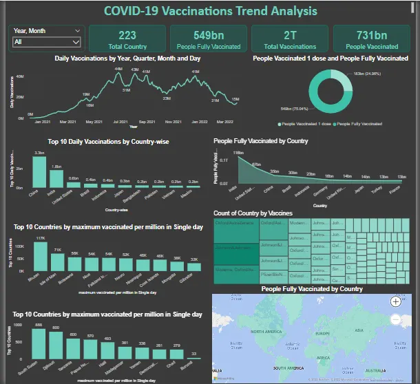
The card visualization has been used to show different numeric values like total countries, vaccination details and number of people vaccinated.
- In this we can see that there are 223 countries available in the given data set
- There are 549 billion Peoples are Fully Vaccinated all over the world.
- Total Vaccinations available is more than 2 trillion.
- There are 731 billion peoples have been Vaccinated at least 1st Dose or 2nd Dose.

The Slicer is added with Year and the Month. It is used to know how the vaccine process is going on.

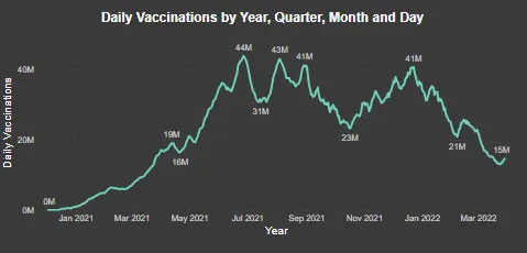
A line graph is used to represent to daily vaccinations versus the date of the record.
- In this line graph we can see the people vaccinated date based on date.
- The Vaccinated ratio is gradually increased from Jan 2021 and it reaches high of 44M on Jun 2021.
- The graph has seen variations in further months where it has dropped to 23 million doses in a day and again seen a raise of 41 million doses. Still around 15 million doses were administered at the end of March 2022.
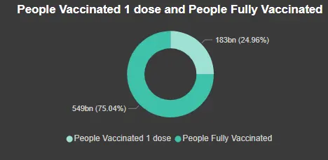
A donut chart has been plotted to represent the People Fully Vaccinated and the People Vaccinated at least one dose.
- From the Donut chart we can that 25% of peoples are vaccinated at least one dose and 75% of peoples are fully vaccinated in the world
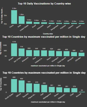
A Bar chart has been plotted to represent the Top 10 Countries by daily Vaccination, Top 10 and Bottom 10 country with maximum vaccinated in single day
- The Country at the Top level of daily vaccination is China and India there are almost 26 billion and 1.83 billion are vaccinated respectively.
- Bhutan is the country which has achieved the benchmark of giving 117k doses of vaccine per million of its population.
- South Sudan is the country which has achieved the lowest benchmark of giving 888 doses of vaccine per million of its population.
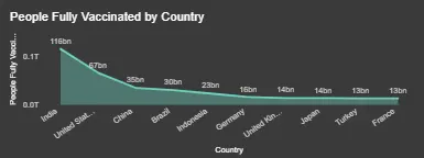
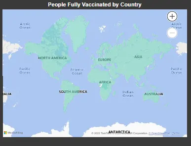
Through the area map we have analysis the top 10 country in which peoples are fully vaccinated.
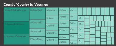
The Tree map is plotted to see the different type of vaccines used different countries.
A map visualization is also shown which gives the population fully vaccinated in different countries and are differentiated based on the colour gradient.
Insights:
The final report provides valuable insights into the vaccination efforts around the world. By analysing the data, it is possible to identify the top 10 sources of vaccines, as well as the countries with the highest rates of fully vaccinated individuals.
The high rate of fully vaccinated showing that people are interested to destroy the deadly virus from the world.
By using the insights gained from this analysis, it is possible to make informed decisions and take effective action to address the challenges posed by COVID-19. So, we can conclude that the analysis of the data has been a valuable and informative process, and it is hoped that the insights gained will be useful in the ongoing efforts to combat the pandemic.
Recommendations:
- We can perform operations with various categories.
- In order to improve the accuracy and usefulness of the data analysis, it is important to ensure that the datasets used are of high quality and are properly cleaned and organized.
- The developed and economically strong countries should help out the under developed and developing countries to improve the vaccination of the people.
- At least 90% of the population should be vaccinated at least once to avoid further problems.
Conclusions:
The results of this analysis reveal that the trend of COVID-19 vaccinations is increasing in many countries. There is evidence that the number of people receiving their first dose of the vaccine is steadily increasing, while the percentage of people receiving their second dose has also been steadily increasing. Additionally, the data shows that the rate of vaccination varies across countries, with some countries having higher rates than others. In general, it appears that the rollout of the vaccine is progressing well, and that more people are becoming vaccinated on a daily basis.