Unsupervised Learning - Kmeans Week 11 Challenge
Objective:
- Brief introduction to K-means algorithm and similarity feature determination.
- Implementation of K-means algorithm in python for automobile dataset.
a) K-means algorithm and similarity feature determination

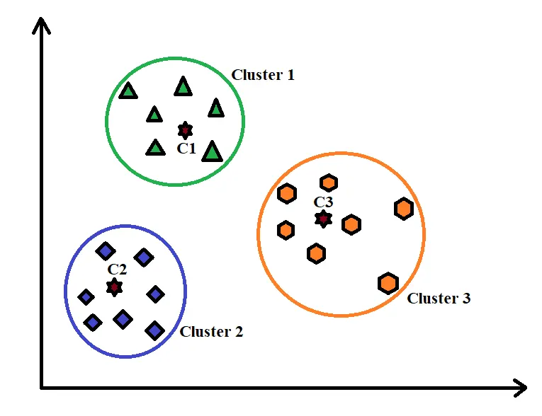
K-means algorithm is a simple iterative machine learning algorithm used in unsupervised learning. The basic idea behind K-means algorithm is to separate data into clusters on the basis of similarity and henceforth identfy the underlying patterns. To achieve this objective, K-means looks for a fixed number (k) of clusters in a datasets. Clusters can be referred to as a collection of datapoints aggregated based on certian similarities.
Steps for k-means clustering
1) Random selection of ‘K’ cluster.
2) Calculate the distance between each data point and cluster centers.
3) Assigning the datapoints to the cluster centre to which the distance is minimum.
4) Recalculate the new cluster center.
5) Reassign the datapoints to the closest new cluster centers.
6) Repeat until data points stay in the same cluster.
Different similarity calculation methods are listed below:
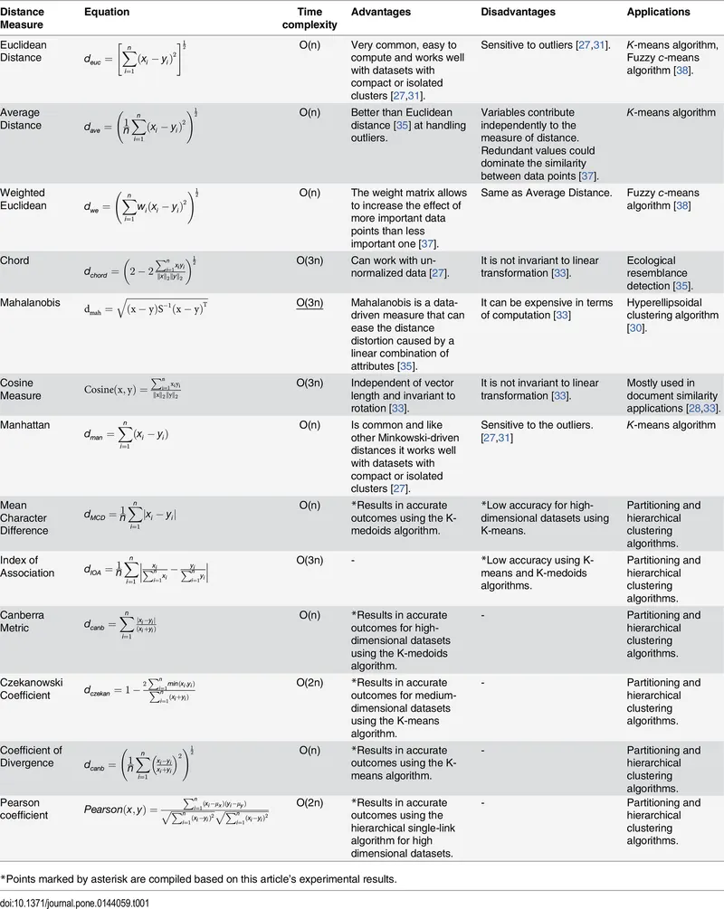
*Source: Shirkhorshidi AS, Aghabozorgi S, Wah TY (2015). A Comparison Study on Similarity and Dissimilarity Measures in Clustering Continuous Data.
Pros:
- Fast, robust and easy to grasp.
- Scales to large dataset.
- The algorithm is relatively efficient.
- Ideal when data set are distinct.
- Generalizes well to clusters of different size and shapes.
Cons:
- Number of clusters 'k' have to be choosen manually.
- Dependent on initial values.
- Sensitive to outliers.
- Trouble working with overlapping data.
b) Implementation of K-means algorithm in python for automobile dataset

# Clustering with K-means algorithm

import pandas as pd
import numpy as np
import matplotlib.pyplot as plt
import seaborn as sns

df = pd.read_csv('D:/MLnAI/Challenges/C6/auto.csv')
print(df.head())
Understanding the type of data variables:
print(df.info())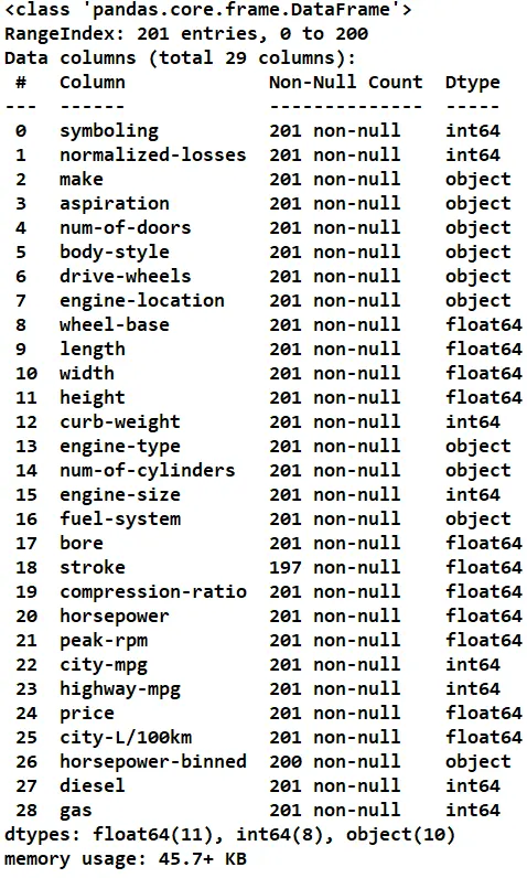
Computing the basic statistics for continuous variables:
print(df.describe())            # excludes variable type 'object'
#df.describe(include=['object']) # includes variable type 'object'
print(df.corr())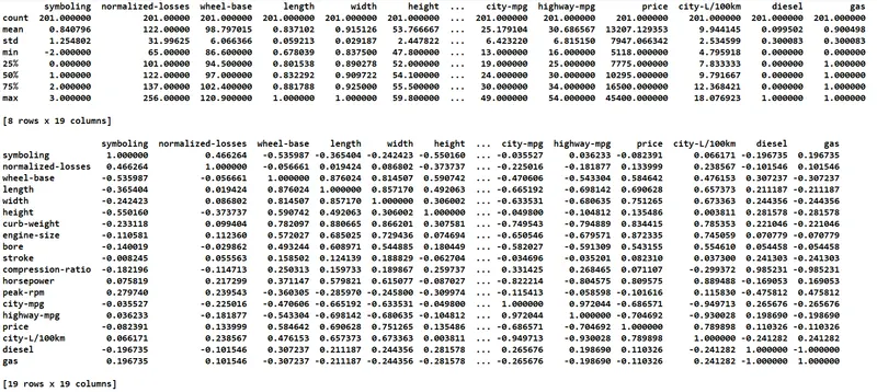
Visualizing the correlation between different variables of the dataset:
# Visualization of correlation with seaborn heatmap
f,ax = plt.subplots(figsize = (10,10))
sns.heatmap(df.corr(),annot = True)
plt.show()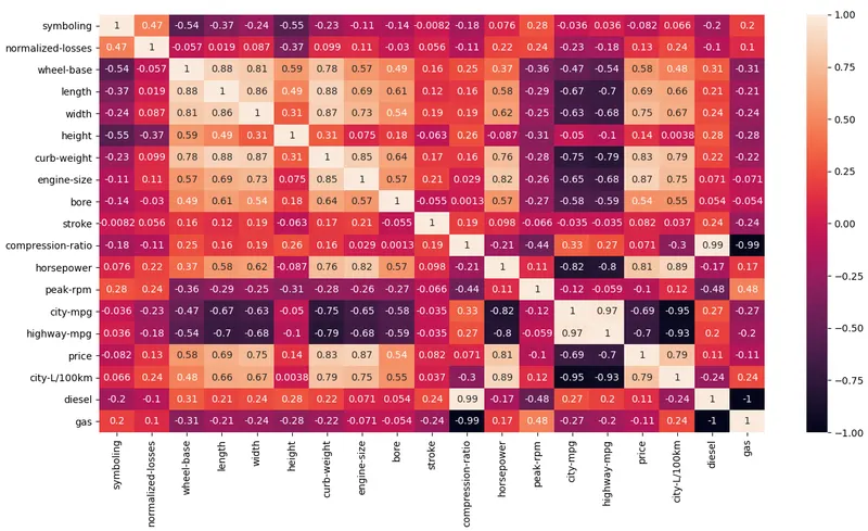
# Numerical variables and their correlation with price
sns.regplot(x="engine-size", y="price", data=df)
plt.show()
print(df[["engine-size", "price"]].corr())
sns.regplot(x="horsepower", y="price", data=df)
plt.show()
print(df[["horsepower", "price"]].corr())
sns.regplot(x="highway-mpg", y="price", data=df)
plt.show()
print(df[["highway-mpg", "price"]].corr())
sns.regplot(x="city-mpg", y="price", data=df)
plt.show()
print(df[["city-mpg", "price"]].corr())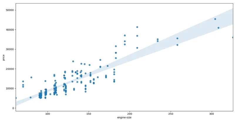
It can be seen that there is a positive correlation between engine-size and price of the automobile.
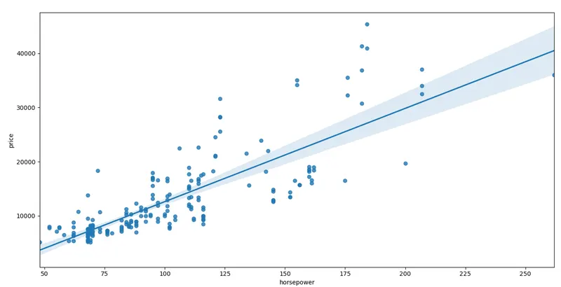
Here also, it could be seen that there is a positive correlation between horsepower and price of the automobile.
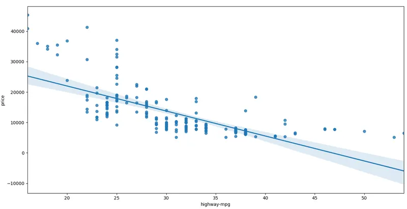
From the above figure, it is quite evident that there is a negative correlation between highway-mpg and price of the automobile.
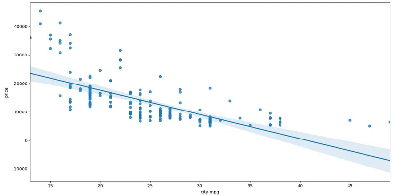
It's evident here also that there is a negative correlation between city-mpg and price of the automobile.
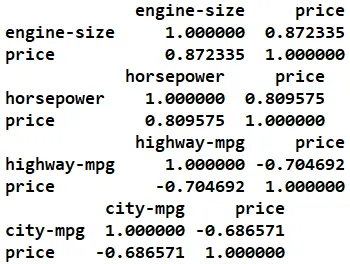
Correlation between different variables is listed below:
# Categorical variables and their correlation with price

sns.boxplot(x="engine-location", y="price", data=df)
plt.show()
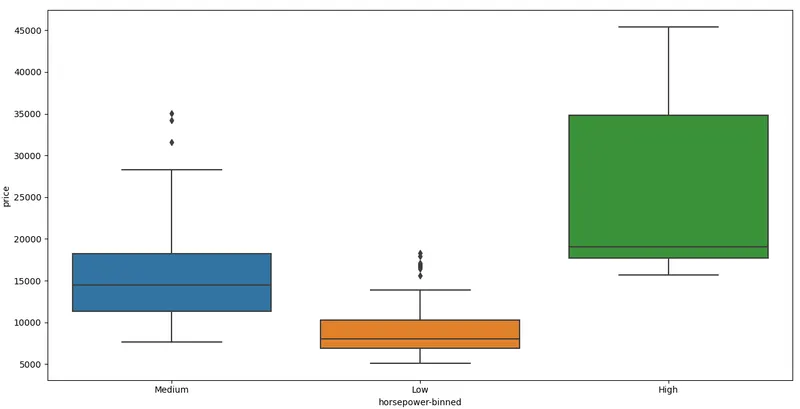
sns.boxplot(x="horsepower-binned", y="price", data=df)
plt.show()
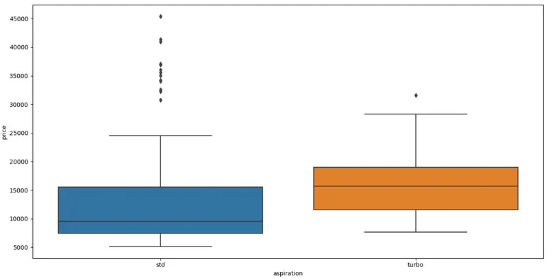
sns.boxplot(x="aspiration", y="price", data=df)
plt.show()
sns.boxplot(x="body-style", y="price", data=df)
plt.show()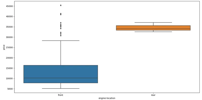
From above figure, it quite evident that the distribution of engine location on price is quite distinct and hence can be used as a good predictor of automobile price.
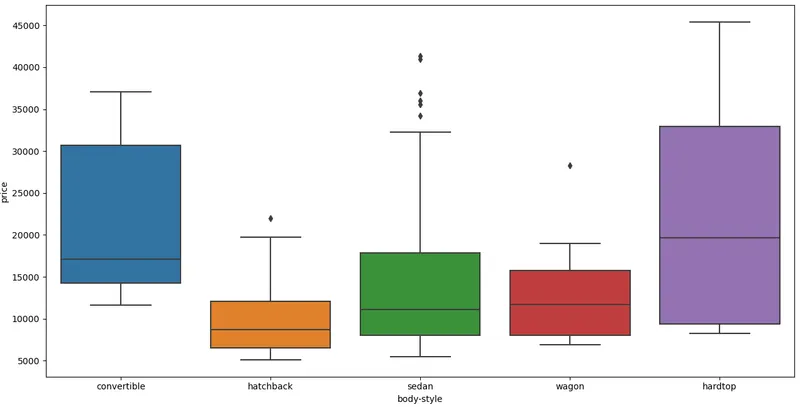
The above figure illustrates that there is significant overlapping of body style data with automobile price and hence, body style wouldn't be a good predictor of automobile price.
print(df['drive-wheels'].unique())
print('')
['rwd' 'fwd' '4wd']
df_group_valuable = df[['drive-wheels','body-style','price']]
df_group_dw = df_group_valuable.groupby(['drive-wheels'],as_index=False).mean()
print(df_group_dw)
print('')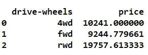
From the above data, rear-wheel drive (rwd) vehicles seems to be the most expensive in terms of price as compared to four wheel drive (4wd) and front wheel drive (fwd).
df_group_bs = df_group_valuable.groupby(['body-style'],as_index=False).mean()
print(df_group_bs)
print('')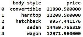
From the above data, vehicle with hard top body style seems to be the most expensive interms of price as compared to other four body styles, namely, convertible, hatchback, sedan, wagon.
df_group_dwbs= df_group_valuable.groupby(['drive-wheels', 'body-style'],as_index=False).mean()
print(df_group_dwbs)
print('')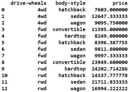
From the above data, vehicle with a combination of hard top body style and rear wheel drive seems to be the most expensive interms of price.
df_frame = df_group_dwbs.pivot(index='drive-wheels',columns='body-style')
print(df_frame)
print('')
# Checking for missing data
missing_data = df_frame.isnull().sum()
print("The missing value:", "\n", missing_data)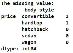
One missing value each is found in convertible and hardtop cases.
df_frame = df_frame.fillna(0) # Filling the missing value with zero

missing_data = df_frame.isnull().sum()
print("The missing value:", "\n", missing_data)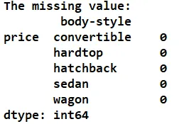
Missing values are removed from the dataframe.
sns.heatmap(df_frame, annot=True, fmt='.2f')
plt.title('Price relation to Drive wheel and Body style')
plt.show()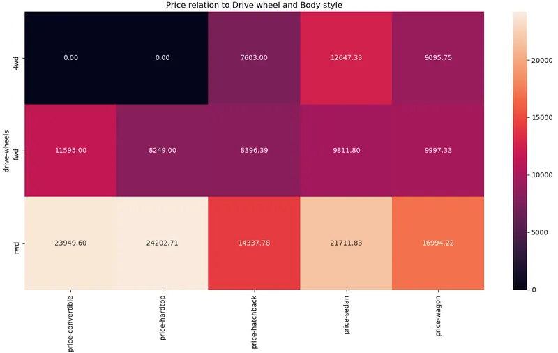
df.columns = df.columns.str.replace("-","_")
fuel = ["diesel"if each == 0 else "gas" for each in df.gas]
df["fuel"] = fuel
print(df)
y = df.fuel
s = df[["normalized_losses","wheel_base","length","width","height","curb_weight",
        "engine_size","bore","stroke","horsepower","peak_rpm","city_mpg","highway_mpg",
        "price","city_L/100km"]]

s_norm = (s- s.min()) / (s.max()- s.min()) # Scaling

print(s_norm)
df1 = pd.concat([s_norm, y], axis = 1)
print(df1)
sns.countplot(x = df1.fuel, label = "Counts")
plt.show()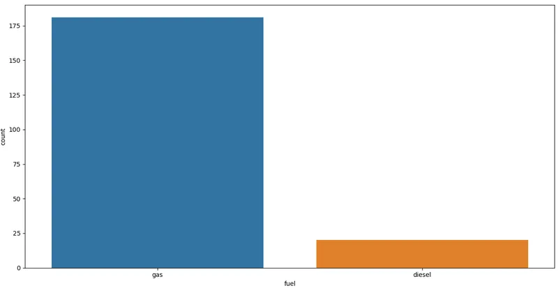
# Clustering for engine size and horse power
data = df1[["engine_size", "price"]]

from sklearn.cluster import KMeans
sse = []

# Determine the suitable 'k' value from elbow curve
for k in range (2,10):
    kmeans = KMeans(n_clusters = k)
    kmeans.fit(data)
    sse.append(kmeans.inertia_)

plt.plot(range(2,10), sse)
plt.show()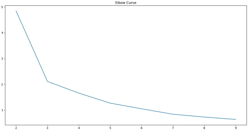
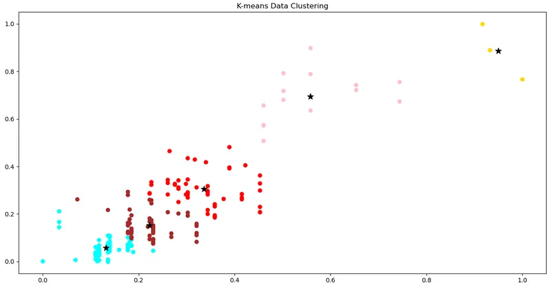
The graph (elbow curve) above illustrates that after k=5 there is no significant change measured and hence, moving forward with the classification prediction with K-means algorithm, five clusters will be good enough.
km = KMeans(n_clusters = 5)
Y = km.fit_predict(data)

data["Cluster"] = Y
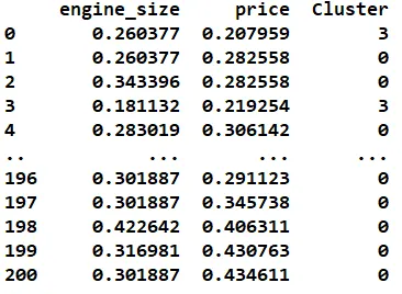
print(data)

plt.scatter(data.engine_size[data.Cluster == 0], data.price[data.Cluster == 0],)
plt.scatter(data.engine_size[data.Cluster == 1], data.price[data.Cluster == 1],)
plt.scatter(data.engine_size[data.Cluster == 2], data.price[data.Cluster == 2],)
plt.scatter(data.engine_size[data.Cluster == 3], data.price[data.Cluster == 3],)
plt.scatter(data.engine_size[data.Cluster == 4], data.price[data.Cluster == 4],)

plt.scatter(km.cluster_centers_[:,0], km.cluster_centers_[:,1], s = 100,, marker = '*')
plt.show()