Project 2
The steps we are going to follow in this case are:
- Selecting the right attributes.
- Finding the optimum value of K using Elbow method.
- Implementing K-Means algorithm.
1. Selecting the right Attribute:
- Importing the necessary libraries.
import pandas as pd
import numpy as np
import matplotlib.pyplot as plt
import seaborn as sns
from sklearn.cluster import KMeans
In the above code, the numpy we have imported for the performing mathematics calculation, matplotlib & seaborn is for plotting the graph, and pandas are for managing the dataset. KMeans is imported from sklearn library to perform the algorithm.
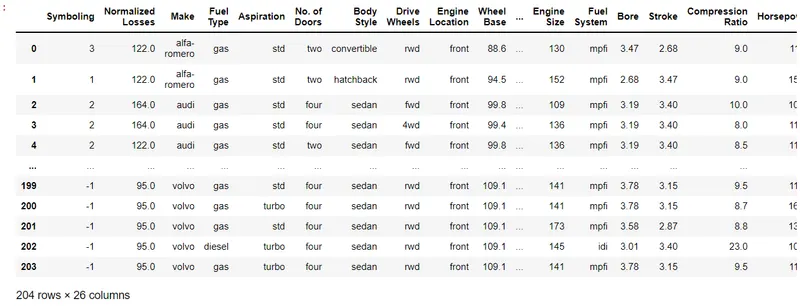
- Importing the 'Car' dataset.
- Creating a heatmap of correlation of all the attributes.
plt.subplots(figsize = ([15,15]))
sns.heatmap(df.corr(),cmap = 'YlGnBu',annot = True)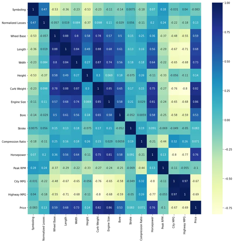
We can observe from the above heatmap that 'Price' and 'City MPG' are negatively correlated which means that they are absolutely opposite to each other.
These are the attributes that we actually required in real life also because when we buy a vehicle we always look into the price and mileage that particular vehicle gives.
So in the next step we are going to form the clusters of these two attributes with respect to the 'Make' attribute,which is also obvious because we want to know which company offers what price amd mileage.
2. Elbow plots:
- Before creating the elbow plots for these attributes we'll first make 2 new dataframe in which one is containing 'City MPG' & 'Price' while the second one is containing only 'Make'.
new_df = df[['Make','City MPG','Price']]
new_df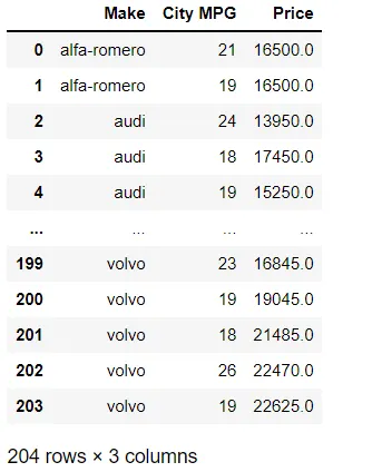
X = new_df.iloc[:,[1,2]]
X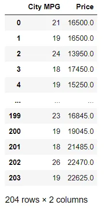
Y = new_df.iloc[:,[0]]
Y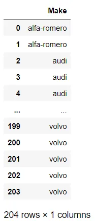
- Now let's visualise the scatter plots of 'Price' Vs 'Make' and 'City MPG' vs 'Make'.
plt.figure(figsize = (15,12))
plt.scatter(X['City MPG'],Y['Make'])
plt.xlabel('City MPG')
plt.ylabel('Make')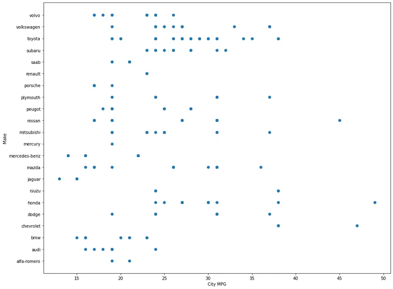
plt.figure(figsize = (15,12))
plt.scatter(X['Price'],Y['Make'])
plt.xlabel('Price of the Vehicles')
plt.ylabel('Make')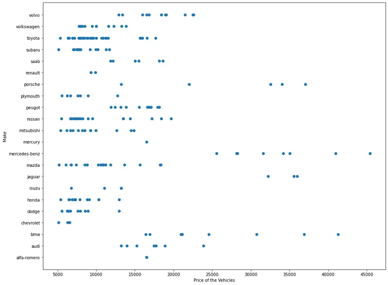
- Elbow plot for 'City MPG'.
from sklearn.preprocessing import StandardScaler
scaler = StandardScaler()
scaler.fit(X)
scaled_X = pd.DataFrame(scaler.transform(X),columns = X.columns)
scaled_X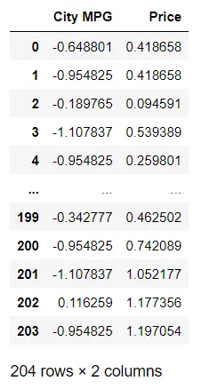
k_rng = range(1,10)
sse1 = []
for k1 in k_rng:
    km1 = KMeans(n_clusters = k1)
    km1.fit(scaled_X[['City MPG']])
    sse1.append(km1.inertia_)

plt.xlabel('K_Values')
plt.ylabel('City Mileage')
plt.plot(k_rng,sse1,marker = 'o')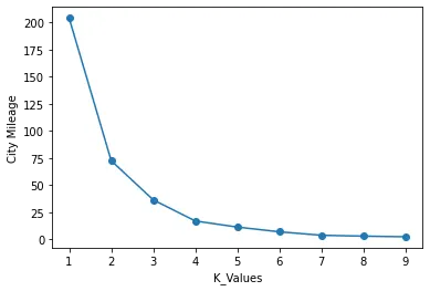
The optimum value for K in 'City MPG' attribute is 3.
- Elbow plot for 'Price'.
k_rng = range(1,10)
sse2 = []
for k2 in k_rng:
    km2 = KMeans(n_clusters = k2)
    km2.fit(scaled_X[['Price']])
    sse2.append(km2.inertia_)

plt.xlabel('K_Values')
plt.ylabel('Price')
plt.plot(k_rng,sse2,marker = 'o')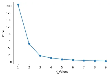
The optimum value for K in 'Price' attribute is 3.
3. Implementing KMeans Algorithm:
Now we will apply the KMeans Clustering algorithm to 'City MPG' and 'Price' attributes with respect to 'Make' attribute.
This clearly means that we want to find out which auto company should we gor for, in terms of its Price and Mileage.
As the optimum value for K = 3 for both the attributes, KMeans alhorithm will going to create 3 clusters of classification.
- KMeans for 'City MPG' with 'Make'.
km1 = KMeans(n_clusters = 3)
km1.fit(scaled_X[['City MPG']])
y_predict = km1.predict(scaled_X[['City MPG']])
MC_df = pd.concat([scaled_X['City MPG'],Y['Make']],axis = 1)
MC_df['Cluster(M vs C)'] = y_predict
MC_df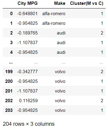
In the above case the clusters represents the amount of Mileage offered by different Auto makers.
MC_df1 = MC_df[MC_df['Cluster(M vs C)'] == 0]
MC_df2 = MC_df[MC_df['Cluster(M vs C)'] == 1]
MC_df3 = MC_df[MC_df['Cluster(M vs C)'] == 2]
plt.subplots(figsize = ([15,10]))
plt.scatter(MC_df1['City MPG'],MC_df1['Make'],color = 'red')
plt.scatter(MC_df2['City MPG'],MC_df2['Make'],color = 'green')
plt.scatter(MC_df3['City MPG'],MC_df3['Make'],color = 'blue')
plt.title('KMeans Clustering of Vehicle City Mileage')
plt.xlabel('City Mileage')
plt.ylabel('Make')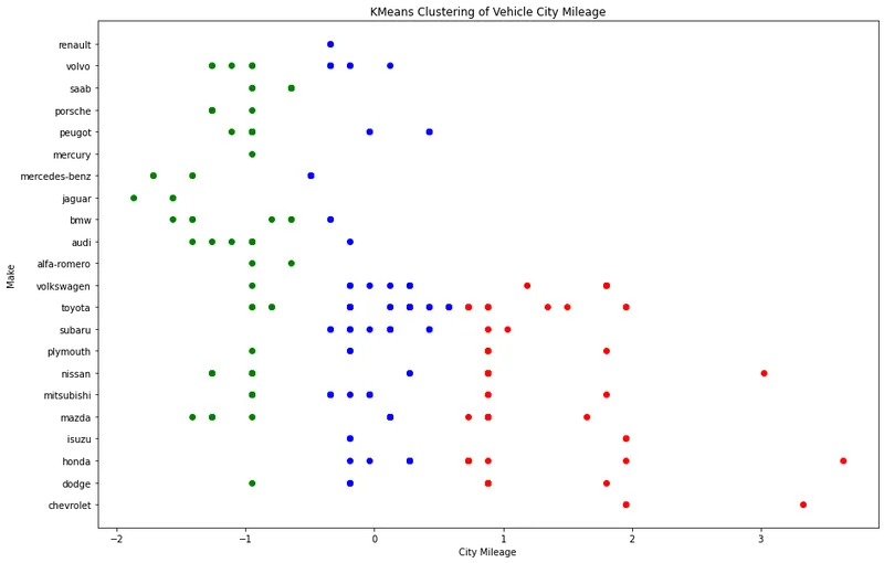
- KMeans for 'Price' with 'Make'.
km2 = KMeans(n_clusters = 3)
km2.fit(scaled_X[['Price']])
y_predict = km1.predict(scaled_X[['Price']])
MP_df = pd.concat([scaled_X['Price'],Y['Make']],axis = 1)
MP_df['Cluster(M vs P)'] = y_predict
MP_df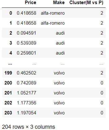
MP_df1 = MP_df[MP_df['Cluster(M vs P)'] == 0]
MP_df2 = MP_df[MP_df['Cluster(M vs P)'] == 1]
MP_df3 = MP_df[MP_df['Cluster(M vs P)'] == 2]
plt.subplots(figsize = ([15,10]))
plt.scatter(MP_df1['Price'],MP_df1['Make'],color = 'red')
plt.scatter(MP_df2['Price'],MP_df2['Make'],color = 'green')
plt.scatter(MP_df3['Price'],MP_df3['Make'],color = 'blue')
plt.title('KMeans Clustering of Price')
plt.xlabel('Price')
plt.ylabel('Make')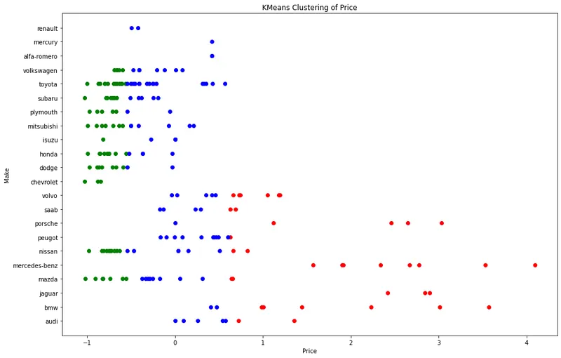
We can see from the above plot that the cars in the green clusters are very low costs cars, the cars in the blue clusters are moderately expensive vehicles and the cars in the red clusters are the most expensive cars among them.
Hierarchical Clustering and its types:
Hierarchical clustering, also known as hierarchical cluster analysis, is an algorithm that groups similar objects into groups called clusters. The endpoint is a set of clusters, where each cluster is distinct from each other cluster, and the objects within each cluster are broadly similar to each other.
Hierarchical clustering can be performed with either a distance matrix or raw data. When raw data is provided, the software will automatically compute a distance matrix in the background. The distance matrix below shows the distance between six objects.
Hierarchical clustering starts by treating each observation as a separate cluster. Then, it repeatedly executes the following two steps: (1) identify the two clusters that are closest together, and (2) merge the two most similar clusters. This iterative process continues until all the clusters are merged together. This is illustrated in the diagrams below.
The main output of Hierarchical Clustering is a dendrogram, which shows the hierarchical relationship between the clusters:
In the example above, the distance between two clusters has been computed based on the length of the straight line drawn from one cluster to another. This is commonly referred to as the Euclidean distance. Many other distance metrics have been developed.
The choice of distance metric should be made based on theoretical concerns from the domain of study. That is, a distance metric needs to define similarity in a way that is sensible for the field of study. For example, if clustering crime sites in a city, city block distance may be appropriate. Or, better yet, the time taken to travel between each location. Where there is no theoretical justification for an alternative, the Euclidean should generally be preferred, as it is usually the appropriate measure of distance in the physical world.
Linkage Criteria:
After selecting a distance metric, it is necessary to determine from where distance is computed. For example, it can be computed between the two most similar parts of a cluster (single-linkage), the two least similar bits of a cluster (complete-linkage), the center of the clusters (mean or average-linkage), or some other criterion. Many linkage criteria have been developed.
As with distance metrics, the choice of linkage criteria should be made based on theoretical considerations from the domain of application. A key theoretical issue is what causes variation. For example, in archeology, we expect variation to occur through innovation and natural resources, so working out if two groups of artifacts are similar may make sense based on identifying the most similar members of the cluster.
Where there are no clear theoretical justifications for the choice of linkage criteria, Ward’s method is the sensible default. This method works out which observations to group based on reducing the sum of squared distances of each observation from the average observation in a cluster. This is often appropriate as this concept of distance matches the standard assumptions of how to compute differences between groups in statistics (e.g., ANOVA, MANOVA).
Agglomerative Versus Divisive Algorithms:
Hierarchical clustering typically works by sequentially merging similar clusters, as shown above. This is known as agglomerative hierarchical clustering. In theory, it can also be done by initially grouping all the observations into one cluster, and then successively splitting these clusters. This is known as divisive hierarchical clustering. Divisive clustering is rarely done in practice.
Implementing Hierarchical Clustering to the 'Car' Dataset:
The Steps we are going to follow to perform the algoritm are:
- Creating dendrograms for both the attributes,
- Implementing Agglomerative Clustering method.
- Making Scatter plots for both the attributes.
1. Creating Dendrogrms:
- Dendrogram for 'City MPG' attribute.
plt.figure(figsize = (15,15))
import scipy.cluster.hierarchy as sch
dendrograms = sch.dendrogram(sch.linkage(scaled_X[['City MPG']],method = 'ward'))
plt.title('Dendrogram for City Mileage')
plt.xlabel('City Mileage')
plt.ylabel('Euclidean Distance')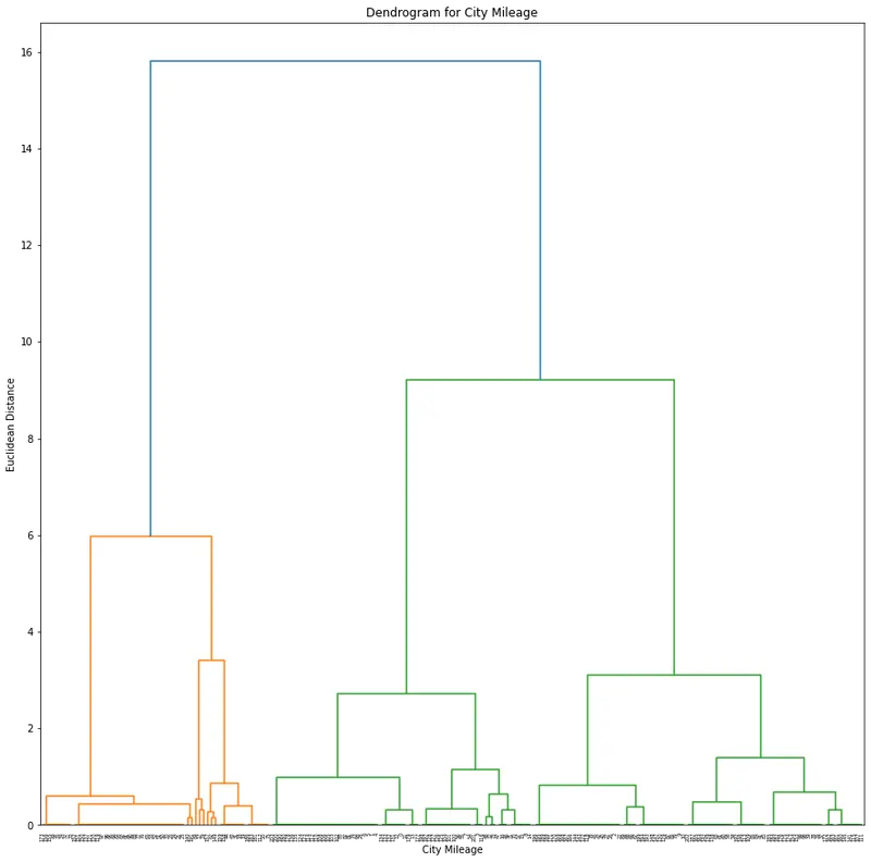
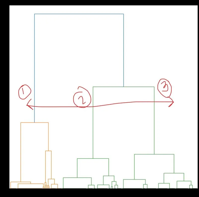
So by looking at the above dendrogram we can find that the optimumm value of the clusters are 3.
- Dendrogram for 'Price' attribute.
plt.figure(figsize = (15,15))
dendrograms = sch.dendrogram(sch.linkage(scaled_X[['Price']],method = 'ward'))
plt.title('Dendrogram for Car Price')
plt.xlabel('Car Price')
plt.ylabel('Euclidean Distance')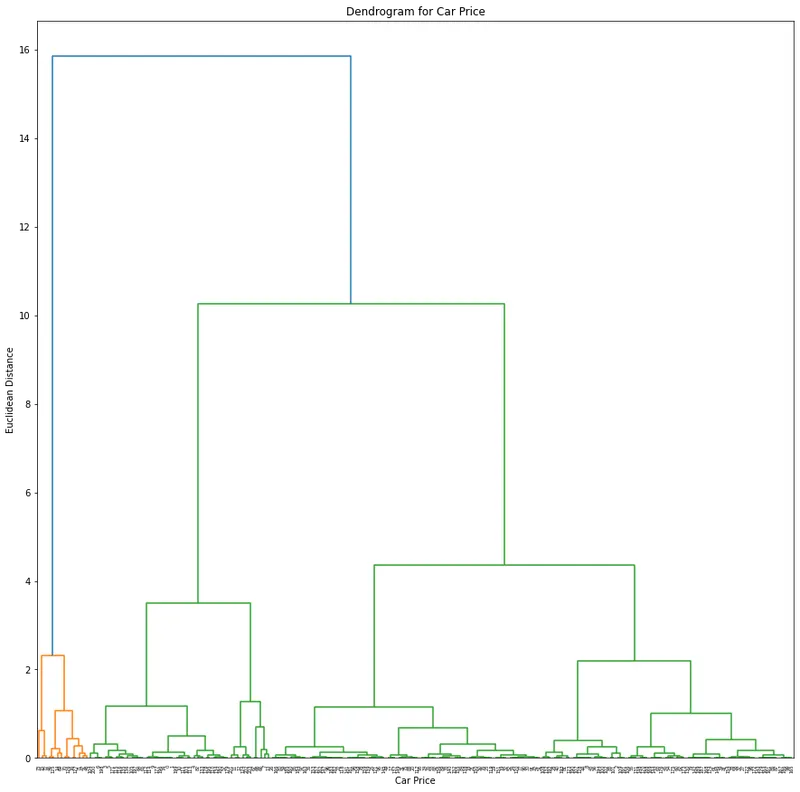
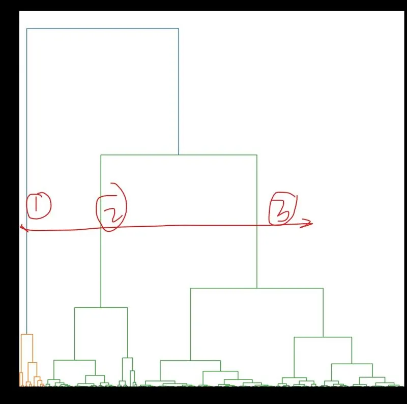
So by looking at the above dendrogram we can find that the optimumm value of the clusters are 3.
2. Performing Agglomerative Algorithm.
- We first perform the algorithm to 'City MPG' .
hc = AgglomerativeClustering(n_clusters = 3,affinity = 'euclidean',linkage = 'ward')
hc_predict_mpg = hc.fit_predict(scaled_X[['City MPG']])
mpg = pd.concat([scaled_X['City MPG'],Y['Make']],axis = 1)
mpg['Clusters'] = hc_predict_mpg
mpg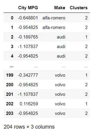
- Performing algorithm to 'Price'.
hc = AgglomerativeClustering(n_clusters = 3,affinity = 'euclidean',linkage = 'ward')
hc_predict_price = hc.fit_predict(scaled_X[['Price']])
price = pd.concat([scaled_X['Price'],Y['Make']],axis = 1)
price['Clusters'] = hc_predict_price
price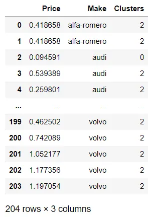
3. Scatter plots:
mpg1 = mpg[mpg['Clusters'] == 0]
mpg2 = mpg[mpg['Clusters'] == 1]
mpg3 = mpg[mpg['Clusters'] == 2]
plt.subplots(figsize = ([15,10]))
plt.scatter(mpg1['City MPG'],mpg1['Make'],color = 'red')
plt.scatter(mpg2['City MPG'],mpg2['Make'],color = 'green')
plt.scatter(mpg3['City MPG'],mpg3['Make'],color = 'blue')
plt.title('Hierarchical clustering of City Mileage')
plt.xlabel('City Mileage')
plt.ylabel('Make')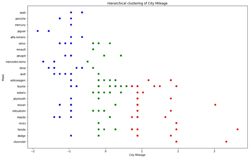
price1 = price[price['Clusters'] == 0]
price2 = price[price['Clusters'] == 1]
price3 = price[price['Clusters'] == 2]
plt.subplots(figsize = ([15,10]))
plt.scatter(price1['Price'],price1['Make'],color = 'red')
plt.scatter(price2['Price'],price2['Make'],color = 'green')
plt.scatter(price3['Price'],price3['Make'],color = 'blue')
plt.title('Hierarchical clustering of Vehicle Price')
plt.xlabel('Price')
plt.ylabel('Make')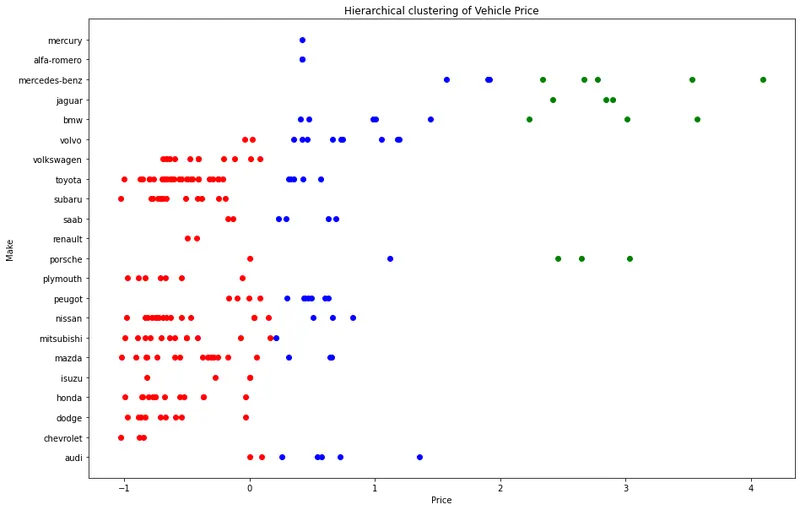
Summary and Conclusion:
- KMeans Clustering of the dataset was performed and scatter plots were created.
- Hierarchical Clustering was performed and scatter plots were created.
- In both the clustering method the optimum number of clusters were found to be 3.
- The Clusters form in both the algorithms were exactly the same.
df = pd.read_csv('clean_auto.csv')
df = df.drop(columns = df[['Unnamed: 0']])
df