Project 1 - Data Handling and Interpolation
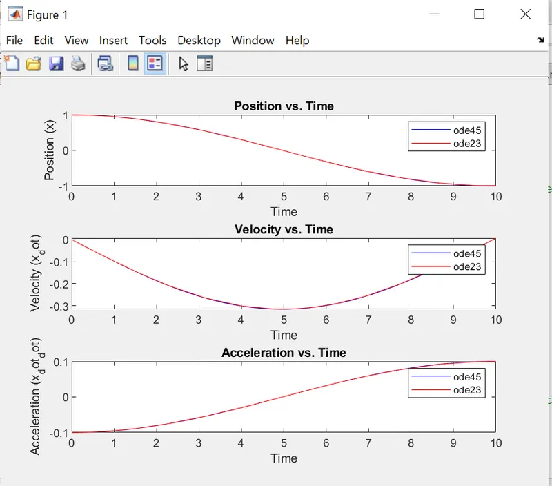
1) Solve the simple harmonic oscillator equation [m . dx² / dt² = -k.x ] for a given m (mass) and k (spring constant) values using ‘ode45’ and ‘ode23’ solver in MATLAB.
- Plot x, x_dot (ẋ) & x_dot_dot (ẍ).
- Use the input dialog box to get ‘m’ & ‘k’ values from the user.
- Compare ‘ode45’ and ‘ode23’ plots and explain.
Solution:
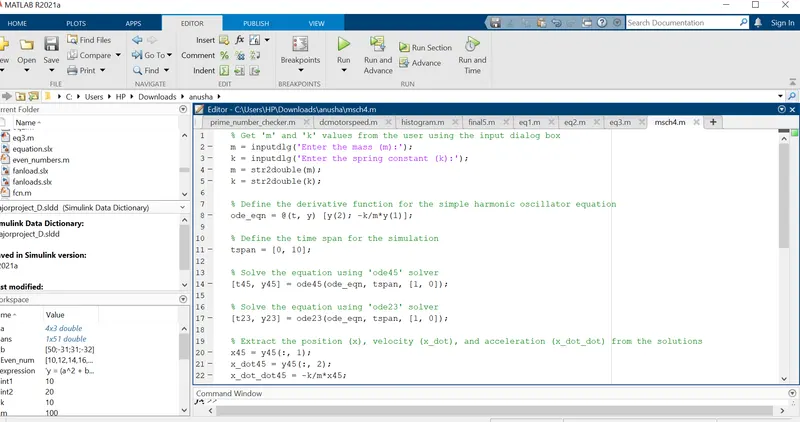
% Get 'm' and 'k' values from the user using the input dialog box
m = inputdlg('Enter the mass (m):');
k = inputdlg('Enter the spring constant (k):');
m = str2double(m);
k = str2double(k);
% Define the derivative function for the simple harmonic oscillator equation
ode_eqn = @(t, y) [y(2); -k/m*y(1)];
% Define the time span for the simulation
tspan = [0, 10];
% Solve the equation using 'ode45' solver
[t45, y45] = ode45(ode_eqn, tspan, [1, 0]);
% Solve the equation using 'ode23' solver
[t23, y23] = ode23(ode_eqn, tspan, [1, 0]);
% Extract the position (x), velocity (x_dot), and acceleration (x_dot_dot) from the solutions
x45 = y45(:, 1);
x_dot45 = y45(:, 2);
x_dot_dot45 = -k/m*x45;
x23 = y23(:, 1);
x_dot23 = y23(:, 2);
x_dot_dot23 = -k/m*x23;
% Plot the results
figure;
subplot(3, 1, 1);
plot(t45, x45, 'b', t23, x23, 'r');
xlabel('Time');
ylabel('Position (x)');
title('Position vs. Time');
legend('ode45', 'ode23');
subplot(3, 1, 2);
plot(t45, x_dot45, 'b', t23, x_dot23, 'r');
xlabel('Time');
ylabel('Velocity (x_dot)');
title('Velocity vs. Time');
legend('ode45', 'ode23');
subplot(3, 1, 3);
plot(t45, x_dot_dot45, 'b', t23, x_dot_dot23, 'r');
xlabel('Time');
ylabel('Acceleration (x_dot_dot)');
title('Acceleration vs. Time');
legend('ode45', 'ode23');
2) Write a program to perform the following steps
- load altitude vs temperature data from the tables International Standard Atmosphere (ISA) ((click on the link))
- use the ‘polyfit’ function to determine a regression model: T = f(h) for the above table.
- evaluate the model determined using the ‘polyval’ function
- determine the goodness of fit (goodnessOfFit function)
- Generate comparative plot for the loaded and evaluated data
- store polyval evaluated data into a text file.
Solution:
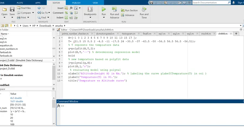
H=[-1 0 1 2 3 4 5 6 7 8 9 10 Il 13 15 17 ];
T= (21.5 15 8.5 2 -4.5 -1l -17.5 24 -30.5 -37 -43.5 -50 -56.5 56.5 56.5 -56.51);
% T reprents the temprature data
g=polyfit(H,T,2);
plot(H,T,'--') % determining regression model
hold
% new temprature based on polyfit data
j=polyval(g,H);
plot(H,j,'r');
% evaluating model using polyval
xlabeI('AItitude(height H) in Km.'); % labeling the curve ylabeICTemprature(T) in oci )
ylabeI('Temprature(T) in 0C.');
title('Temprature vs Altitude curve')
3) Create a function to evaluate the following expression.
y= sin(x²) +cos(x) - 2 sin(x) cos(x)
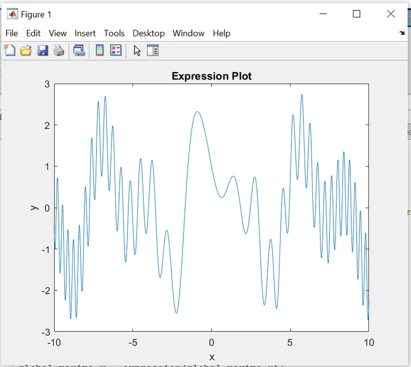
- Generate the plot and determine all local minima and global maxima values.
- Use the ‘gtext’ command to highlight the local minima and global maxima value in the graph.
Hint: make use of 'fminsearch' & 'max' commands.
Solution:
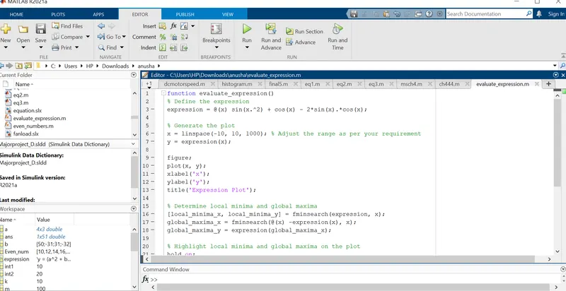
function evaluate_expression()
% Define the expression
expression = @(x) sin(x.^2) + cos(x) - 2*sin(x).*cos(x);
% Generate the plot
x = linspace(-10, 10, 1000); % Adjust the range as per your requirement
y = expression(x);
figure;
plot(x, y);
xlabel('x');
ylabel('y');
title('Expression Plot');
% Determine local minima and global maxima
[local_minima_x, local_minima_y] = fminsearch(expression, x);
global_maxima_x = fminsearch(@(x) -expression(x), x);
global_maxima_y = expression(global_maxima_x);
% Highlight local minima and global maxima on the plot
hold on;
plot(local_minima_x, local_minima_y, 'ro', 'MarkerSize', 8);
plot(global_maxima_x, global_maxima_y, 'go', 'MarkerSize', 8);
hold off;
% Annotate local minima and global maxima values
for i = 1:numel(local_minima_x)
text(local_minima_x(i), local_minima_y(i), sprintf('%.2f', local_minima_y(i)), 'VerticalAlignment', 'bottom');
end
for i = 1:numel(global_maxima_x)
text(global_maxima_x(i), global_maxima_y(i), sprintf('%.2f', global_maxima_y(i)), 'VerticalAlignment', 'top');
end
end
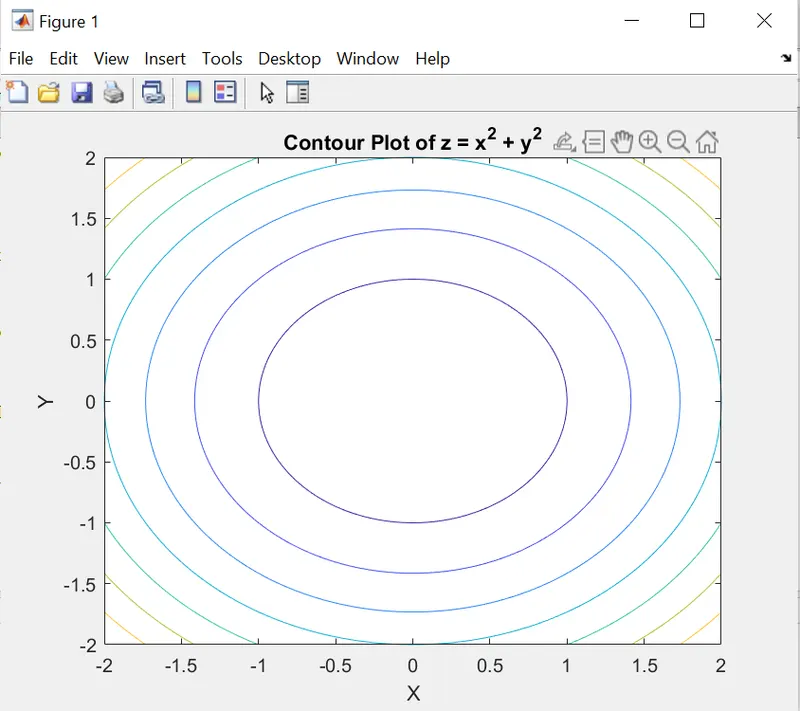
4) Give a brief note on the “contour” command. Illustrate with an example.
Note :
- For example, take simple code and execute in MATLAB.
- Attach the same along with the answer body
Solution:-
Contour plots are useful for visualizing the shape and characteristics of functions or datasets. They provide a way to visualize the changing values of a variable across different levels or heights. Contour plots can reveal patterns, trends, and regions of interest in the data.
The contour lines in a plot represent the points where the function or dataset has a constant value. The spacing between the contour lines indicates the rate of change of the variable. Closer contour lines indicate a steeper gradient, while wider spacing indicates a gentler gradient.
The "contour" command provides various options to customize the appearance of the contour plot, such as specifying the contour levels, changing line styles, adding labels, and coloring the contours. These options allow you to enhance the clarity and visual appeal of the plot.
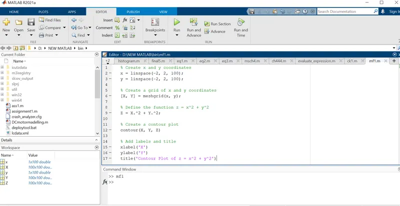
PROGRAM:
% Create x and y coordinates
x = linspace(-2, 2, 100);
y = linspace(-2, 2, 100);
% Create a grid of x and y coordinates
[X, Y] = meshgrid(x, y);
% Define the function z = x^2 + y^2
Z = X.^2 + Y.^2;
% Create a contour plot
contour(X, Y, Z)
% Add labels and title
xlabel('X')
ylabel('Y')
title('Contour Plot of z = x^2 + y^2')