PROJECT: CREATING SALES REPORTS OF COMPANY PRODUCTS USING PIVOT TABLES AND CHARTS IN MICROSOFT EXCEL.
PROJECT: CREATING SALES REPORTS OF COMPANY PRODUCTS USING PIVOT TABLES AND CHARTS IN MICROSOFT EXCEL.
- Understanding the dataset and data formatting is the foremost step for any analyst. Format the data as per the requirements and maintain linearity in terms of borders, font, and alignment as much as possible.
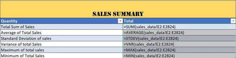
- Create data summary of the sales_data involving:
- SUM OF TOTAL SALES
- AVERAGE OF TOTAL SALES
- STANDARD DEVIATION OF TOTAL SALES
- VARIANCE OF TOTAL SALES
- MAXIMUM OF SALES
- MINIMUM OF SALES
- Formulas of the same are given below:
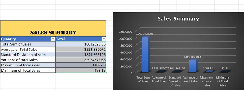
- To represent the data pictographically insert charts.
- Select the data.
- insert>>Charts>>Choose chart
- Pivot Tables are useful to reorganize and summarize data.
- For a categorial representation of the table for the fields Status,ProductLine and Sales we are using a pivot table in a new Sheet.

- Click on + to create a new Worksheet and all the worksheets created will appear at the bottom of the sheets in the above manner.
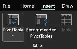
- To create a Pivot Table choose any cell on the dataset and insert>> Pivot Table.
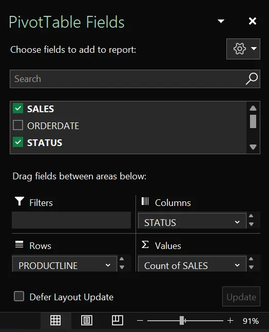
- Choose Fields(Status, product line, and Sales) as per the requirement to create the PivotTable.
- Also, there are Filters, columns, rows, and Values each having a role in the Pivot Table
- Filter: Filter the selected data further.
- Columns: Fields dropped under columns reflect on the columns of the Table.
- Rows: Similarly, fields dropped rows reflect on the Rows of the Table.
- Values: Used to calculate the values. Can choose to summarize data using functions like SUM, Avg, Min, Max, Var, and Stdev.
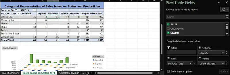
- Now add PivotChart for a graphical representation. PivotTable Analyze >> PivotChart.
- Created a new ribbon ABC having all the formatting commands.
- To customize a ribbon
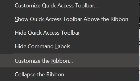
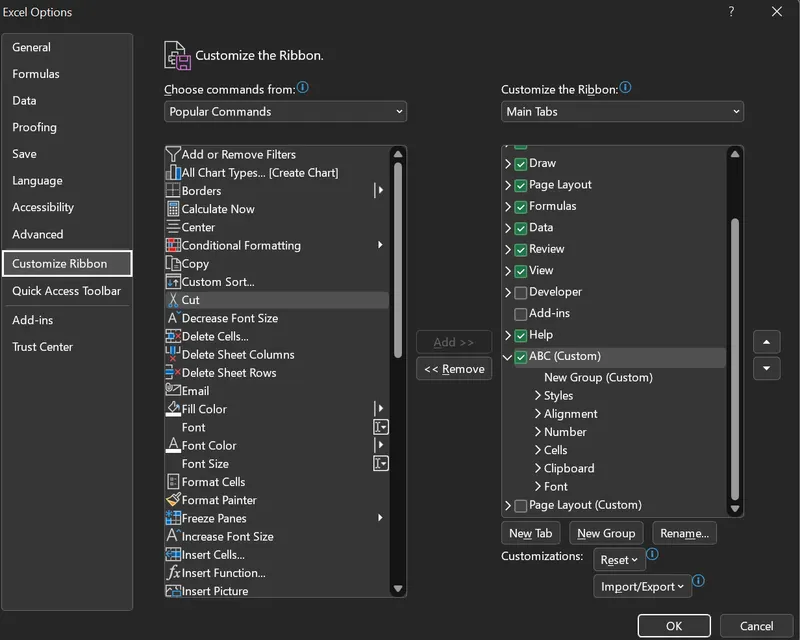 Add or remove the format commands to create this ribbon.
- To customize a ribbon
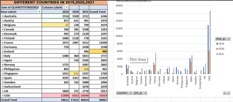
- To analyze the quantities ordered by different countries in the quarters of 2019,20,21.
- Create a PivotTable using fields of QTR_ID, YEAR_ID, QUANTITIES ORDERED, and COUNTRY.
- Year_id in the column and qtr_id and country in the Rows give us a better understanding of the count of the quantities ordered in those years.
- Here Count of quantities ordered is used in the values to analyze the same.
- A PivotChart is also added for insights as the USA top the list with the highest quantities ordered irrespective of the YEAR and Ireland becomes the country with the Lowest Quantities Ordered of all the countries.
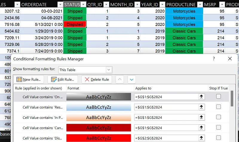
- Conditional Formatting is used to spot trends and patterns using different bars, icons, and colours. To specify the order status and ProductLine conditional formatting is performed. Also top10% of the Quantities Ordered are highlighted using conditional formatting
- Replaced 2003 -> 2019, 2004->2020, 2005->2021 using replace all by giving the respective range.
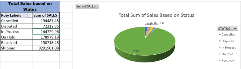
- Total sales of the products depending on the status of the product are analyzed by using a PivotTable with fields Status and the sum of sales in values.
- A staggering 93% of products are shipped.
- 2% canceled.
- 1% resolved
- 1% Disputed
- 2% On hold
- 1% In Process
- Lastly, 2 new columns are added with reference to ProductCode using LEFT() and RIGHT() functions to obtain the required result.
- Also, top10% of the Quantities Ordered are highlighted using conditional formatting.