Project 1 - COVID-19 Vaccinations Trend Analysis
Project 1 - COVID-19 Vaccinations Trend Analysis
Aim:
The aim of this project is to check if all the people in the world got vaccinated with Covid-19 vaccination during the years 2020 to 2022, and how much target is achieved in vaccinating.
Introduction:
In the year 2019 there was outbreak of a deadly virus Corona. Many of the lives lost in minutes and most of them fought against it, there was a vaccine found soon enough in 2020 to stop this deadly virus and was developed by different sources such as “World Health Organization, Ministry of Health, Government of Aruba, Government of Australia via CovidBaseAU, Government of Azerbaijan, Pan American Health Organization, ---"
The data which is provide to us contains the details of the people vaccinated and the type of vaccination provided to the country.
We have the details of total how many people are getting vaccinated daily and how many vaccinations are provided daily.
Problem statement:
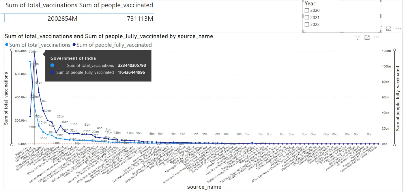
- Created analysis of how total number of vaccines provided by each source and how many got fully vaccinated with particular source vaccine.
- Created a table to show sum total vaccinations and sum of people vaccinated at least once, using year filter for the table and the source vaccination line chart.
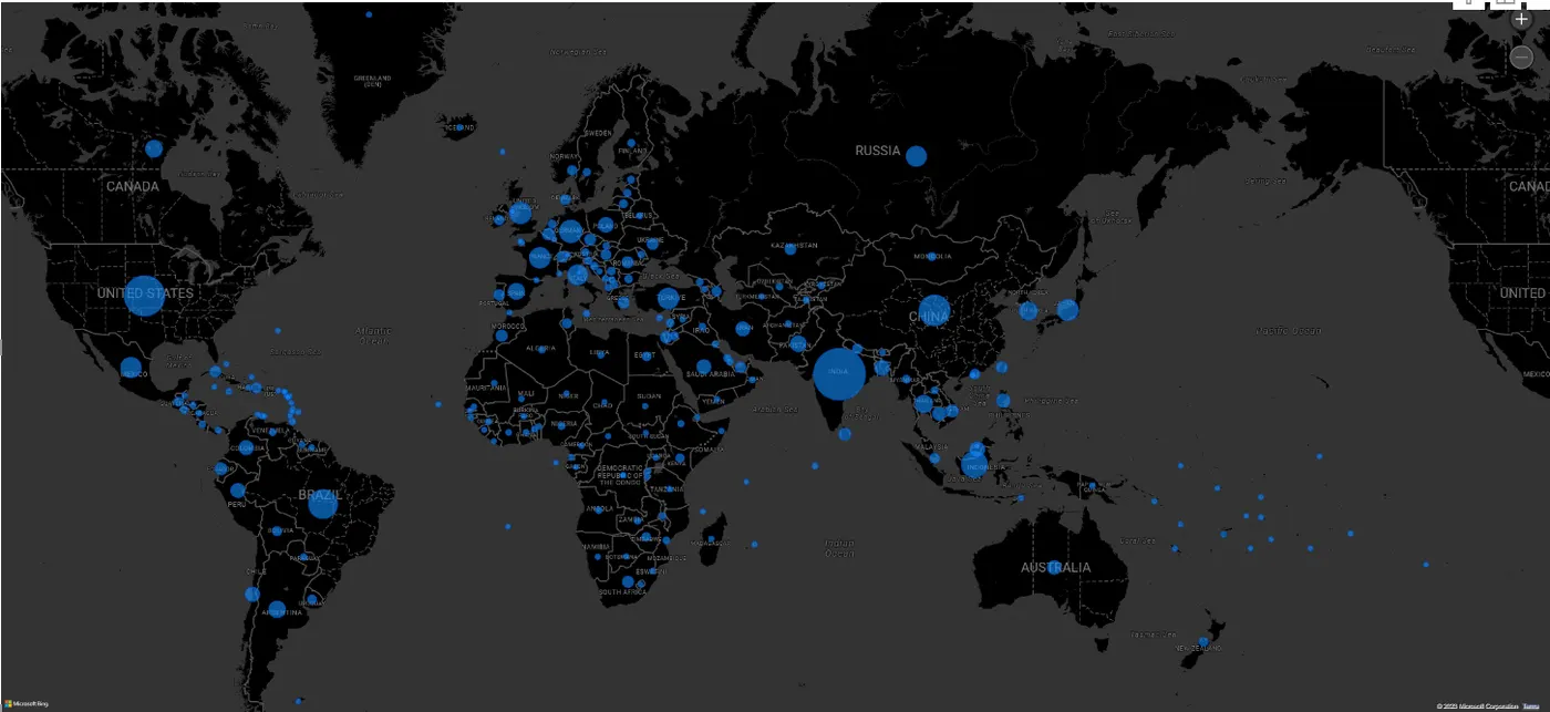
- Created map view based on counties where people got fully vaccinated, total vaccines suppled to the country, people vaccinated at least once and total people vaccinated.
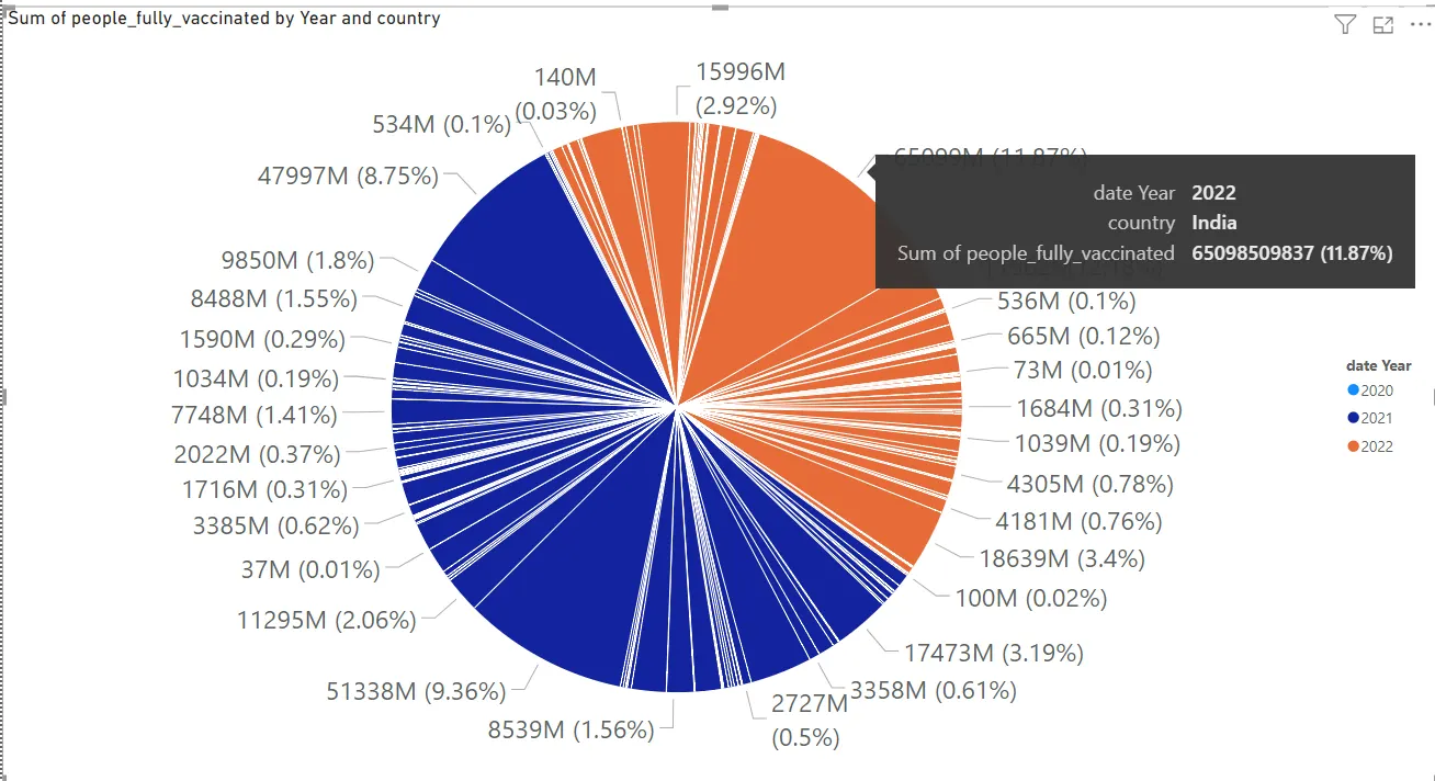
- Created a pie chart based on which year how many people are fully vaccinated in the country.
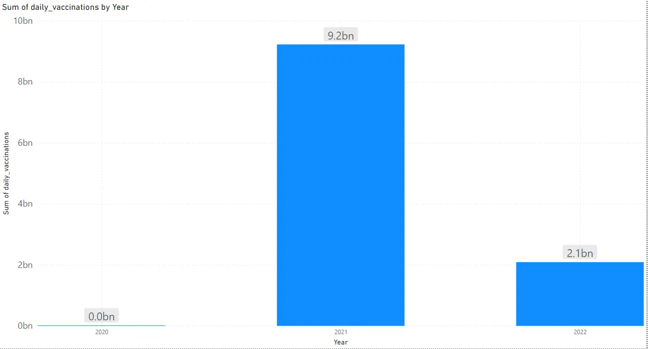
- We analysed how the daily vaccination per year, used hierarchy to drill down through the dates.
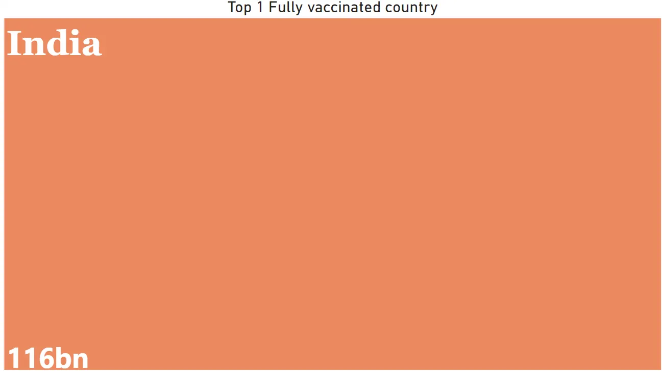
- We have sorted the country which is in the top having all most of the people vaccinated.
Methodology:
- We have imported the data set “country_vaccinations.CSV” using the get data option. And used transform data to open the power query editor.
- In the power query editor, once the data is opened, we observed the data which is given is having the respective countries vaccinations details like, daily how many vaccines were supplied and how many got vaccinated till date, what percent of people or fully vaccinated and how many took at least one dose. And the vaccine source provider name for each country.
- After analysing the we have performed some basic data cleaning and transformation processing like replacing the null values with 0 and transforming few data types to the numbers from decimals and assigning first row as header.
- Once the data cleaning part is completed, we have loaded the data to PowerBi desktop to create visualizations.
Analysis:
Here we have first analysed how all the countries in the world are doing in vaccinations, we have created a map chart using the countries provided.
Using the below visualization, we can know the details of which is the country which is having high rate of vaccinations and which is having less. In this viz we have made use of the tooltips to show the total vaccinations and people fully vaccinated so it would be easy to collect the details from the specific country.
In the below viz we have analysed, in overall which source’s vaccine was supplied and used more in all 3 years, we can see the “Government of India” stands first in place of where a greater number of people got vaccinated with.
In the same viz we can also see overall in the world how many vaccines were supplied and how many got vaccinated, and we can also filter both the visualizations using the year filter provided.
This is the viz where we can find the details of the fully vaccinated countries in percent per year. Here if we observed in the year 2021, we get a greater number of people vaccinated than the 2022 and 2020. And the 2020 stands last as the year where not much vaccinations were made.
We analysed how was the rate of change in the daily supply of the vaccines over years. We can find that in year 2021 we had a more transit of vaccines daily. We have also used the drill through if need to know which month or which quarter we have more supply of vaccine, to maintain the granularity.
Over all the years 2020-2022 we are able to find that the India stands first in the vaccinating. which is having 116 billion total vaccinations.
Insights:
Here we have analysed all the countries and sources who shared the vaccines, country India and the source “Government of India” stands first in supply and the vaccinating. We have also mainly found that the at the rate of increase in the vaccinations is rapidly increased in the year 2021 and gradually reduced to 2022, one of the reasons could be the most of the people in the countries got vaccinated completely.
Recommendations:
If we could get the more granularity in the data set such as population of the specific country or city or state so that it would be better to estimate how many people are yet to get vaccinated.
If we have the information of how many vaccinations got left for the date or after completing the whole populations, we can use such data to share the availability of the vaccines to the other places where there is shortage in the vaccine.
Conclusions:
With the data and the analysis that we performed that we can say that there is a huge amount of population got vaccinated totally by the end of 2022 compared to 2020, by which we can say a wide range of people got vaccinated with Covid-19 vaccination.