Project 1
Project_01:Data cleaning on Automobile 1985 dataset and perform descriptive analytics.
Part_01:Data cleaning of Automobile 1985 dataset
Domain Knowledge:
- This data set consists of three types of entities:
- The specification of an auto in terms of various characteristics,
- assigned insurance risk rating,
- This rating corresponds to the degree to which the auto is more risky than its price indicates. Cars are initially assigned a risk factor symbol associated with its price. Then, if it is more risky (or less), this symbol is adjusted by moving it up (or down) the scale. Actuarians call this process "symboling". A value of +3 indicates that the auto is risky, -3 that it is probably pretty safe.
3.normalized losses in use as compared to other cars.
- The is the relative average loss payment per insured vehicle year. This value is normalized for all autos within a particular size classification (two-door small, station wagons, sports/specialty, etc…), and represents the average loss per car per year.
- Number of Instances: 205
- Number of Attributes: 26 total
-- 15 continuous
-- 1 integer
-- 10 nominal - Attribute Information
- symboling: -3, -2, -1, 0, 1, 2, 3
- normalized-losses: continuous from 65 to 256
- make: alfa-romero, audi, bmw, chevrolet, dodge, honda, isuzu, jaguar, mazda, mercedes-benz, mercury, mitsubishi, nissan, peugot, plymouth, porsche, renault, saab, subaru, toyota, volkswagen, volvo.
- fuel-type: diesel, gas
- aspiration: std, turbo
- num-of-doors: four, two
- body-style: hardtop, wagon, sedan, hatchback, convertible
- drive-wheels: 4wd, fwd, rwd
- engine-location: front, rear
- wheel-base: continuous from 86.6 120.9
- length: continuous from 141.1 to 208.1
- width: continuous from 60.3 to 72.3
- height: continuous from 47.8 to 59.8
- curb-weight: continuous from 1488 to 4066
- engine-type: dohc, dohcv, l, ohc, ohcf, ohcv, rotor
- num-of-cylinders: eight, five, four, six, three, twelve, two
- engine-size: continuous from 61 to 326
- fuel-system: 1bbl, 2bbl, 4bbl, idi, mfi, mpfi, spdi, spfi
- bore: continuous from 2.54 to 3.94
- stroke: continuous from 2.07 to 4.17
- compression-ratio: continuous from 7 to 23
- horsepower: continuous from 48 to 288
- peak-rpm: continuous from 4150 to 6600
- city-mpg: continuous from 13 to 49
- highway-mpg: continuous from 16 to 54
- price: continuous from 5118 to 45400.
Importing neccessary libraries
import pandas as pd
import numpy as np
import matplotlib.pyplot as plt
import seaborn as sns
#filterning warnings
import warnings
warnings.filterwarnings("ignore")
Loading csv
auto = pd.read_csv('auto.csv') #reading csv file from local disk
auto.head()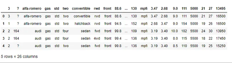
- above database column name are not meaning full and conatins special charactters like '?'.
Loading data with proper column name and replacing special characters with NaN values
auto_data = pd.read_csv('auto.csv',header=None,names= ['symboling','normalized-losses','make','fuel-type','aspiration','num-of-doors','body-style','drive-wheels','engine-location','wheel-base','length','width','height','curb-weight','engine-type','num-of-cylinders','engine-size','fuel-system','bore','stroke','compression-ratio','horsepower','peak-rpm','city-mpg','highway-mpg','price'],na_values=['?','??'])

auto_data.head()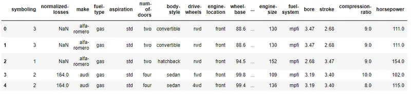
print(auto_data.columns) #printing column nameIndex(['symboling', 'normalized-losses', 'make', 'fuel-type', 'aspiration',
'num-of-doors', 'body-style', 'drive-wheels', 'engine-location',
'wheel-base', 'length', 'width', 'height', 'curb-weight', 'engine-type',
'num-of-cylinders', 'engine-size', 'fuel-system', 'bore', 'stroke',
'compression-ratio', 'horsepower', 'peak-rpm', 'city-mpg',
'highway-mpg', 'price'],dtype='object')
Checking missing values
Null_values = auto_data.isnull().sum()
Null_values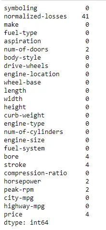
- normalized-losses,num-of-doors,bore,stroke,horsepower,peak-rpm andPrice have Miising values.
Dealing with Missing values
- If the datatype of the column is numerical then replace the values with Mean in case of Normal distribution and
Median imputatation in case of Skewed distribution. - If the datatype of the column is Categorical then the Mode Imputation method is the appropriate method.
- Replacing NaN values with frequency
auto_data['num-of-doors'].value_counts()four 114 two 89 Name: num-of-doors, dtype: int64
#replacing all null values in num-of-doors with four(majority) because categorical column

auto_data['num-of-doors'].fillna('four',inplace=True)
2.Replacing Missing Values with mean because coulmn is normaly distributed
auto_data['bore'].fillna(auto_data['bore'].mean(),inplace=True)
auto_data['stroke'].fillna(auto_data['stroke'].mean(),inplace=True)
auto_data['horsepower'].fillna(auto_data['horsepower'].mean(),inplace=True)
auto_data['peak-rpm'].fillna(auto_data['peak-rpm'].mean(),inplace=True)
3.Repacling Missing values of Normalized-losses with median
plt.figure(figsize=(10,5))

plt.subplot(1,2,1)
sns.boxplot(x=auto_data["normalized-losses"])
plt.title("Boxplot for outliers detection", fontweight="bold")

plt.subplot(1,2,2)
sns.distplot(x=auto_data["normalized-losses"])
plt.title("Distribution plot for skewness", fontweight="bold")

plt.show()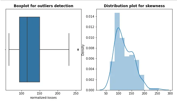
#Replacing Missing Values with Median because coulmn is skewed
auto_data['normalized-losses'].fillna(auto_data['normalized-losses'].median(),inplace=True) #this is little bit skewed to left
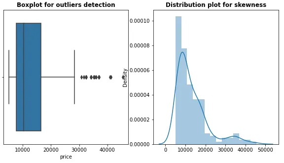
Replacing Missing values of price with median
plt.figure(figsize=(10,5))

plt.subplot(1,2,1)
sns.boxplot(x=auto_data["price"])
plt.title("Boxplot for outliers detection", fontweight="bold")

plt.subplot(1,2,2)
sns.distplot(x=auto_data["price"])
plt.title("Distribution plot for skewness", fontweight="bold")

plt.show()
auto_data['price'].fillna(auto_data['price'].median(),inplace=True)Summary of dataframe
auto_data.info()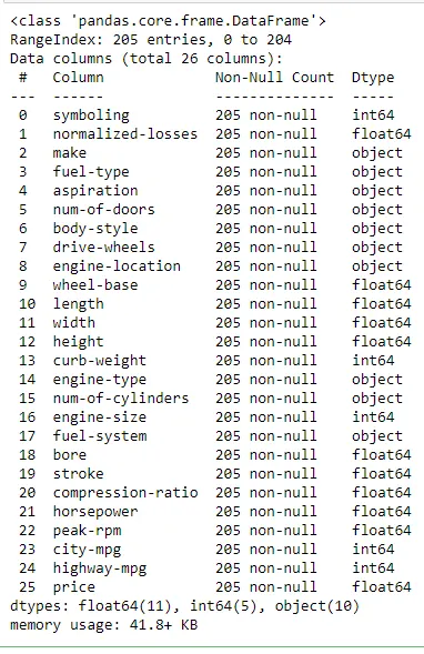
Correcting Datatype
- If we check in above Dtypes of all attribues,Some of attributes such as num-of- doors,num-of cylinder.
they should be 'int'or 'float' format instead of 'object'. - So let's first convert the str to number using replace() and then convert the object to int or float uaing astype().
#Checking unique values of num-of-doors
auto_data['num-of-doors'].unique()
array(['two', 'four'], dtype=object)
#Checking  unique values of num-of-cylinders
auto_data['num-of-cylinders'].unique()
array(['four', 'six', 'five', 'three', 'twelve', 'two', 'eight'],
dtype=object)
#Replacing str with number

auto_data['num-of-doors'].replace('two',2,inplace=True)
auto_data['num-of-doors'].replace('four',4,inplace=True)

#converting object dtype value into int64
auto_data['num-of-doors']=auto_data['num-of-doors'].astype('int64')
#Replacing str with number
auto_data['num-of-cylinders'].replace('two',2,inplace=True)
auto_data['num-of-cylinders'].replace('three',3,inplace=True)
auto_data['num-of-cylinders'].replace('four',4,inplace=True)
auto_data['num-of-cylinders'].replace('five',5,inplace=True)
auto_data['num-of-cylinders'].replace('six',6,inplace=True)
auto_data['num-of-cylinders'].replace('eight',8,inplace=True)
auto_data['num-of-cylinders'].replace('twelve',12,inplace=True)
#converting Dtype 'object'to int
auto_data['num-of-cylinders']=auto_data['num-of-cylinders'].astype('int64')Till now we have cleaned data by filling Missing values and Correcting Dtype of variables
- Now Next step is to data transformation in common format. Although This step in not neccesary everytime.
- For example:suppose any country that accepts fuel consumption in L/100km standard .then it become neccessary for us to transform MPG to L/100Km.
Transform (mpg to L/100km)
- Formaula for unit Conversion from Mpg to L/100Km.
- L/100km = 235/mpg i.e 1L/100km = 235 divided by 1 mpg
- In our dataset, the fuel consumption columns "city-mpg" and "highway-mpg" are represented by mpg (miles per gallon) unit.
# To convert mpg to liters per 100 km (L/100km), divides 235 by the miles per gallon(mpg) value.

auto_data['city-L/100Km'] = 235 / auto_data['city-mpg']
auto_data['highway-L/100Km'] = 235 / auto_data['highway-mpg']

auto_data.head() # Checking transformation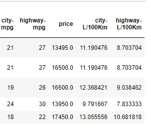
Binning:
- Binning is a process of transforming continuous numerical variables into discrete categorical 'bins', for grouped analysis.
auto_data['horsepower'].describe()count 203.000000 mean 104.256158 std 39.714369 min 48.000000 25% 70.000000 50% 95.000000 75% 116.000000 max 288.000000 Name: horsepower, dtype: float64
#unique values in horsepower column

auto_data['horsepower'].unique()- array([111. , 154. , 102. , 115. , 110. , 140. , 160. , 101. , 121. , 182. , 48. , 70. , 68. , 88. , 145. , 58. , 76. , 60. , 86. , 100. , 78. , 90. , 176. , 262. , 135. , 84. , 64. , 120. , 72. , 123. , 155. , 184. , 175. , 116. , 69. , 55. , 97. , 152. , 200. , 95. , 142. , 143. , 207. , 288. , 104.25615764, 73. , 82. , 94. , 62. , 56. , 112. , 92. , 161. , 156. , 52. , 85. , 114. , 162. , 134. , 106. ])
- In our dataset,"horsepower" is a real valued variable ranging from 48 to 288, it has 60 unique values
Histogram in order to see distrubution of data
auto_data["horsepower"] = auto_data["horsepower"].astype(int, copy=True)
auto_data["horsepower"]

#Copy = True willl create the another copy of column including changes to it.
#int is Dtype we want to apply.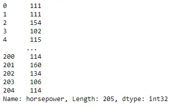
plt.hist(auto_data['horsepower'])
#Setting x&y labels
plt.xlabel("horsepower")
plt.ylabel("count")
plt.title("horsepower bins")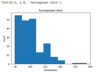
#histplot in order to check bins

sns.histplot(data=auto_data, x="horsepower", bins=3)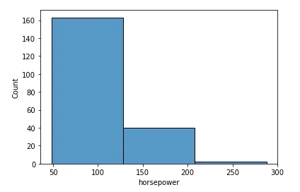
- 3 bins of equal size bandwidth so we use numpy's linspace(start_value, end_value, numbers_generated function.)
- Since we are building 3 bins of equal length, there should be 4 dividers, so numbers_generated=4.
bins = np.linspace(min(auto_data["horsepower"]),max(auto_data["horsepower"]),4)
bins
array([ 48., 128., 208., 288.])
#setting bins
bins_names = ['Low', 'Medium', 'High']

#applying panads cut()function to fix the bins into bins_names

auto_data['horsepower-binned'] = pd.cut(auto_data['horsepower'], bins, labels=bins_names ,include_lowest = True)
auto_data[['horsepower','horsepower-binned']].head(5)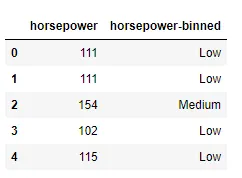
#convering category type into object dtype

auto_data['horsepower-binned']=auto_data['horsepower-binned'].astype('object')
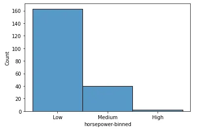
let's check count of each bin & histogram after binning
auto_data["horsepower-binned"].value_counts()Low 163 Medium 40 High 2 Name: horsepower-binned, dtype: int64
#Bins visualization
sns.histplot(data=auto_data, x="horsepower-binned")
#let's drop the horsepower column
auto_data.drop(['horsepower'],axis=1,inplace=True)
auto_data.head()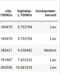
- We can see horsepower binned column.
Part_02:Exploration of using Visvualization
- DESCRIPTIVE STATISTICS
#Checking shape after cleaning data

auto_data.shape  #previously (205,26)
(205, 28) # two columns City-L/100Km & hughway -L/100Km are newly added columns after trasnforamtion of units.
#calculating some statistical data like percentile, mean and std

auto_data.describe().T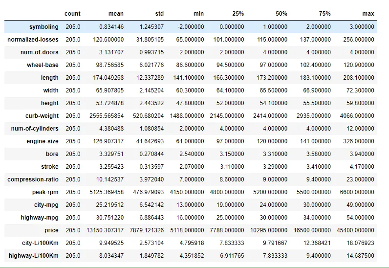
-
Above Table shows us :
- the count of that variable
- the mean
- the standard deviation (std)
- the minimum value
- the IQR (Interquartile Range: 25%, 50% and 75%)
- the maximum value
Concise summary of a DataFrame
- This method prints information about a DataFrame including the index dtype and column dtypes, non-null values and memory usage.
auto_data.info()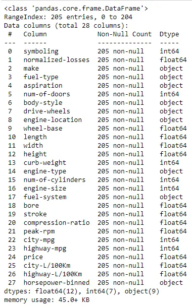
- Above shows there is no null values and All attributes have correct dtypes.
Univariant analysis
- Plotting Histogram & Countplots
#selecting columns having'int64'&'object' dtypes

cat = auto_data.select_dtypes(include=['int64','object'])
print(list(cat))
['symboling', 'make', 'fuel-type', 'aspiration', 'num-of-doors', 'body-style', 'drive-wheels', 'engine-location', 'curb-weight', 'engine-type', 'num-of-cylinders', 'engine-size', 'fuel-system', 'city-mpg', 'highway-mpg', 'horsepower-binned']
Plotting countplot
cat_list = ['symboling','num-of-doors', 'num-of-cylinders','fuel-type', 'aspiration', 'body-style', 'drive-wheels', 'engine-location', 'engine-type', 'fuel-system', 'horsepower-binned']
fig, axs = plt.subplots(nrows=6,ncols=2,figsize =(15,20))
for col,ax in zip(cat_list[0:],axs.ravel()):
    sns.countplot(x=col,data=auto_data,ax=ax)
    plt.xticks(rotation='vertical')
plt.savefig("Countplot",facecolor='y',bbox_inches="tight",pad_inches=0.3, transparent=True)- Using for loop, plotting countplots of each attributes from cat_list.
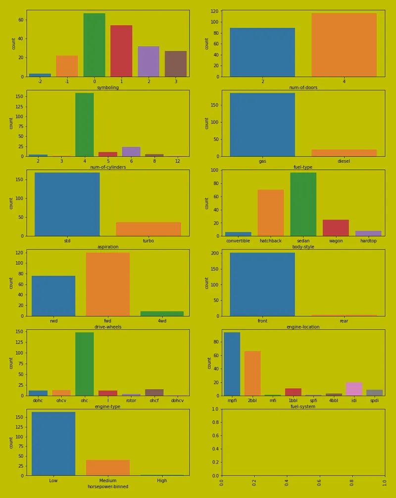
- From above countplot chart, we will draw some insights.
- Four doors cars are more than the two doors cars.
- maximum numbers of cars having four number of cylinders then followed by 6 number of cylinders and then 5.
- Most of the cars are working on gas.
- most of the cars are front wheel drive(fwd)
- Almost cars having engine located at front.
- Majority of cars are uses 'mpfi' fuel injection system.
Let's check number of cars of each brand
df_make_count = auto_data['make'].value_counts() # counting cars

fig, ax = plt.subplots(1, 2, figsize=(20,10))
df_make_count_barplot = sns.barplot(y = df_make_count.index,x = df_make_count.values, ax = ax[0])
df_make_count_barplot.set_ylabel('count')
df_make_count_barplot.set_xlabel('Car brand')
df_make_count.plot.pie(autopct="%1.1f%%", ax=ax[1])
plt.savefig("vehicles count",facecolor='g', bbox_inches="tight",
            pad_inches=0.3, transparent=True)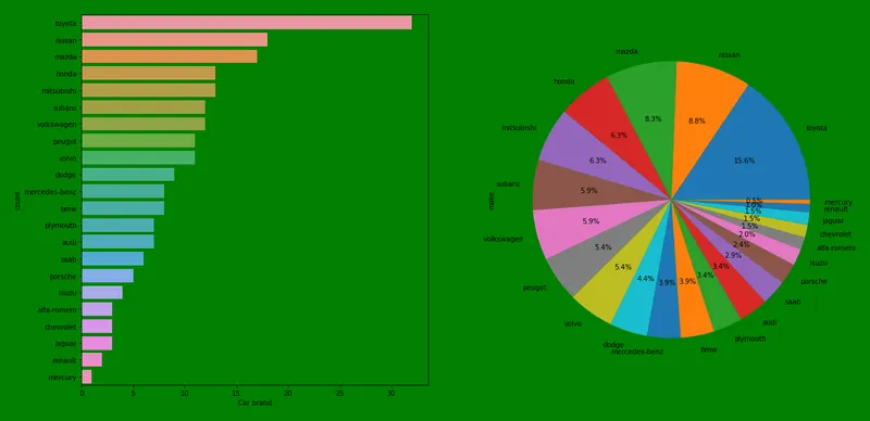
- we can see that most of the cars in the datasets is of toyota brand followed by nissan, mazda etc
1.Boxplot to detect outliers:
- We are checking the outlier in each numerical atrributes by using seaborn boxplot() function.
- Here , we are using for loop and plot the boxplot for each attributes from num list as follow:
num = [ 'normalized-losses', 'wheel-base', 'length', 'width', 'height', 'curb-weight', 'engine-size', 'bore', 'stroke', 'peak-rpm', 'price', 'city-L/100Km', 'highway-L/100Km']
fig, axs = plt.subplots(nrows=5,ncols=3,figsize =(15,20))
for col,ax in zip(num[0:],axs.ravel()):
    sns.boxplot(x=col,data=auto_data,ax=ax)
    plt.xticks(rotation='vertical')
    plt.savefig("boxplot", bbox_inches="tight",
            pad_inches=0.3, transparent=True)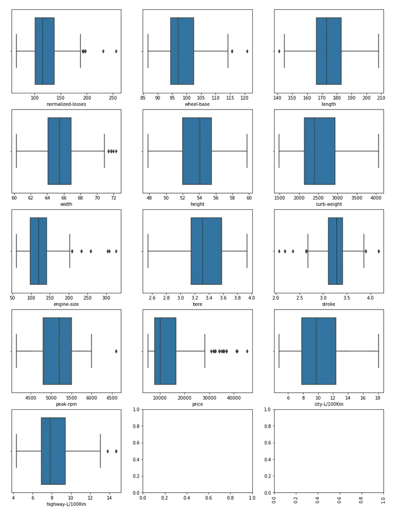
- From above boxplot graphs chart, we can say normalized -losses,engine-size,stroke and price have outliers.
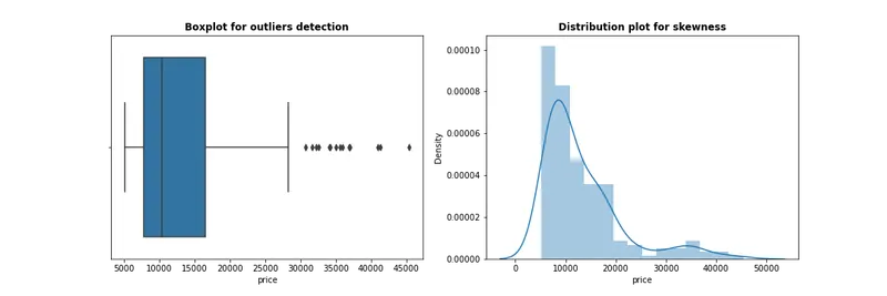
- We can also draw boxplot & distplot to check outlier & distribution of data
- for example : for price we can plot as follow
#Boxplot & distribution plot for price attribute

plt.figure(figsize=(15,5))

plt.subplot(1,2,1)
sns.boxplot(auto_data["price"])
plt.title("Boxplot for outliers detection", fontweight="bold")
plt.savefig('price')
plt.subplot(1,2,2)
sns.distplot(auto_data["price"])
plt.title("Distribution plot for skewness", fontweight="bold")
plt.savefig('price')
plt.show()
Now let's see some distribution of attributes in order to check skewness:
1.Whee_base distplot
# wheel-base distplot

sns.distplot(auto_data['wheel-base'],color='r')
plt.savefig("wheel-base")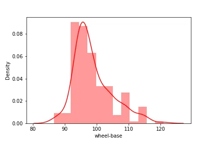
2.Normalized-losses distplot
#Normalized losses distplot

sns.distplot(auto_data['normalized-losses'],color='y')
plt.savefig("Normalized_losses")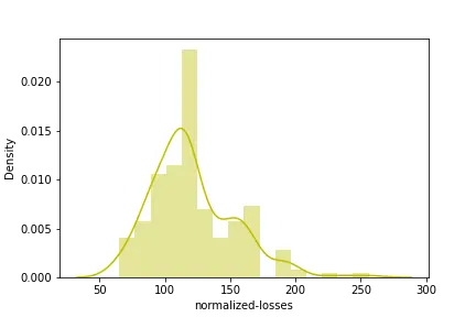
3.highway-L/100Km distplot
#distplot for highway-L/100Km

sns.distplot(auto_data['highway-L/100Km'],color='r')
plt.savefig('highwaympg')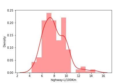
3.City-L/100Km distplot
#distplot for city-l/100Km

sns.distplot(auto_data['city-L/100Km'],color='g')
plt.savefig('cit-L/100Km')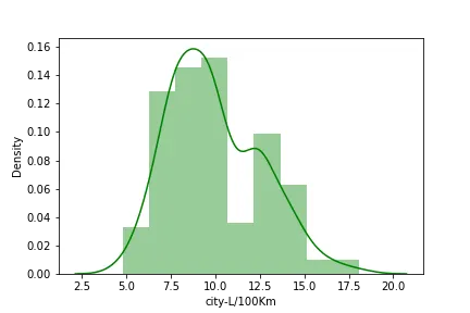
Bivariant Analysis
1.Barplots
# barplot betn num-of- cylinder & price
sns.barplot('num-of-cylinders', 'price', hue='num-of-doors',data=auto_data)
plt.savefig('price_vs_numofcyl')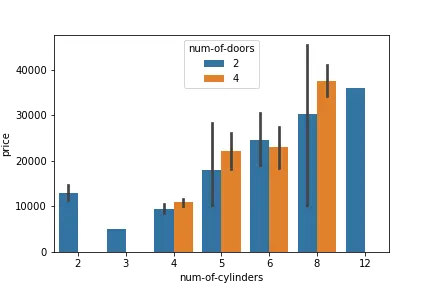
- From above we can say vehicle with 2 doors,8 cylinder have highest price.
- From above we can say cars with 4 doors are less costly than 2 doors cars except in case of 4 cylinder.
#barplot between horsepower-binnned &price

sns.barplot('horsepower-binned', 'price', hue='fuel-type', data=auto_data)
plt.savefig('price_vs_hp')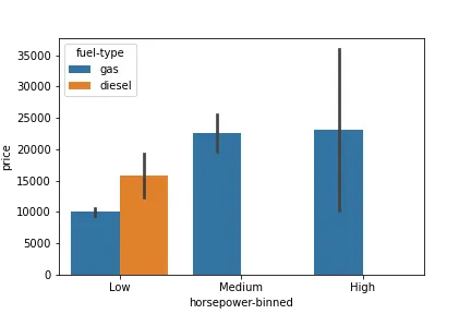
- From above low horsepower diesel engine is costlier than low horsepower gas engine.
- High horsepower gas engine have maximum price.\
- AS Horsepower increases price also goes on increasing.
#barplot engine-type vs price

sns.barplot('engine-type', 'price', hue='fuel-type', data=auto_data)
plt.savefig('price_vs_engine_type')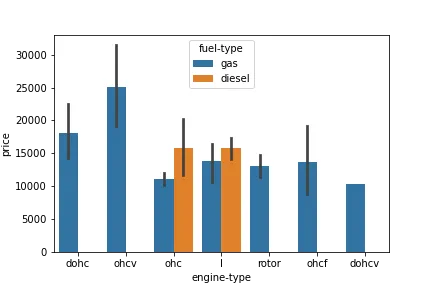
- Gas engine type 'Ohcv' has highest price than all other type of engine
#number of cylinder vs number of doors barplot
plt.figure(figsize=(10,10))
sns.barplot('num-of-cylinders','num-of-doors', hue='body-style', data=auto_data)
plt.savefig('cylinder_vs_doors')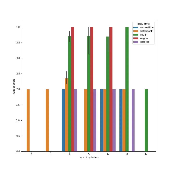
- From above we can say vehicles with 4 doors and numbers of cylinders 4,5,6,8 are either sedan and wagon.
- hadrop,convertible and hatchback are having 2 doors only.
2.Scatterplots
#heigh vs price scatterplot

sns.scatterplot('height','price', data=auto_data)
plt.savefig('scatterplot1')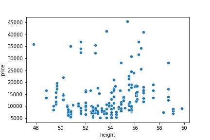
- There is no relationship between heigh & price of car.
- We can say height does not play role in increasing price of cars.
3.Regression plots
#regplot between price &lenght

sns.regplot('price','length', data=auto_data)
plt.savefig('Regplot1')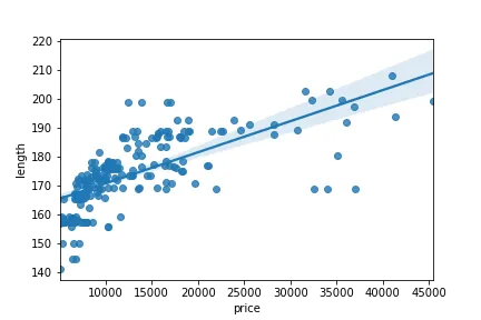
#reg between price & width

sns.regplot('price','width', data=auto_data)
plt.savefig('Regplot2')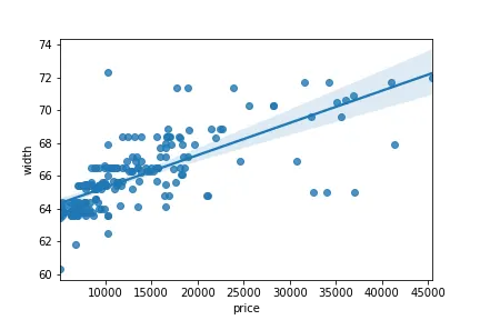
#regression plot engine-size & price.
#we can draw correlation matrix.

sns.regplot('engine-size','price',data=auto_data)
plt.savefig('Regplot3')
auto_data[['engine-size','price']].corr()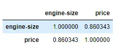
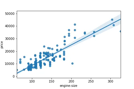
- From above we can say lengh & width and engine size have positive relationship with price.
- Price increases with engine size.
- we can see correlation between 'engine-size' and 'price' and see it's approximately 0.86.
4.Boxplots:
- Categorical attributes and their correlation with price.
#body style vs price boxplot

sns.boxplot(x="body-style", y="price", data=auto_data)
plt.savefig('body style vs price')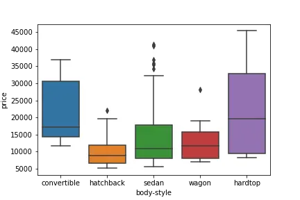
- Above we can see,boxes overlap and their median lines are inside the overlap range.
- As we mentioned above distributions of price between the different body-style categories have a significant overlap,and so body-style would not be a good predictor of price.
#engine location vs price boxplot

sns.boxplot(x="engine-location", y="price", data=auto_data)
plt.savefig('location vs price')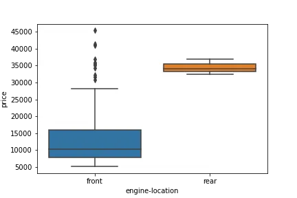
- Two boxes are not overlaped and they are enough distinct, we can say engine location is the predictor of rice.
Simillarly we can plot other relationship of catogorical attributes with price
#aspiration vs price boxplot

sns.boxplot(x="aspiration", y="price", data=auto_data)
plt.savefig('aspiration vs price')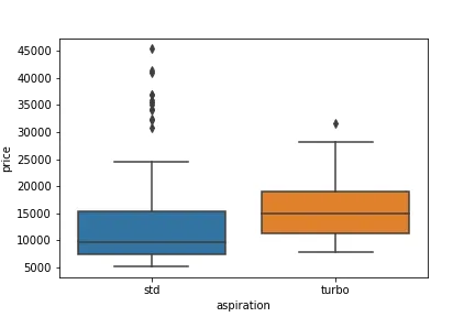
#drive-wheer vs price

sns.boxplot(x="drive-wheels", y="price", data=auto_data)
plt.savefig('Dw vs price')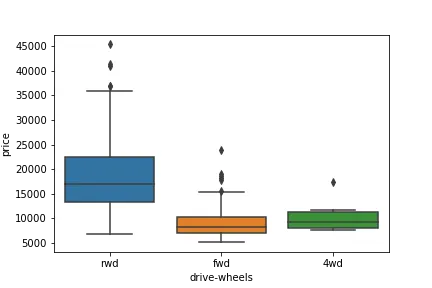
5.Correlation and Heatmap
#correlation matrix using corr() function

auto_data.corr()

#Heatmap
plt.figure(figsize=(15,7))
sns.heatmap(auto_data.corr(),annot=True)
plt.savefig('Heatmap')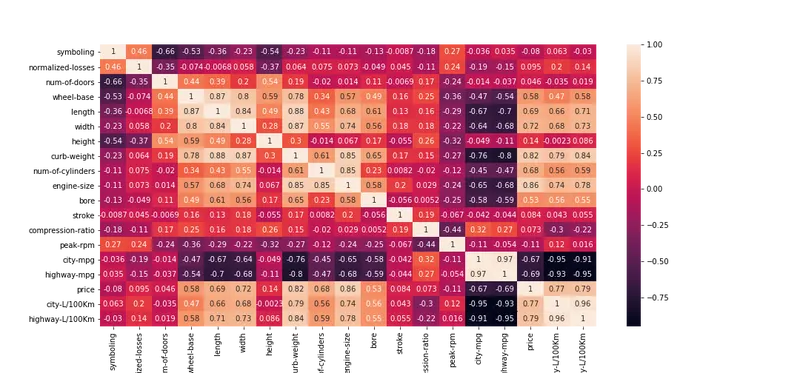
- Price is having high positive correlation with curbweight,enginesize and highly negative correlated with mpg.
- Model specifications (wheelbase, lenght, weight, height, crubweight, enginesize, bore, stroke, compressionration) and performance metrics (peakrpm, citympg, highwaympg) are mostly negatively correlated.
Let's save cleaned data in As auto_cleaned_data.csv
# saving cleaned data

auto_data.to_csv('auto_cleaned_data.csv')
Note: Jyupiter notebook and cleaned data file(auto_cleaned_data.csv) are uploaded.